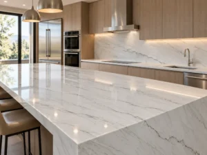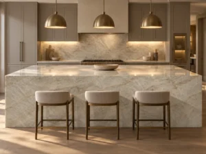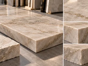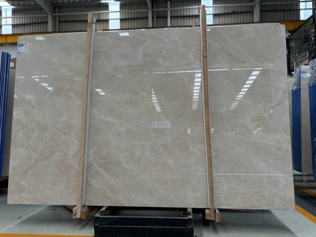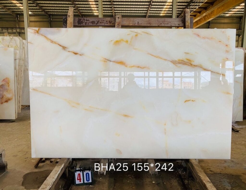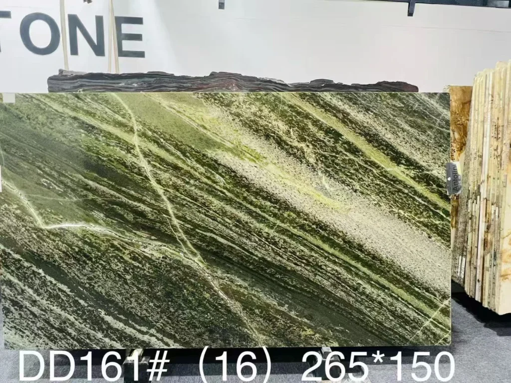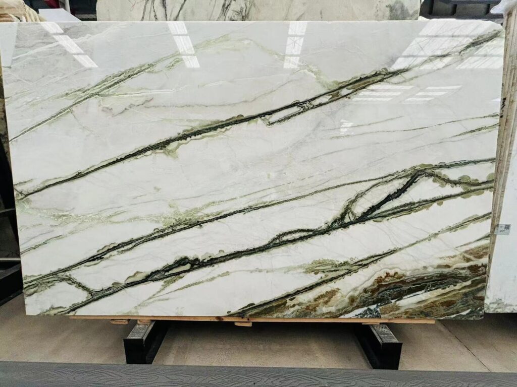

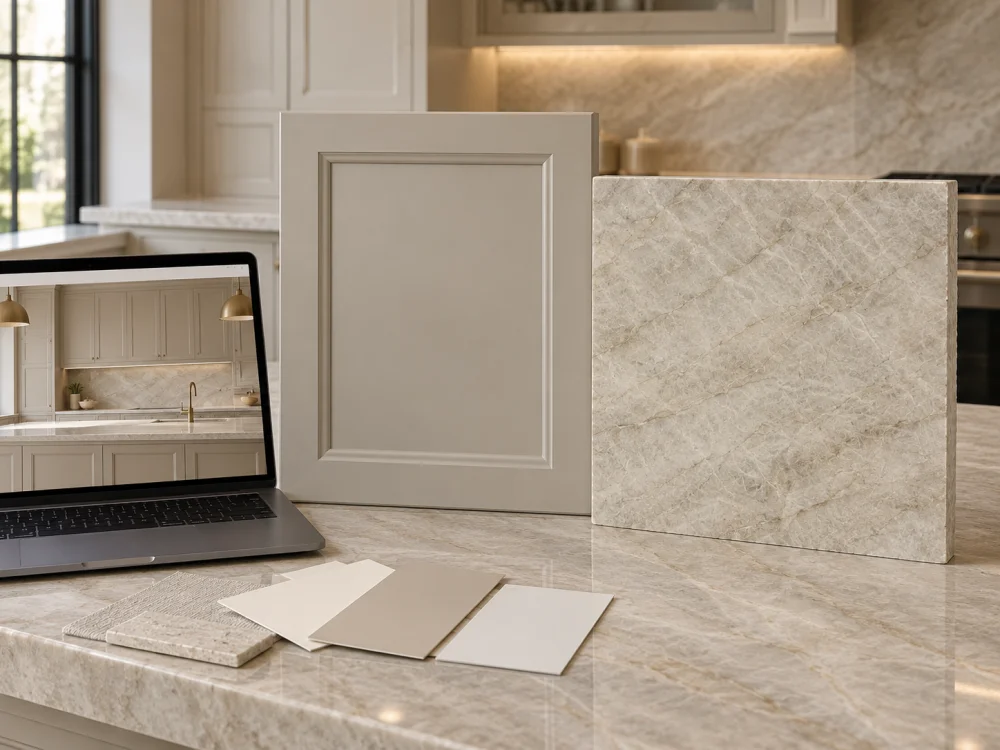
A designer sends a kitchen rendering with warm-white cabinets and pale Natural Quartzite.
The combination looks balanced on a laptop.
The client opens the same file on a phone and says the cabinets look slightly yellow.
The cabinet supplier sends a digital colour chart that looks greyer.
Then the actual painted door arrives and appears warmer beside the selected stone than anyone expected.
Which colour is correct?
This is the central problem behind Quartzite and Painted Cabinets: Why a Screen Colour Is Not Enough.
A screen can communicate design intent, help narrow colour families, and make remote discussion easier. It cannot reliably reproduce the complete physical relationship between a painted cabinet finish and a natural stone slab.
The final kitchen is made from physical materials under physical light.
That is where the important approval should happen.
Digital colour is useful, but it is not a physical paint standard.
The same image can look different on two phones, two computer monitors, or a printed page because each device reproduces colour differently.
Brightness settings, display calibration, colour profile, image compression, ambient room light, and automatic screen adjustments can all influence what the viewer sees.
Paint manufacturers themselves caution that on-screen colour representations may differ from actual painted colour and recommend confirming final selections with physical samples.
A rendering can answer useful questions:
These are legitimate early-stage decisions.
But a rendering should not be treated as proof that a specific cabinet paint will match a specific Natural Quartzite slab.
Online paint libraries are useful for finding candidate colours and identifying manufacturer colour names or codes.
They are not a substitute for viewing the real colour in the intended environment.
A pale greige that looks neutral on a screen may become warmer beside cream Quartzite. A clean-looking white may appear cooler once it touches a warm stone background.
A photograph is more useful than a generic digital swatch because it shows the real finish in context.
However, camera exposure, white balance, editing, daylight conditions, and the receiving screen can still alter the colour relationship.
Use photographs for documentation and remote discussion, but do not confuse photographic colour with a controlled physical approval.
Screen Rendering → Shortlist the Direction. Physical Cabinet Sample + Actual Quartzite → Approve the Relationship.
The phrase “white painted cabinets” is not a complete specification.
Neither is “warm greige.”
For colour-sensitive work, the cabinet finish should be connected to a stable project reference.
Where applicable, record:
This helps prevent a visual approval from becoming disconnected from the product eventually used on the cabinetry.
The same nominal colour can read differently when surface reflection changes.
A lower-sheen cabinet finish may appear softer and more diffuse. A glossier finish can reflect windows, countertops, flooring, and light sources more strongly.
This becomes particularly noticeable beside polished Natural Quartzite because both surfaces can reflect their surroundings.
Do not approve the colour relationship with one finish and assume another sheen will produce exactly the same visual result.
A small paint chip can introduce the colour.
A larger painted drawdown is more useful.
For a cabinet-to-stone decision, a finished cabinet door or representative approved cabinet panel is often more informative because it shows a larger area of the intended finish.
It can also be positioned vertically, which better represents how the cabinetry will actually be viewed beside a horizontal countertop.
A painted cabinet finish may be relatively uniform across one door.
Natural Quartzite is different.
One slab can contain several related colours and mineral structures at the same time.
When matching cabinetry, separate at least three visual components.
Look at the relatively quiet stone areas between stronger veins and mineral features.
Does the background appear:
This background often has the strongest direct relationship with a painted cabinet colour.
Now look separately at the movement.
A stone with a pale background may contain taupe, grey, gold, brown, green-grey, or darker mineral lines.
Those features can pull the complete kitchen palette warmer or cooler when viewed from room distance.
Finally, step back.
Does the complete slab read as pale and quiet?
Or do the veins occupy enough area that the slab appears significantly darker or greyer than its background?
These are different observations.
The site’s Infinity White Quartzite in a White-on-White Kitchen: Comparing Undertones guide uses the same principle: background undertone, brightness, and vein distribution should be reviewed separately before deciding whether a pale stone coordinates with painted cabinetry.
Background Undertone + Background Brightness + Vein / Mineral Distribution. Do not describe a complete Quartzite slab with one screen-picked colour value.
Colour relationships are comparative.
A cabinet sample that appears neutral when viewed alone can look noticeably warmer or cooler after it is placed directly beside another material.
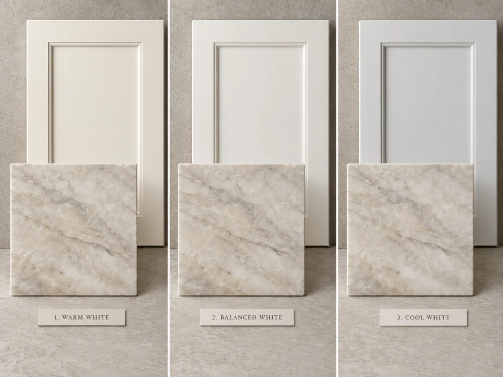
Imagine a Natural Quartzite slab with cream and pale taupe movement.
Place it beside a cooler painted white.
The cabinetry may suddenly appear cleaner, greyer, or slightly blue by comparison, while the stone appears warmer.
Neither surface has physically changed.
The difference becomes visible because they are now being judged together.
Reverse the situation.
A soft warm-white cabinet may appear creamy or yellow when it is placed beside a stone with a cooler pale-grey background.
Again, this does not automatically mean the cabinet colour is wrong.
The project needs to decide whether the contrast is intentional, acceptable, or unsuitable.
Greige cabinet colours sit between grey and beige and can shift visually depending on surrounding materials.
A greige beside warm oak flooring may appear relatively grey.
The same cabinet colour beside cool stone and stainless steel may appear warmer.
This is why choosing a greige from a digital chart without the stone and flooring present can produce an unexpected finished room.
The countertop and cabinets do not need to be identical in colour.
A successful kitchen may use:
Close Coordination — cabinet and stone backgrounds have similar temperature and brightness.
Soft Tonal Contrast — the stone is slightly warmer, greyer, or darker but still clearly related.
Deliberate Contrast — cabinetry and stone are intentionally different, with the rest of the palette helping connect them.
The goal is a deliberate relationship, not a forced colour match.
A combination approved under one light may look different under another.
This is especially important for pale cabinets and pale Quartzite.
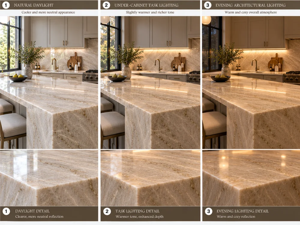
Window size, orientation, time of day, weather, and reflected outdoor colours can all influence how the surfaces are perceived.
A cabinet door viewed beside the countertop near a large window may look different from the same combination on an interior wall.
Under-cabinet lighting can place concentrated artificial light directly onto the countertop and backsplash area.
It may emphasize warm or cool content differently from ceiling lighting.
If the Quartzite extends up the backsplash, this condition becomes particularly important because the stone and cabinet finish meet within the illuminated zone.
Pendants over an island can create reflected highlights on polished stone.
They may also change how nearby cabinet fronts read from the main room approach.
Review the actual colour temperature and lighting design where these factors are known and materially important.
A kitchen approved only in bright daylight may feel different after sunset.
Warm artificial lighting can strengthen cream and beige content. Cooler lighting can emphasize grey or blue tendencies.
This does not mean one lighting condition reveals the “true colour.”
The finished palette should work under the conditions that matter to the project.
| Review Condition | What to Observe | Common Mistake |
| Daylight | Stone background, cabinet undertone, floor relationship | Treating one sunny photograph as final colour proof |
| Under-cabinet light | Countertop / backsplash / cabinet junction | Ignoring a major task-light source |
| Pendant / ceiling light | Reflections and overall room palette | Confusing reflection with intrinsic stone colour |
| Evening condition | Warm/cool balance after daylight disappears | Approving only the daytime appearance |
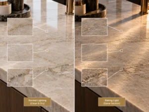
The article Quartzite Slabs Viewed Upright vs Flat: Why the Presentation Changes provides a related example of how the same natural stone can look different when light direction, reflection, viewing angle, and surface orientation change.
The cabinet finish and Quartzite are usually not the only large surfaces in the room.
A combination that looks balanced in isolation can change once flooring, wall paint, backsplash, or metal finishes are introduced.
Place the selected Quartzite reference directly beside the cabinet-door sample.
Do not leave a large gap between them if the finished countertop will physically meet the cabinetry.
Observe:
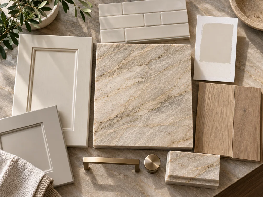
A wall colour can change the apparent relationship between the cabinet and stone.
Where painted walls directly border tall cabinets or a stone backsplash, include the actual paint sample or approved drawdown.
The floor often occupies a large visual area below the cabinetry.
Warm oak, pale limestone, grey tile, terrazzo, or dark timber can each change how the cabinet colour is perceived.
Hardware and plumbing finishes are smaller, but they can reinforce the warm or cool direction of the palette.
Brass, champagne bronze, polished nickel, brushed nickel, stainless steel, and black finishes can all influence the overall visual balance.
If Quartzite itself becomes the full-height backsplash, its visual influence increases dramatically.
If another tile or stone is used, include that material before final cabinet-colour approval.
Actual Quartzite + Cabinet Door + Wall Paint + Floor + Backsplash + Metal Finish + Project Lighting. Change one major variable at a time when diagnosing an undertone problem.
A small stone sample can introduce a material.
It cannot fully represent the complete slab.
Natural Quartzite may vary in tone, movement, mineral distribution, and overall visual weight across one board and between related boards.
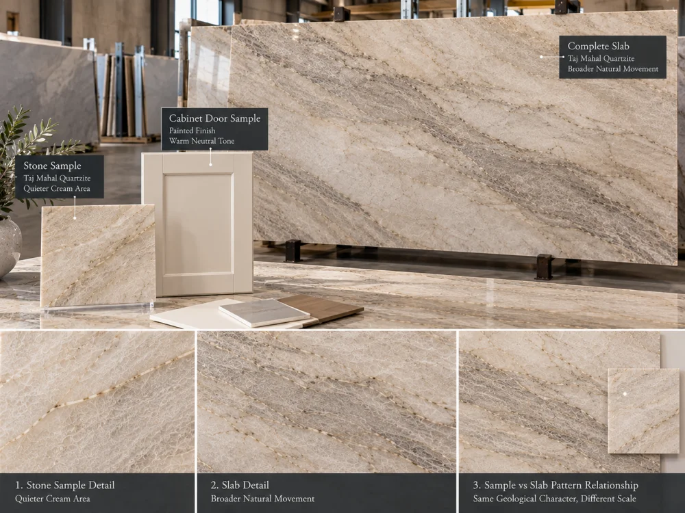
A 100 mm or 300 mm sample may come from a quiet cream area.
The full island may include broader taupe or grey movement.
If cabinet paint is selected only against the quiet sample, the finished kitchen may feel more contrast-heavy than expected.
Where the project is slab-specific, compare the cabinet direction with current full-slab photographs or the actual physical boards.
Step back far enough to understand the overall slab.
Then inspect the proposed island or countertop areas more closely.
The Quartzite Slab Showrooms: What to Bring to a Selection Appointment guide recommends bringing physical cabinet, flooring, paint, metal, and other adjacent samples where colour coordination matters rather than relying only on phone photographs.
Polished and honed versions of the same natural stone can read differently because reflection and visual depth change.
If the final Quartzite will be honed, do not approve the cabinet combination solely from a polished stone sample without considering the finish change.
For highly expressive stone, the overall slab may contain several visual zones.
The cabinet relationship should ultimately consider the part of the slab that will become the main finished worktop, particularly for a large island or full-height backsplash.
The phrase “Does this white match?” is too vague.
A better physical review separates the variables.
Use the same identified Quartzite reference.
Place Cabinet Colour A beside it.
Then replace only the cabinet sample with Cabinet Colour B.
Do not change the stone, lighting, flooring, and cabinet sample simultaneously.
Place both options in the same physical position and orientation.
If one sample is close to a window and another is in shade, the comparison becomes difficult to interpret.
At close distance, examine undertone and surface finish.
From the main room approach, judge the complete visual weight.
A subtle cabinet-to-stone difference that appears obvious from 300 mm away may look balanced from normal room distance.
Once the cabinet choice has been narrowed, add the wall, flooring, backsplash, and hardware references back into the palette.
Confirm that solving one undertone issue has not created another.
Do not record only:
“White cabinet approved.”
A better record identifies:
This is not automatically a defect.
The physical sample should generally become the more useful reference for the physical project, provided it corresponds to the specified cabinet finish.
Confirm that the delivered sample represents the intended:
If the reference itself is wrong, the colour discussion should stop until the correct sample is available.
If the sample identity is correct but the colour relationship is undesirable, determine why.
Possible observations include:
If the cabinet colour is still open, test another physical cabinet sample while keeping the stone and major room finishes constant.
If the cabinet finish is already fixed, evaluate whether another Quartzite slab or another design element should change.
Do not continuously adjust several finishes at once.
That makes it difficult to know what actually solved the problem.
A successful Quartzite-and-painted-cabinet palette does not require every neutral surface to match exactly.
It requires the differences to look intentional under the lighting and surrounding materials of the real room.
| Approval Reference | Useful For | Limitation |
| Screen rendering | Design direction and early shortlist | Not reliable as final physical colour approval |
| Digital paint swatch | Finding candidate colour references | Display varies by device |
| Small physical paint chip | Initial undertone comparison | Small area and finish may limit interpretation |
| Finished cabinet door | Cabinet colour, sheen and larger-area relationship | Still needs project lighting and adjacent materials |
| Small Quartzite sample | Local stone colour and finish | Cannot establish full slab variation |
| Actual slab / current full-slab reference | Overall natural movement and slab-specific palette | Finished room lighting still needs consideration |
A practical approval sequence is:
Digital Shortlist → Physical Paint Sample → Cabinet Door → Actual Quartzite → Full Material Palette → Daylight Review → Artificial-Light Review → Defined Approval.
If the cabinet colour changes after this approval, repeat the affected comparison.
If the selected Quartzite slab changes materially, repeat the affected comparison.
If the stone finish changes from polished to honed, reassess the visual relationship where the difference matters.
This is more reliable than trying to preserve an earlier approval when the physical references have changed.
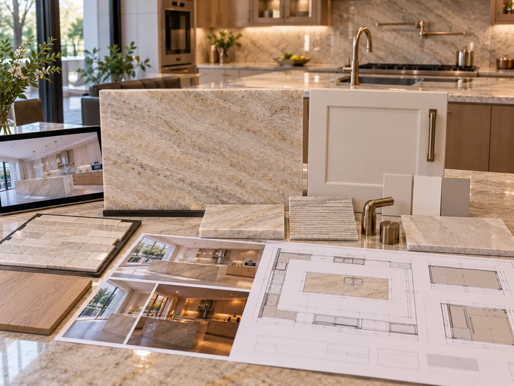
A screen is useful for shortlisting colours, but it should not be treated as final physical colour approval. Device calibration, brightness, image processing, room lighting, and other variables can change the displayed colour. For a colour-sensitive Quartzite kitchen, compare an identified physical cabinet sample with the actual stone reference.
The cabinet may have a warmer cream or yellow undertone, the Quartzite may have a cooler background, or surrounding light and finishes may increase the apparent difference. Compare the cabinet and stone directly under the same lighting before deciding which material should change.
No. Close coordination, soft tonal contrast, and deliberate contrast can all work. What matters is whether the relationship appears intentional when the actual cabinet finish, Quartzite, wall, floor, backsplash, and lighting are viewed together.
A paint chip can support early comparison, but a larger painted sample or representative finished cabinet door is generally more useful for final colour-sensitive review because it shows a larger physical area and the intended finish more clearly.
Use both for different purposes where available. A small stone sample helps with local colour and finish, while the actual slab or current full-slab reference shows the natural variation, vein distribution, and overall visual weight that may dominate a large island or backsplash.
Daylight and artificial lighting can change the perceived warm/cool relationship and reflection of pale materials. Review important combinations under the lighting conditions the completed kitchen will actually use rather than approving only one daytime photograph.
Send Josh the proposed Natural Quartzite material, current slab references where available, cabinet paint manufacturer and colour reference, physical cabinet-door or finish sample information, stone finish, kitchen drawings, wall and flooring references, backsplash material, relevant metal finishes, lighting information where known, stone dimensions, quantities, and delivery destination.
For project-based Natural Quartzite kitchens, HRST STONE can coordinate available full-slab photographs, board references, selected finish information, CAD/shop drawings, cutting layouts, visible-face review, QC records, packing, and export documentation according to the confirmed project scope. Send Josh the kitchen drawings, proposed cabinet-finish reference, physical sample information where available, wall and flooring palette, lighting context, stone dimensions, quantities, visual priorities, and destination for review.