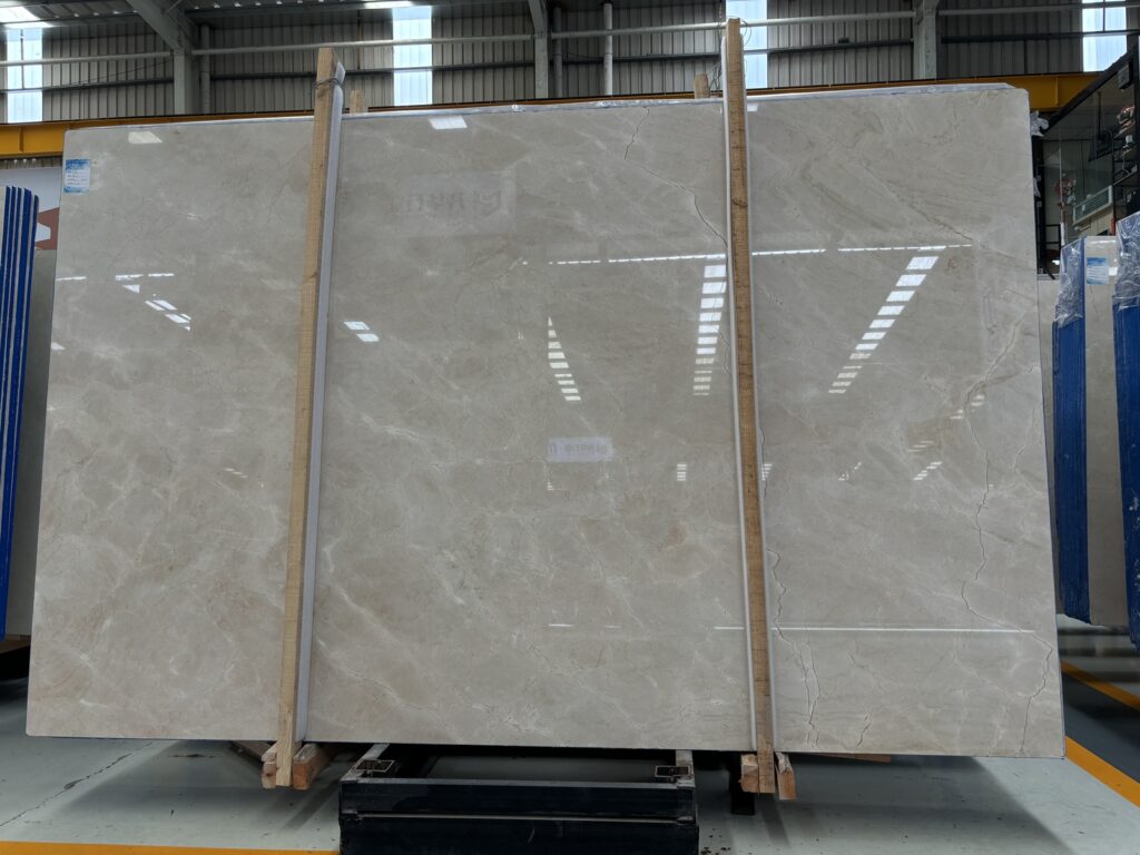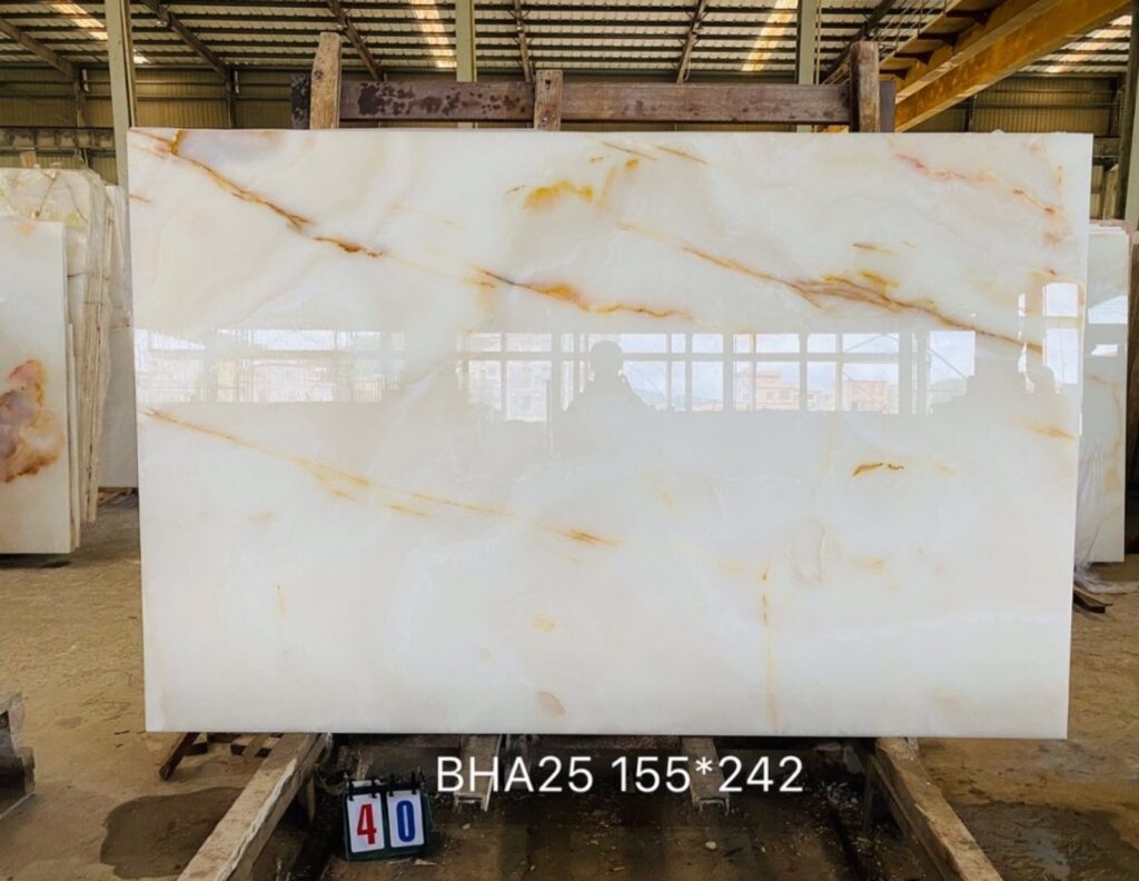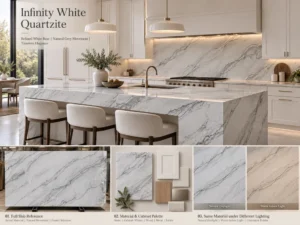
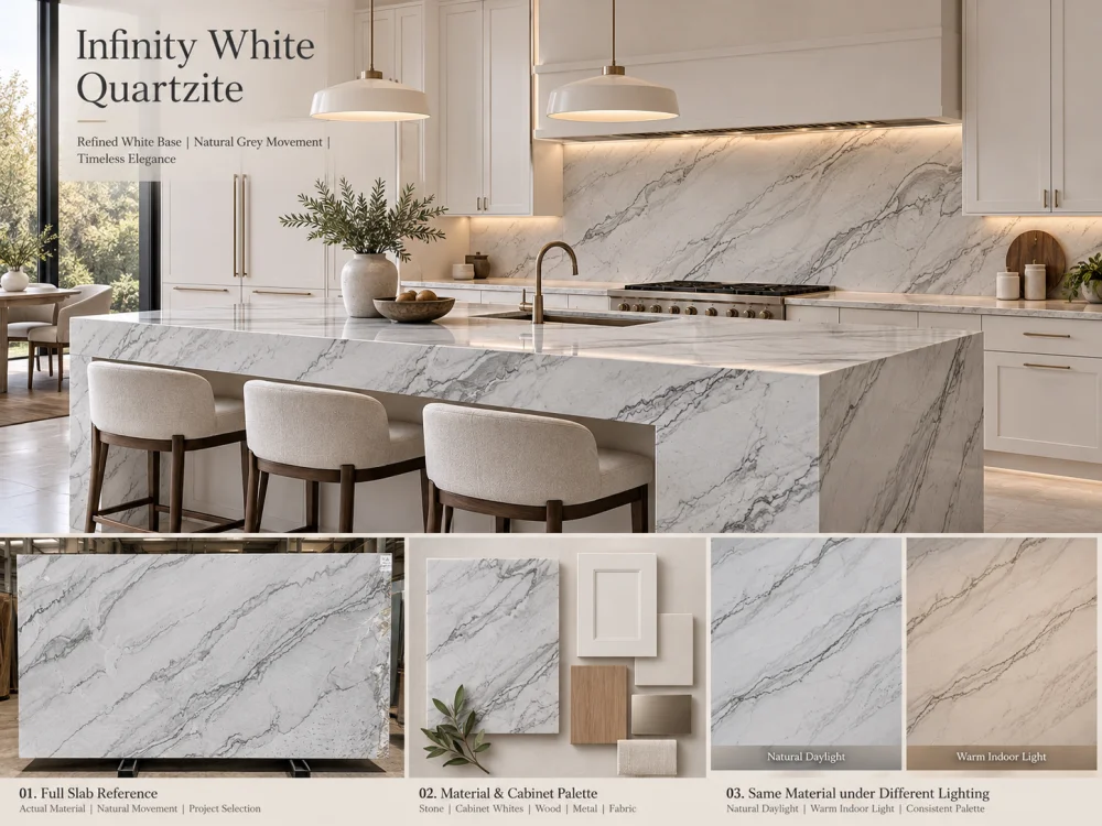
인피니티 화이트 쿼츠라이트는 화이트 대 화이트 주방에 적합하다고 볼 수 있지만, “화이트’라는 단어만으로는 캐비닛, 벽 페인트, 백스플래시 마감재와의 정확한 조화를 확정할 수 없습니다. 실제 제안된 석재를 캐비닛과 페인트 샘플 등 실물 자료와 비교하고, 색조의 미세한 차이와 밝기, 무늬 등을 구분하며, 완공된 공간에서 예상되는 조명 아래에서 이들의 조합을 면밀히 검토해야 합니다. 최종적으로는 각 재료 간의 관계를 승인해야 하며, 보편적인 ”화이트’ 색조로 단정지어서는 안 됩니다.
화이트 주방은 여러 가지 서로 다른 화이트 계열을 배치하더라도 전체적으로 어색해 보이지 않을 수 있습니다. 문제는 이러한 차이들이 의도적인 것인지 여부를 파악하는 데 있습니다.
화이트 캐비닛 도어, 화이트 벽면, 옅은 색상의 석재 조리대, 그리고 전면 높이의 석재 백스플래시가 조화를 이루는 주방을 상상해 보세요. 각 재료는 단독으로 볼 때 모두 화이트처럼 보일 수 있습니다. 그러나 이를 함께 배치하면 캐비닛은 크림빛으로, 벽은 약간 푸른빛을 띠며, 석재는 은은하게 회색빛을 띨 수 있습니다.
이는 다음과 같은 경우에 고려해야 할 핵심 설계 질문입니다 인피니티 화이트 쿼츠라이트 주방: 실제 석재가 동일한 공간 내에서 다른 화이트 마감재들과 어떻게 조화를 이룰 것인지에 대한 문제입니다.
답변을 얻기 위해서는 “퓨어 화이트’라는 이름의 캐비닛 페인트를 선택하거나 매력적인 석재 사진만을 살펴보는 것으로는 부족합니다. 관련 조명 아래에서, 올바른 비율로 구성된 실제 재료들을 체계적으로 비교해야 합니다.
화이트 표면은 겉보기 밝기 외에도 다양한 특성을 지닙니다. 어떤 화이트는 따뜻한 노란빛, 크림색, 베이지 톤을 띠기도 하고, 또 다른 화이트는 차가운 푸른빛이나 회색 톤을 가질 수도 있으며, 상대적으로 균형 잡힌 모습을 보이기도 합니다.
이러한 차이를 흔히 언더톤. 이라고 부릅니다. 샘플을 개별적으로 볼 때에는 눈에 잘 띄지 않지만, 두 표면이 맞닿으면 그 차이가 분명히 드러날 수 있습니다.
화이트 대 화이트 주방에서는 재료 간 직접적인 접촉이 많아지므로 이러한 차이점이 더욱 중요해집니다. 화이트 캐비닛 문짝은 옅은 색상의 조리대 바로 아래에 위치할 수 있고, 석재 백스플래시는 흰색 상부장과 맞닿을 수 있으며, 벽 페인트는 흰색 후드 주변이나 높은 팬트리 캐비닛과 만나게 됩니다.
이러한 경계에서는 시각적으로 재료 간의 차이를 직접 비교하게 됩니다.
중요한 점은 모든 화이트를 똑같이 만드는 것이 항상 목표는 아니라는 것입니다. 신중하게 계획된 차이를 통해 깊이감을 더하고, 전체가 화이트인 인테리어가 단조롭게 보이지 않도록 할 수 있습니다. 문제는 주방이 완성된 후에도 일관성이 없어 보이는, 계획되지 않은 재료 간의 관계입니다.
인피니티 화이트 쿼츠라이트는 천연석으로, 프로젝트에 실제로 적용될 재료의 외관을 반드시 해당 재료 자체로부터 평가해야 합니다.
그만큼 인피니티 화이트 쿼츠라이트 제품 참고자료 는 회색 또는 더 짙은 자연 무늬가 있는 흰색 바탕을 설명합니다. 또한 여러 가지 가능한 표면 마감 처리 방식을 제시합니다. 이는 유용한 기초 정보일 뿐, 모든 슬랩이 동일한 배경 톤이나 무늬 분포를 갖는다는 보장은 아닙니다.
캐비닛 화이트를 선택하기 전에, 제안된 슬랩의 세 가지 요소를 구분해 보세요:
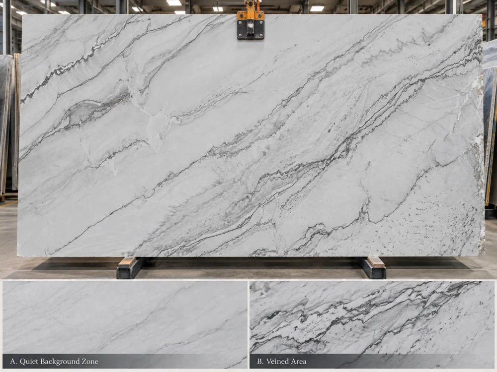
무늬 사이의 넓고 비교적 차분한 부분을 살펴보세요. 시야 조건에 따라 선명하게 보이는지, 부드럽게 느껴지는지, 회색빛이 도는지, 크림색으로 보이는지, 혹은 변화가 있는지 확인해 보세요. 이것이 석재의 배경과 화이트 캐비닛 간의 관계를 파악하는 데 가장 유용한 참고 자료입니다.
회색 또는 더 짙은 무늬는 전체적인 시각적 인상을 좌우하며, 특히 완성된 조리대의 큰 부분을 차지할 경우 더욱 두드러집니다. 무늬가 더 강렬한 슬랩은 배경이 비교적 밝아 보여도, 멀리서 보면 더 회색으로 보일 수 있습니다.
슬랩 사진이나 샘플에서 한 발 물러나 보세요. 석재가 주로 옅은 표면으로 읽히는지, 아니면 더 어두운 특징들로 인해 시각적으로 더 활발하게 느껴지는지 확인해 보세요. 이는 배경 언더톤과는 다릅니다.
석재를 “회색 무늬가 있는 화이트’라고만 설명하는 구매자는, 조용한 화이트 배경과 완전한 아일랜드나 백스플래시가 만들어내는 전체적인 인상 사이의 차이를 놓칠 수 있습니다.
배경 언더톤 + 배경 밝기 + 무늬 분포
이들은 주방 전체의 색채 조합을 판단하기 전에 각각 별도로 검토되어야 합니다.
화이트 대 화이트 선택이 종종 혼란스러워지는 이유 중 하나는 “맞춤’이라는 표현이 여러 가지 의미로 사용되기 때문입니다.
두 재료가 비슷한 언더톤을 가지고 있더라도 밝기는 현저히 다를 수 있습니다. 반대로, 두 재료가 동일하게 밝아 보이더라도 하나는 따뜻한 느낌을, 다른 하나는 차가운 느낌을 줄 수 있습니다.
| 비교하는 대상 | 물어야 할 질문 | 가능한 관찰 사항 |
| 언더톤 | 화이트가 따뜻한 톤, 차가운 톤, 혹은 상대적으로 중성적인 톤을 띠는지 확인하세요. | 석재 옆에서 캐비닛이 더 크림색으로 보입니다. |
| 밝기 | 어느 표면이 더 밝아 보이는지 확인하세요. | 석재는 약간 더 어둡지만 반드시 따뜻한 느낌은 아닙니다. |
| 무늬 대비 | 자연적인 무늬가 화이트 영역을 얼마나 강하게 간섭하는지 확인하세요. | 실내 거리에서 조리대가 더 회색으로 보입니다. |
| 표면 반사 | 마감재가 주변의 빛과 색상과 어떻게 상호작용하는지 확인하세요. | 광택 처리된 표면은 근처의 창문이나 캐비닛을 반사합니다. |
이러한 구분은 흔히 발생하는 실수를 막아줍니다: 조리대가 “너무 회색’으로 보인다고 해서 캐비닛 페인트를 바꾸는 행위 말입니다. 실제 문제는 차가운 배경 언더톤이 아니라 강한 자연 무늬일 가능성이 높기 때문입니다.
The most useful comparison begins with physical references rather than isolated online images.
For an Infinity White Quartzite kitchen, assemble the proposed stone sample or representative current material reference, a finished cabinet door or approved finish sample, the actual wall-paint drawdown, and the intended backsplash reference.
Where the stone is the backsplash, include that information explicitly. A countertop and full-height backsplash made from the same stone create a much larger continuous visual field than a countertop alone.
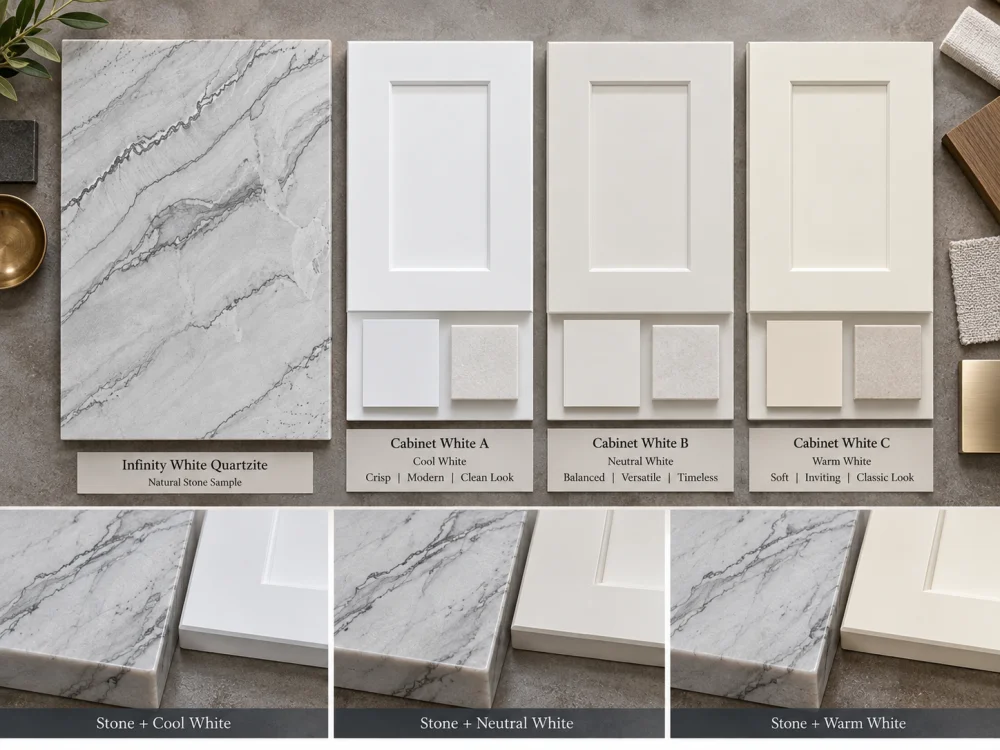
Place the stone sample immediately next to the cabinet finish. Review the edge-to-edge relationship, not merely two samples positioned far apart.
Ask whether the stone appears warmer, cooler, darker, or more patterned. Record these as separate observations.
Introduce the proposed wall paint. A wall white that appears neutral in isolation may look warmer or cooler once it becomes the background behind the cabinet and countertop.
Pay particular attention to areas where wall paint directly borders upper cabinets, tall units, open shelving, or the backsplash.
Flooring and metal finishes can influence the overall reading of the palette. Warm wood floors, pale stone floors, brushed nickel, brass, and black hardware create different surrounding color relationships.
These materials should not distract from the white comparison. Their role is to reveal whether the overall palette has a coherent direction.
If you are testing three cabinet whites, keep the Infinity White stone reference, wall paint, lighting, and other finishes unchanged. Change only the cabinet sample.
This is essential. If several variables change at once, it becomes difficult to identify why one combination appears more balanced.
Stone A + Cabinet White 2 + Same Wall + Same Light
Stone A + Cabinet White 3 + Same Wall + Same Light
Change one finish at a time.
Light can change how white surfaces are perceived. This matters because an Infinity White Quartzite kitchen may be photographed or sampled in a stone showroom, but experienced under a completely different combination of daylight and artificial light.
A north-facing room, a kitchen with large sunlit windows, and an interior kitchen with limited daylight can produce different impressions of the same materials. The apparent effect also depends on the room’s surrounding colors and the characteristics of the lighting fixtures.
Warmer artificial lighting may make cream or yellow tendencies more apparent. Cooler light may emphasize grey or blue tendencies. These are possible perceptual effects, not fixed predictions for every slab and lamp.
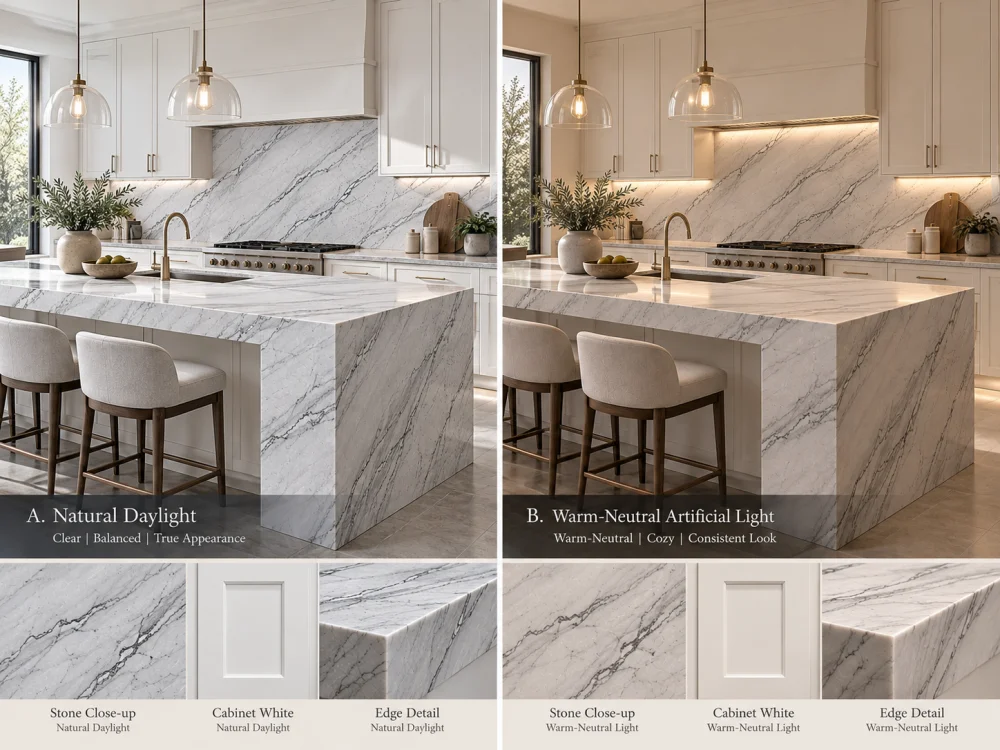
Compare the material set in the actual room where practical. Observe the palette when the kitchen receives its normal daylight and again when that light changes significantly.
Keep the samples close together and avoid judging one in direct sun while another remains in shadow.
Use the proposed or representative project lighting. Consider ceiling lights, under-cabinet strips, and pendants separately if they illuminate different parts of the stone.
Lighting color temperature alone does not fully describe color rendering. The actual lamp or a suitable representative should be part of a color-sensitive review.
Photographs are useful for documenting arrangements and discussing options remotely. However, automatic camera white balance, exposure, editing, and display settings can alter perceived whites.
Where precise color judgment matters, physical samples viewed under controlled conditions should take priority over a phone image.
Instead of searching for a universal “best white cabinet color,” test three intentional relationships against the proposed Infinity White slab.
The stone background and cabinet white appear relatively similar in temperature and brightness. Natural veining provides most of the visible variation.
This may suit a minimal kitchen where the designer wants the stone and cabinetry to read as a connected pale composition.
The risk is expecting a natural stone to behave like a uniform painted finish. Even when the quieter stone background coordinates closely, other areas may differ.
The cabinet and stone are intentionally different in brightness or warmth, but their relationship appears consistent with the walls, floor, and lighting.
For example, a slightly softer-looking stone beside a cleaner white cabinet may create depth without appearing accidental. Whether this works depends on the actual samples, not a generic color formula.
The design accepts a clearly visible difference between the cabinet white and the stone. A contrasting backsplash, architectural shadow line, timber detail, or other planned transition may help establish that separation.
This approach can be useful when the chosen Infinity White slab has a distinctive appearance that should remain visible rather than being forced into a near-identical white match.
The correct outcome is not always the closest color match. It is the most coherent relationship for the intended room.
Not every part of the kitchen exposes the same color relationship.
The strongest visual comparisons often occur where two large surfaces meet or where one white surface frames another.
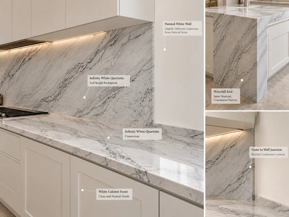
This is a direct comparison between horizontal natural stone and vertical cabinetry. The materials also receive and reflect light differently because of their orientation.
Review a representative cabinet door beneath the stone sample, not only beside it on a flat table.
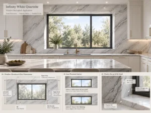
A backsplash can make the stone’s background and veining much more prominent because the material occupies a vertical plane in the main field of view.
Place the proposed wall or cabinet white beside a vertical stone sample. Do not assume that approval of the horizontal countertop automatically covers the backsplash appearance.
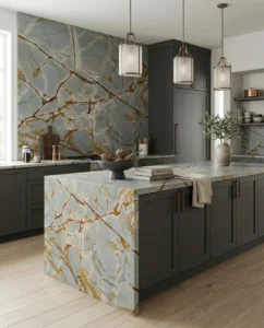
A waterfall end places the stone vertically next to cabinetry, flooring, or a contrasting island base. This can make an undertone difference more noticeable than it is on the top alone.
If the project includes a waterfall, review the actual stone allocation and the surrounding finishes from the main room viewpoint.
Large painted surfaces can act as a visual reference for nearby stone. A warm white hood beside a cooler-looking stone backsplash may make the difference more obvious.
Where the kitchen includes several painted whites, identify which finish should act as the principal reference rather than treating every surface independently.
First determine whether the observation concerns the stone’s quiet background, its natural veining, or a lighting effect.
If the stone looks grey because of its vein density, changing cabinet white may not significantly alter the overall geological character. If the quiet background looks creamy only beside a particularly cool cabinet, the relative color relationship may be contributing to the effect.
Use a short diagnostic sequence:
A change in appearance does not necessarily mean that either material is defective or incorrectly supplied. It may be a result of adjacent colors, viewing conditions, finish, or natural variation.
If the relationship remains unsuitable, possible design responses include reconsidering the cabinet finish, adjusting another major white reference, reviewing the stone selection, or introducing a deliberate transition. The appropriate response depends on which elements of the design are still open for change.
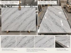
A polished stone reference and a honed stone reference may not look identical under the same light. Polished surfaces produce stronger reflections, while honed surfaces generally have a more diffuse appearance. Leathered surfaces introduce additional texture that can affect highlights and shadows.
These visual differences matter in a nearly all-white kitchen because the design may rely on subtle contrasts rather than strong color changes.
Do not approve the final color relationship using one finish and assume it will transfer unchanged to another.
Also distinguish a small sample from a complete slab. A sample may show a quiet white area while the actual proposed slab contains more grey movement or other natural variation. The final island and perimeter tops may come from different zones or multiple slabs.
For a large kitchen, review the selected stone areas at the scale of their intended applications. A full-height backsplash and a broad island may contribute differently to the perceived balance of white.
The final approval should identify which actual material references were compared and what visual relationship the project intends to achieve.
| 참고 | 기록할 내용 |
| Infinity White stone | Actual slab or sample reference, intended finish, and relevant selected zones |
| Cabinet white | Approved physical door or finish reference and revision |
| Wall and backsplash | Current paint and backsplash references, including direct-contact conditions |
| 조명 | Daylight and representative artificial-light conditions used for review |
| Visual decision | Close match, soft contrast, or deliberate separation, plus any unresolved differences |
When the material palette is accepted, coordinate it with the current kitchen drawings and stone layout. If the selected slab, cabinet finish, surface finish, or lighting specification changes, reassess the affected color relationship before treating the earlier approval as still applicable.
The same general issue arises with other pale natural stones, although each material has its own appearance. For a related example focused on another material, see Mont Blanc Quartzite with White Cabinets: Avoiding Undertone Mismatch.
만약 인피니티 화이트 쿼츠라이트 주방, the final goal is not a theoretical perfect white. It is a deliberate, repeatable material decision based on the actual stone, actual cabinetry, adjacent finishes, and expected room lighting.
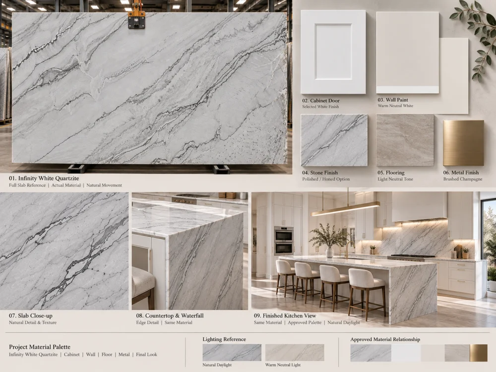
No fixed undertone should be assumed from the commercial name alone. The proposed slab’s background and natural movement should be compared with the actual cabinet and wall finishes under relevant lighting.
There is no single cabinet white that suits every slab and design. Test the actual stone against current cool, neutral, or warm cabinet finish samples, keeping the surrounding finishes and lighting consistent.
The impression may come from the stone’s natural grey veining, a difference in background brightness, a cooler relative undertone, or the lighting conditions. These should be evaluated separately before changing the design.
Not necessarily. A close match, a soft tonal difference, or a deliberate contrast can all be design choices. What matters is whether the relationship looks intentional when the actual materials are viewed together.
Photographs help communicate a proposed palette but can change perceived whites because of exposure, white balance, editing, and screen differences. Physical references under controlled lighting are preferable for final color-sensitive decisions.
Yes. Different finishes can change reflection and the perceived appearance of the same stone. Review a representative finish before approving its relationship with the cabinetry.
Recompare the selected stone, cabinet finish, wall paint, backsplash, floor, and relevant lighting. An earlier approval based on a different cabinet white may no longer describe the final combination.
For a white-on-white kitchen project, HRST STONE can help coordinate available Infinity White Quartzite slab references, selected finish information, stone layouts, CAD/shop drawing requirements, fabrication communication, QC records, and export packing according to the confirmed scope. Send Josh the kitchen drawings, cabinet-white reference, wall and backsplash finishes, intended lighting information, stone dimensions, quantities, and delivery destination for a project-specific discussion.
저작권 © HRST STONE / XIAMEN HRST STONE CO., LTD. 모든 권리 보유.