빠른 요약
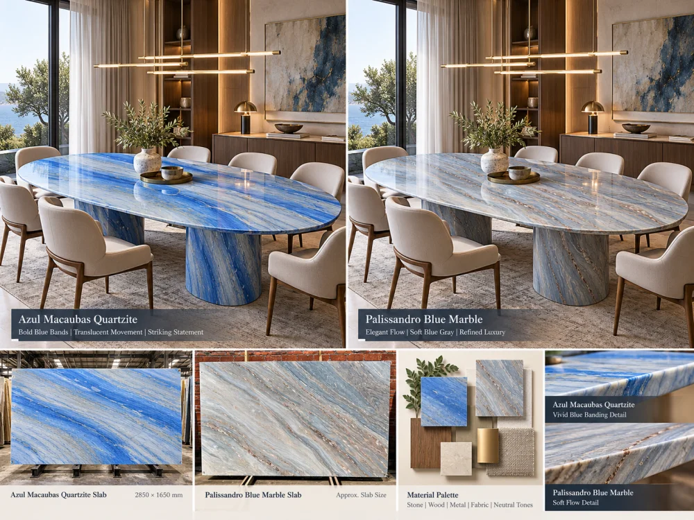
아줄 마카우바스 쿼츠라이트와 팔리산드로 블루 대리석 모두 파란색을 주조로 한 인테리어에 잘 어울리지만, 결정은 단순히 어느 석재가 더 “파랗게” 보이는지에만 국한되어서는 안 됩니다. 실제 제안된 판재를 실물 크기로 비교한 뒤, 목재, 금속, 천연 가죽, 벽면 마감재 및 프로젝트 조명과 함께 각각의 파란색, 흰색, 회색 및 어두운 색조의 변화가 어떻게 연출되는지 살펴보세요. 아줄 마카우바스와 팔리산드로 블루는 서로 다른 자연석 카테고리에 속하므로, 시각적 디자인 비교와는 별도로 각각의 기술적 요구사항도 반드시 확인해야 합니다.
디자이너의 말:
“우리는 파란색 자연석을 원합니다.”
꽤 구체적인 요청이네요.
그렇지 않습니다.
어떤 파란색 석재는 차갑고 직선적이며 건축적인 느낌을 줄 수 있습니다.
또 다른 석재는 층이 느껴지고 부드러우며 분위기 있는 느낌을 줄 수 있습니다.
어떤 석재는 10미터 밖에서도 공간을 압도할 수 있습니다.
다른 석재는 파란색-회색 계열의 천연 가죽, 브러시드 메탈, 옅은 목재와 더욱 은은하게 어우러질 수 있습니다.
이것이 바로 유용한 접근 방식입니다. 아줄 마카우바스 쿼츠라이트 vs 팔리산드로 블루 대리석.
두 개의 이름만 비교하지 마세요.
두 가지 가능한 인테리어를 비교하세요.
두 재료 중 하나를 선택하기 전에, 파란색이 해당 공간에서 어떤 역할을 해야 하는지 명확히 정의하세요.
파란색을 중심 포인트로
석재는 공간에 들어섰을 때 가장 먼저 눈에 띄는 주요 시각 요소가 되어야 합니다.
파란색을 배경으로
석재는 가구나 예술품을 압도하지 않으면서도 분위기를 조성해야 합니다.
파란색을 연결 고리로
석재는 인테리어 전체에 걸쳐 파란색, 회색, 목재 및 금속 마감재들을 자연스럽게 연결해야 합니다.
답변에 따라 실제 판재에서 무엇을 찾아야 하는지도 달라집니다.
제안된 아줄 마카우바스 쿼츠라이트와 팔리산드로 블루 대리석 샘플을 동일한 프로젝트 자재들 옆에 배치해 보세요.
단독으로 매력적으로 보이는 석재가 반드시 의도한 공간 구성까지 만들어내는 것은 아닙니다.
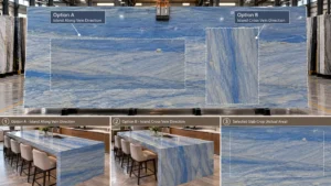
아줄 마카우바스 쿼츠라이트의 경우, 대규모로 나타나는 방향성 있는 파란색 무늬의 움직임이 디자인 논의에서 매우 중요한 부분입니다.
작은 샘플만으로 판단하지 마세요.
실제 제안된 판재에서는 다음 사항을 검토하세요:
대형 건축 표면의 경우, 단순히 아줄 마카우바스를 좋아하는지 여부만으로 판단해서는 안 됩니다.
그것은 실제 아줄 마카우바스 판재 중 어느 부분이 공간에 사용될 것인지;.
팔리산드로 블루 대리석 역시 같은 방식으로, 즉 유용한 규모와 실제 제안된 재료를 기준으로 검토해야 합니다.
상표명이 특정한 외관을 보장한다고 단정하기보다는, 다음 사항을 살펴보세요:
This makes the comparison specific to the slabs being considered rather than to two catalogue descriptions.
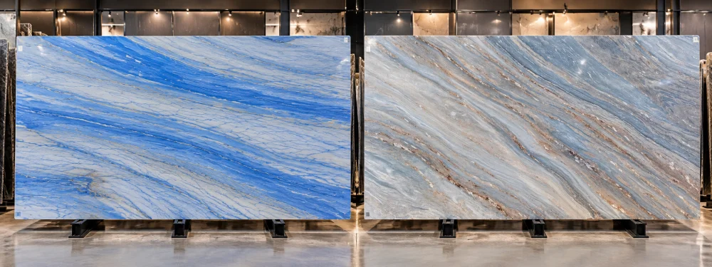
Place full-slab references side by side.
| Design Question | 아줄 마카우바 규암 | Palissandro 블루 대리석 |
| Dominant Movement | Review the actual slab for the scale, direction and spacing of its blue bands. | Review the actual slab for its layered or flowing marble movement. |
| Room-Distance Reading | Check whether the main bands remain strongly legible across the room. | Check whether the layered movement reads as distinct bands or a broader tonal field. |
| Focal Area | Identify which strong blue movement should remain visible after cutting. | Identify which part of the marble movement should anchor the finished composition. |
| Variation | Treat the selected slab as the visual reference. | Treat the selected slab as the visual reference. |
Visual weight is different from color.
A stone can be pale blue yet visually dominant because its movement is large and directional.
Another stone can contain darker blue-grey areas yet feel calmer because those tones are distributed differently.
ROOM-DISTANCE TEST
Place both full-slab options into the same approximate architectural scale. Step back from the close mineral detail and ask which surface becomes dominant first, which becomes quieter, and whether that hierarchy matches the interior concept.
Timber can substantially change how a blue natural stone is perceived.
A pale oak sample introduces a warm, relatively light reference beside the blue stone.
Place the same oak sample against both proposed stones.
Then compare whether the intended interior feels:
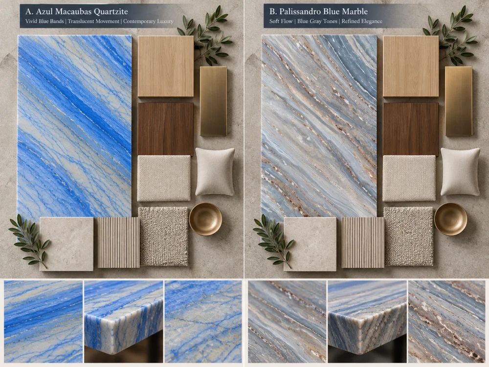
Walnut introduces a deeper warm field.
Instead of assuming that either blue stone automatically works with walnut, compare the actual samples under the intended lighting.
Look at the whole relationship between blue, brown, grey and pale mineral areas.
Blue stone does not exist only beside cabinetry.
Luxury interiors may combine it with:
Do not select the metal from a digital stone photograph.
Build a physical or controlled material board where possible.
This matters especially in living rooms, dining rooms, hospitality spaces and reception areas.
Imagine a blue stone feature wall behind a blue-grey sofa.
If both materials occupy a similar visual intensity, the room may lose hierarchy.
If one acts as the focal element and the other supports it, the composition becomes easier to read.
INTERIOR PALETTE QUESTION
Should the natural stone be the strongest blue object in the room, or should it sit inside a broader family of blue-grey finishes?
Do not compare one material photographed in cool showroom light with another photographed in warm residential light.
Where the project warrants a controlled comparison, review both proposed materials under similar viewing conditions.
Consider:
The purpose is not to assign one fixed digital color to either stone.
It is to understand how the actual proposed material participates in the intended room.
A feature wall is one of the clearest ways to understand the difference between two blue natural stones.
Use the same wall dimensions for both options.
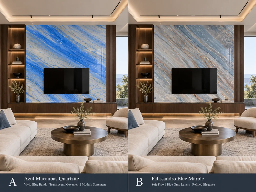
Do not change the furniture or wall size between the two visualisations.
The stone should be the principal variable.
A material that feels very strong across a full wall may read differently on a dining table, console, reception counter or other custom stone furniture.
At furniture scale, look more closely at:
This is why a blue-interior comparison should include the intended application, not only full slabs.
This is particularly important when comparing natural stones online.
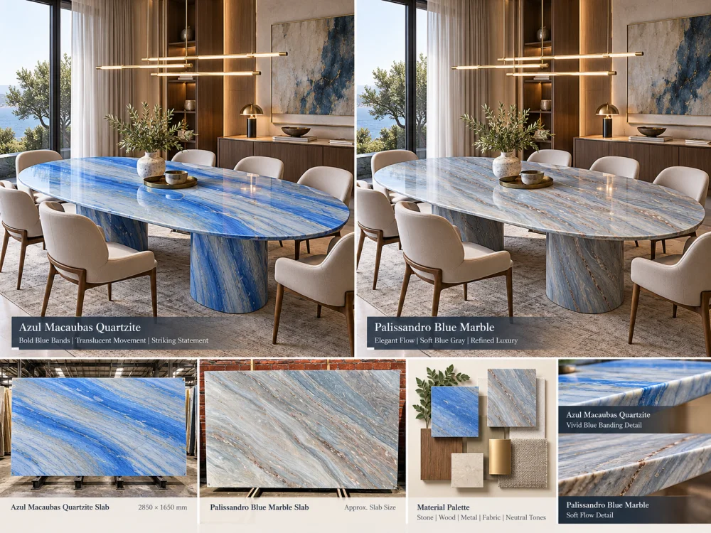
A dramatic close-up from one slab and a quiet wide photograph from another do not create a controlled comparison.
CONTROL THE COMPARISON
Full slab against full slab. Similar scale against similar scale. Same application outline. Same room. Same lighting concept. Then compare.
Finish can affect reflection, perceived depth and the way a natural stone interacts with light.
Rather than assuming a polished or honed appearance from online photography, request or prepare representative finish samples where the finish decision is important.
Compare both materials at the finish relevant to the project.
This keeps the decision focused on the surface that may actually be supplied rather than on unrelated reference photography.
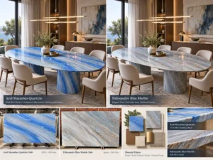
Azul Macaubas Quartzite and Palissandro Blue Marble are not the same material category.
That matters.
But this article should not convert that distinction into unsupported universal performance claims.
TRACK A — DESIGN
Color relationship, pattern scale, movement, focal areas, finish, room distance, adjacent materials and layout.
TRACK B — PROJECT REQUIREMENTS
Required application, relevant material documentation, fabrication, support, installation interfaces, maintenance expectations and other project-specific technical requirements.
Keep the two tracks connected, but do not substitute one for the other.
If a technical property affects the project decision, request information that is relevant to the material and scope being considered.
Examples may include project-required material documentation, available test information, finish information, treatment information or fabrication details.
A commercial name alone should not be used to establish:
For an important blue interior, one of the clearest comparison methods is to build two controlled material boards.
| Material Board A | Material Board B |
| Actual Azul Macaubas Quartzite reference | Actual Palissandro Blue Marble reference |
| Same timber sample | Same timber sample |
| Same metal finish | Same metal finish |
| Same upholstery | Same upholstery |
| Same wall / floor reference | Same wall / floor reference |
| Project-relevant finish | Project-relevant finish |
Change the stone. Keep the rest of the palette constant.
Now you are comparing materials rather than comparing two unrelated mood boards.
The next step is the same experiment at architectural scale.
Use the same:
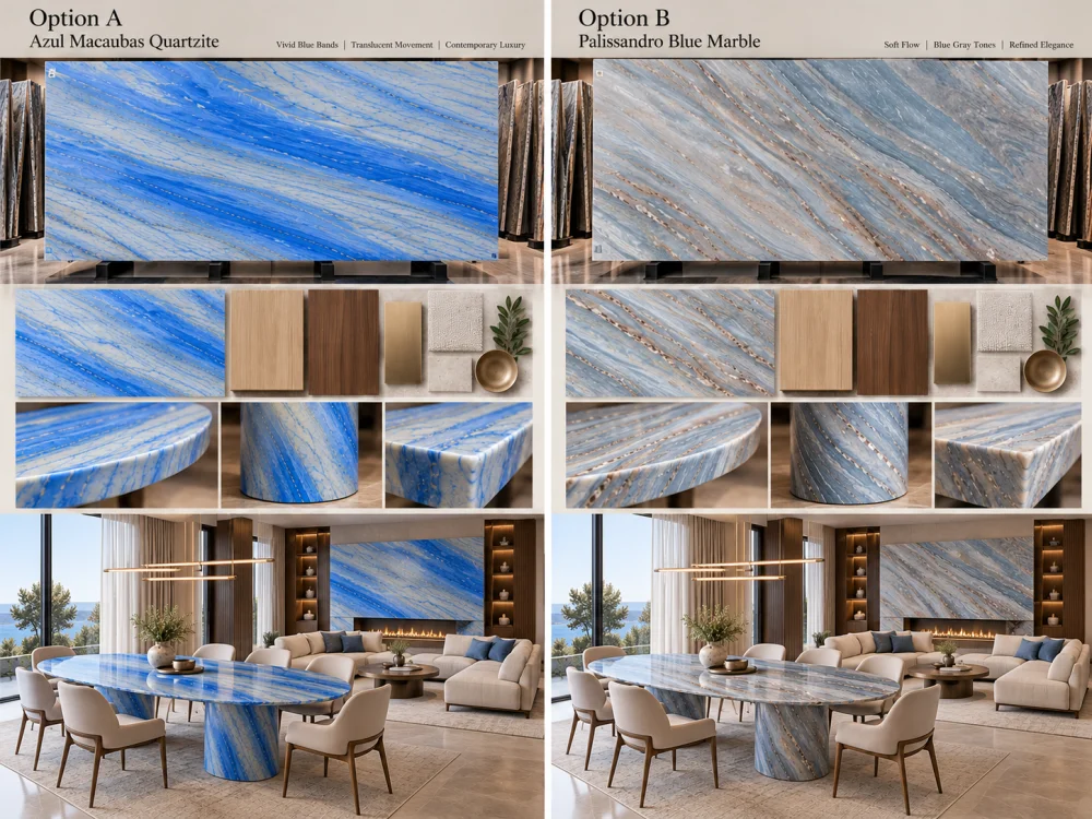
This makes differences in pattern scale, visual weight and room atmosphere easier to judge.
Do not reduce the answer to “Quartzite is better” or “marble is more elegant.”
Instead, finish the comparison with project questions:
01. Should the stone dominate the room or support the room?
02. Which actual slab has the pattern scale appropriate for the application?
03. Which slab works with the selected timber rather than an imagined timber?
04. Which option creates the intended relationship with metal and upholstery?
05. How does each material read under the intended lighting?
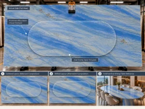
06. What happens when the actual finished-piece outline is placed on each slab?
07. Which project-specific technical requirements still need verification?
08. Which exact slab or slab set is being approved?
유용한 비교는 실제 제안된 판재를 기준으로 이루어져야 합니다. 아줄 마카우바스는 청색 띠의 발달 양상과 방향을 검토해야 하며, 팔리산드로 블루는 대리석층의 특성과 간격을 검토해야 합니다. 자연석 판재마다 차이가 있으므로, 상업적 명칭에만 의존하는 것보다는 전체 판재를 비교하는 것이 훨씬 유용합니다.
만능의 정답은 없습니다. 해당 석재를 시선을 끄는 포인트로, 보다 차분한 배경으로, 혹은 다른 푸른빛이 도는 회색 계열 마감재들 간의 연결 고리로 활용할지 먼저 결정하세요. 그 다음에는 동일한 공간의 색조와 용도에 맞춰 실제 판재들을 비교해 보시기 바랍니다.
샘플은 국부적인 색상과 마감 품질 검토에 도움이 될 수 있지만, 대규모의 자연스러운 움직임은 작은 조각으로는 충분히 표현되지 않을 수 있습니다. 패턴의 스케일이 중요한 경우에는 전체 슬래브 기준을 비교하고, 각 옵션 위에 최종 완성된 부재의 윤곽을 겹쳐 놓아 보십시오.
네. 목재, 금속, 바닥재, 벽지 색상 및 실내 장식은 주변의 색채와 대비 관계를 변화시킵니다. 별도의 무드보드를 사용하기보다는, 동일한 인접 마감 재료를 기준으로 두 가지 제안된 석재를 비교하시기 바랍니다.
조명은 인지되는 색상 간의 관계, 대비, 반사 및 표면의 깊이를 변화시킬 수 있습니다. 차이가 중요한 경우, 프로젝트와 관련된 비교 가능한 시야 조건 하에서 그리고 의도된 마감 상태에서 두 재료를 모두 검토하십시오.
No. Azul Macaubas is commercially supplied as Natural Quartzite, while Palissandro Blue is supplied as natural marble. Project-specific technical requirements should therefore be reviewed using the relevant material information rather than treating both simply as “blue stone.”
네, 레이아웃이 중요한 경우에 해당됩니다. 동일한 아일랜드, 벽, 세면대, 상판 또는 가구의 외곽선을 사용하면 절단 후 각 실제 판재의 어느 부분이 노출될지 파악할 수 있으며, 이는 최종 시공 결과와 더 관련성 높은 비교를 가능하게 합니다.
조쉬에게 의도된 적용 사례, 치수, 수량, 도면, 선호하는 마감재, 현재 사용 중인 슬래브 또는 샘플 참조, 인접한 목재 및 금속 마감재, 벽과 바닥의 참고 자료, 중요한 실내 조망, 배송 목적지, 그리고 아직 검토가 필요한 설계 또는 기술적 질문들을 전달해 주세요.
Compare the Interior, Not Only the Stone
HRST STONE can coordinate current slab photographs, material samples, CAD/shop drawings, actual slab layouts, finish references, visible pattern placement, fabrication QC and export packing around the confirmed project scope. Send Josh the intended application, dimensions, drawings, Azul Macaubas Quartzite and Palissandro Blue Marble references, adjacent finish palette and the room views that matter to the design.
© HRST STONE / XIAMEN HRST STONE CO., LTD. 모든 권리 보유.