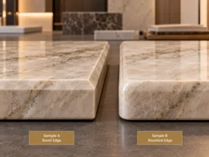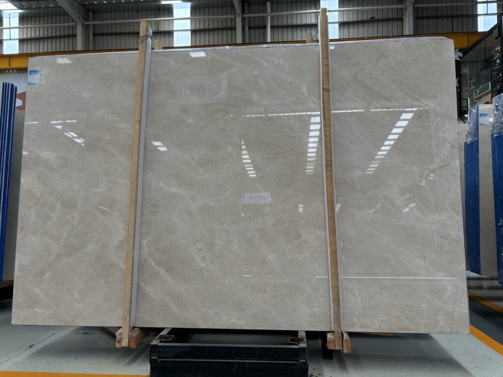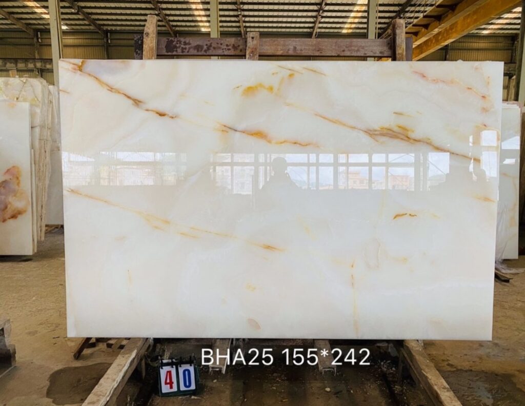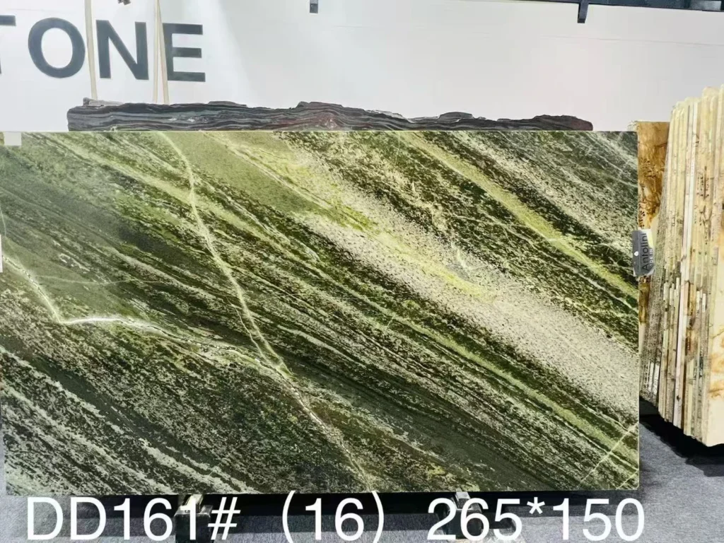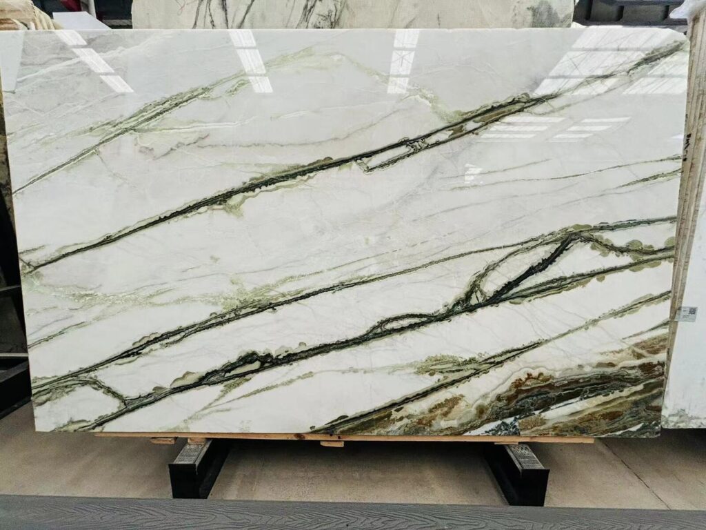


A Natural Quartzite island looks dramatic in the slab warehouse.
A terrazzo floor sample also looks beautiful on the designer’s desk.
Both are approved separately.
Then the kitchen is visualized as a complete room.
The stone has broad directional movement.
The floor contains several contrasting aggregate colors.
Divider strips create another visible grid.
From the entrance, the eye does not know where to settle.
This is the design problem behind Quarzite con pavimenti in terrazzo: evitare motivi contrastanti.
The issue is not that Natural Quartzite and terrazzo cannot be used together.
They can create a sophisticated combination.
The issue is whether both materials are trying to become the dominant pattern at the same time.
A useful project question is therefore:
Which surface should carry the primary visual movement, and how should the other material support it?
Two patterned materials do not automatically create a bad interior.
Problems appear when their visual weight is too similar.
The primary pattern is the material that should attract attention first from the important room viewpoint.
In a kitchen or hospitality space, this may be:
The secondary material can still contain texture and variation.
It simply needs to occupy a different level of visual emphasis.
For example, a strongly directional Quartzite island may sit successfully over a terrazzo floor with:
Reverse the priority and the logic may change.
If the terrazzo floor contains a bold graphic pattern, multiple colors, or large aggregate, the Quartzite may work better when the selected slab has quieter movement.
A dramatic Quartzite and expressive terrazzo can still work together if they are separated by scale, color, location, or viewing distance.
The important question is whether the complete room reads intentionally.
Primary Visual Movement → Secondary Texture → Supporting Solid Surfaces. Two materials can both contain pattern, but they should not automatically demand equal attention from the same viewpoint.
Pattern scale is often more important than a close color match.
Natural Quartzite and terrazzo usually create visual movement in very different ways.

A complete Natural Quartzite slab may contain:
These features can span hundreds of millimeters or a large portion of the slab.
From room distance, smaller details merge and the eye sees the dominant movement of the complete finished piece.
Il relativo Scala del motivo della quarzite: lettura di una lastra a distanza d’ambiente guide explains why close-range mineral detail and room-distance composition should be judged separately.
Terrazzo is created from a matrix and aggregate.
The aggregate can vary in:
A terrazzo with many small contrasting chips can create a high-frequency visual field.
A terrazzo with larger, more widely spaced aggregate produces a different visual rhythm.
A Venetian-style or other large-aggregate design can become visually dominant even from farther away.
A broad, slow-moving Quartzite pattern can often coexist more comfortably with a terrazzo whose smaller texture reads mainly as a field from room distance.
The two materials are still patterned, but they operate at different scales.
Problems are more likely when:
| Pattern Variable | Quartzite Review | Terrazzo Review |
| Scale | Broad veins, mineral fields, slab-scale movement | Aggregate size, density and any larger graphic pattern |
| Frequency | How often major movement changes across the finished piece | How frequently contrasting chips repeat across the floor |
| Direzione | Linear, diagonal, flowing, clustered or non-directional | Random aggregate field plus divider-strip or graphic direction |
| Room-distance reading | Dominant slab composition | Overall floor field, aggregate contrast and grid |
When designers say that a terrazzo floor is “busy,” the aggregate is only one possible reason.
The complete floor contains several visual layers.

The matrix creates the background field of the terrazzo.
It may be warm, cool, light, dark, highly saturated, or relatively neutral.
This large background area can have a stronger relationship with the Quartzite than any individual aggregate chip.
The chips may introduce several additional colors.
Some may connect directly to the Quartzite.
Ad esempio:
The goal is not necessarily to copy every color from the stone into the floor.
Too many direct matches can make the palette look artificially coordinated.
Aggregate size changes how the floor reads.
Very small chips may merge into an overall color field from a distance.
Larger aggregate remains individually visible and can become a strong design element.
Two terrazzo samples can use similar colors but feel completely different if one contains many highly visible chips while the other leaves more matrix visually exposed.
Pattern density should therefore be reviewed independently from chip color.
Divider strips can create another pattern across the floor.
The strips may:
A visually calm terrazzo mix can become much more graphic once the complete divider-strip layout is added.
Do not approve the Quartzite-to-terrazzo relationship from a small terrazzo sample without considering the floor’s larger strip and color layout.
Matrix Color + Aggregate Color + Aggregate Size + Aggregate Density + Divider Strips + Larger Floor Pattern. “Terrazzo” does not describe one fixed visual texture.
Pattern competition and color mismatch are related, but they are not the same problem.
Two materials can have compatible colors and still feel visually too busy.
They can also have different colors and work successfully because their pattern hierarchy is controlled.
Separate the relatively quiet background color from the stronger veins and mineral areas.
Ask whether the background reads:
The matrix often occupies more visual area than any single aggregate color.
Compare its undertone with:
A terrazzo aggregate can repeat one secondary tone from the Quartzite without trying to reproduce the complete stone palette.
This can create a visual connection while allowing the two materials to retain distinct identities.
A pale Quartzite can work above a darker terrazzo floor.
A warm cream Quartzite can sit above a cooler neutral floor if cabinetry or walls intentionally bridge the difference.
The correct result is not always the smallest color difference.
The same principle appears in Quarzite bianca Infinity in una cucina bianco su bianco: confronto tra i sottotoni: background undertone, brightness, and natural movement should be separated before judging the complete palette.
A countertop sample placed directly on top of a flooring sample can create an exaggerated impression of pattern competition.
In the finished room, the materials are separated spatially.

A large kitchen island may physically conceal a substantial floor area.
The visible terrazzo appears around the island perimeter rather than directly underneath the stone surface.
This changes the visual relationship.
The Quartzite often sits on cabinetry rather than touching the terrazzo directly.
The cabinet color can act as a visual buffer.
Ad esempio:
Quartzite → Warm Oak Cabinetry → Terrazzo Floor
is a different composition from:
Quartzite → White Cabinetry → Pale Terrazzo Floor
or:
Quartzite → Dark Cabinetry → Graphic Terrazzo Floor.
A recessed toe kick, dark shadow line, metal base, or floating furniture detail can create another visual separation between the two patterned materials.
This may reduce direct pattern conflict without changing either material.
Review the actual architecture:
The completed relationship is three-dimensional.
From close range, terrazzo chips may appear highly active.
Step several metres away and many of those chips can merge into an overall floor field.
The Quartzite can behave differently.
At close range, the viewer may notice:
Quarzite — crystals, small mineral lines, local color changes.
Terrazzo — individual chips, matrix texture, small aggregate contrasts.
From the normal kitchen working position, Quartzite veins begin to combine into larger movements.
The floor becomes a repeated texture around the base of the island.
From an entrance or living area, the visual hierarchy may change again.
The eye may now see:
There is no universal metre distance for evaluating pattern competition.
Use the positions from which the completed room will actually be experienced.
These might include:
IL Quartzite Pattern Scale article is especially useful here because the same slab can tell very different visual stories from close, working, and room distances.
The relationship is not fixed throughout the day.
Directional daylight can increase contrast across a polished Natural Quartzite surface.
Mineral depth and darker bands may become more visible.
The stone can therefore demand more attention in bright daylight than under diffuse evening lighting.
Aggregate and matrix may reflect light differently.
Glass, marble, granite, or other selected aggregate types can create different highlights.
The exact floor should be reviewed rather than assuming all terrazzo responds the same way.
If both the Quartzite and terrazzo have relatively reflective finishes, the room can contain additional reflected highlights from:
This may increase visual activity without changing either underlying pattern.
Under softer architectural lighting, subtle aggregate differences may merge visually while the Quartzite becomes the main focal material.
Or the opposite may occur if strong floor lighting emphasizes the terrazzo.
Review the lighting states that matter to the project.
Physical samples are essential for color-sensitive coordination.
But sample size affects what can actually be approved.
A stone sample can help with:
It cannot show the complete movement of a large island.
Use the actual slab or current full-slab reference for pattern-scale approval.
A terrazzo sample can show:
But it may not show:
Where the floor design is complex, use the actual terrazzo layout and an appropriately representative sample or mock-up.
Digital terrazzo palettes are useful for preliminary selection.
Final approval should return to the identified physical sample produced for the selected system and mix.
Natural Quartzite should be treated the same way: online photographs help shortlist the material, but slab-specific projects should return to actual board references.
IL Showroom di lastre di quarzite: cosa portare all’appuntamento per la selezione guide recommends bringing physical flooring and other adjacent-material samples when they have a strong visual relationship with the stone.
Use small samples for local color and finish. Use full-slab views for Quartzite movement. Use terrazzo mock-ups or floor layouts for aggregate density, divider strips, and larger pattern. Do not ask one small sample to answer every design question.
When the room feels visually busy, do not change every finish at once.
Build several controlled options.

Use the desired expressive Natural Quartzite slab.
Keep the terrazzo relatively restrained through:
Allow both materials to remain visibly textured but separate their pattern scales.
For example, use:
If the floor contains large aggregate, several colors, or a strong graphic layout, consider a quieter Quartzite slab or a calmer crop from the selected slab group.
The Quartzite remains natural and distinctive without competing directly with the floor.
| Strategy | Quarzite | Terrazzo |
| Quartzite Leads | Expressive slab / strong geological movement | Restrained matrix, aggregate contrast and floor graphics |
| Balanced | Broad controlled movement | Smaller-scale texture with coordinated palette |
| Terrazzo Leads | Quieter slab area or lower-contrast material direction | Large aggregate, multiple colors or strong floor pattern |
The point is not to establish three universal formulas.
It is to make the design hierarchy explicit before the full room is installed.
The final approval should connect the stone, floor, architecture, and lighting.
Registrare:
Record the information relevant to the project, such as:

Cabinetry, wall paint, metal, furniture, toe kicks, and other large surfaces can either calm or intensify the relationship.
Include the finishes that occupy enough visual area to matter.
Do not approve only from directly beside the island.
Step back to the room entrance and other important viewpoints.
Compare daylight and normal artificial lighting where both materially affect the palette.
A useful approval statement may say:
“Selected Quartzite slab and terrazzo floor sample accepted as a coordinated room palette. Quartzite remains the primary focal pattern from the main room approach; terrazzo reads as a smaller-scale supporting floor texture under the reviewed lighting and divider-strip layout.”
This is much stronger than:
“Quartzite matches terrazzo.”
Yes. There is no rule that one of the materials must always be plain. The important issue is visual hierarchy. Compare the actual Quartzite movement with the terrazzo matrix, aggregate size, aggregate density, divider strips, room scale, cabinetry, and lighting so both materials do not unintentionally demand the same visual priority.
Competition can occur when both materials have strong contrast, similar visual scale, high pattern density, multiple directions, or equally dominant positions in the room. The effect should be reviewed from the actual project sightlines rather than from close-up samples alone.
Not necessarily. Repeating one secondary stone tone can help connect the palette, but trying to duplicate every Quartzite color in the terrazzo may make the combination overly coordinated or visually busy. Matrix color, aggregate contrast, chip size, and the rest of the room should also be considered.
No universal aggregate size is best. Smaller aggregate can sometimes read as a quieter field from room distance, but density, contrast, matrix color, divider strips, finish, and the overall floor design also affect visual activity. Review the actual proposed terrazzo mix.
Small physical samples are useful for local color and finish review, but they cannot fully represent slab-scale Quartzite movement or a room-scale terrazzo floor pattern. Use the actual Quartzite slab or full-slab reference together with the approved terrazzo sample, floor layout, and larger mock-up where required.
They can. Divider strips may form a visible floor grid, define color changes, or support a larger decorative pattern. A calm terrazzo mix can appear more graphic once the complete strip layout is visible, so the floor drawing should be included when the strips materially affect the room composition.
Send Josh the proposed Natural Quartzite material, current slab references where available, project drawings, island or countertop dimensions, quantities, stone finish, terrazzo physical sample information, matrix and aggregate references where available, floor plan or divider-strip layout, cabinet and wall finishes, important room sightlines, lighting context, visual-priority goals, and delivery destination.
For project-based Natural Quartzite kitchens, hospitality interiors, reception counters, islands, and other focal stone elements installed above terrazzo flooring, HRST STONE can coordinate available full-slab photographs, board references, finish information, CAD/shop drawings, cutting layouts, pattern-direction review, fabrication QC, packing, and export documentation according to the confirmed stone scope. Send Josh the Quartzite selection, drawings, dimensions, quantities, terrazzo reference, adjacent finishes, visual priorities, and destination for review.