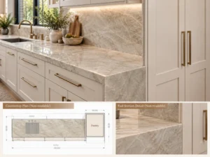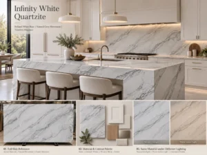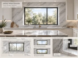

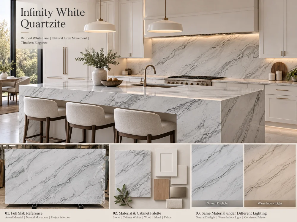
يمكن اعتبار حجر الكوارتزيت الأبيض إنفينيتي في مطبخ أبيض على أبيض، لكن كلمة “أبيض” لا تضمن توافقًا دقيقًا مع الخزائن أو طلاء الجدران أو تشطيبات الحائط الخلفي. قارن الحجر الفعلي المقترح مع نماذج خشبية وطلاءات حقيقية، وتميّز بين النغمة الأساسية والسطوع والنقوش، وتفحّص التوليفة تحت الإضاءة المتوقعة في الغرفة بعد الانتهاء من التنفيذ. اعتمد العلاقة بين المواد، وليس مجرد ظل أبيض مفترض يُعتبر عالميًا.
يمكن لمطبخ أبيض أن يضم عدة درجات مختلفة من اللون الأبيض دون أن يبدو غير متناسق. التحدي يكمن في معرفة ما إذا كانت هذه الاختلافات مقصودة أم لا.
تخيل مطبخًا بأبواب خزائن بيضاء، وجدران بيضاء، وسطح عمل من حجر فاتح اللون، وحائط خلفي من الحجر بطول كامل. قد يبدو كل مادة بيضاء عند عرضها منفردة. لكن عند وضعها جنبًا إلى جنب، قد تبدو الخزانة كريمية، والجدار مائلًا للزرقة قليلًا، والحجر رماديًا بنبرة خفيفة.
هذا هو السؤال التصميمي الأساسي عند التفكير في مطبخ حجر الكوارتزيت الأبيض إنفينيتي: كيف سيتفاعل الحجر الفعلي مع التشطيبات البيضاء الأخرى عندما تتقاسم نفس الغرفة؟
يتطلب الجواب أكثر من مجرد اختيار طلاء خزانة يُسمى “أبيض نقي” أو النظر إلى صورة جميلة للحجر. بل يتطلب مقارنة محكمة بين المواد الفعلية، ضمن العلاقة الصحيحة، وتحت الإضاءة المناسبة.
تختلف الأسطح البيضاء في أمور تتجاوز خفتها الظاهرة. فقد يكون اللون الأبيض مائلًا إلى الأصفر الدافئ أو الكريمي أو البيج؛ أو مائلًا إلى الأزرق أو الرمادي البارد؛ أو يبدو متوازنًا نسبيًا.
غالبًا ما تُسمّى هذه الاختلافات بنغمات أساسية. وقد تكون هذه النغمات دقيقة جدًا بحيث تمر دون ملاحظة عند فحص العينات بشكل منفصل، لكنها تصبح واضحة عند تلاقي سطحين.
في مطبخ أبيض على أبيض، تزداد أهمية هذه الاختلافات مع زيادة التلامس المباشر بين المواد. فقد تقع باب خزانة بيضاء مباشرة أسفل سطح عمل فاتح اللون. وقد يلامس حائط خلفي من الحجر الخزائن العلوية البيضاء. كما قد يلتقي طلاء الجدار بمحيط غطاء المروحة أو بخزانة الطعام العالية ذات اللون الأبيض.
عند هذه الحدود، يقارن العين بين المواد مباشرة.
والأهم من ذلك، ليس الهدف دائمًا جعل كل اللون الأبيض متطابقًا. فالاختلاف المدروس بعناية يمكن أن يضيف عمقًا ويمنع المظهر المسطح لتصميم داخلي باللون الأبيض فقط. أما القلق فهو من علاقة غير مخططة تبدو غير متناسقة بمجرد تركيب المطبخ.
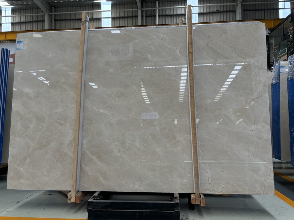
حجر الكوارتزيت الأبيض إنفينيتي هو حجر طبيعي، ويجب تقييم مظهره استنادًا إلى المادة الفعلية المُقترحة للمشروع.
ال مرجع منتج حجر الكوارتزيت الأبيض إنفينيتي يصف خلفية بيضاء مع عروق طبيعية رمادية أو أغمق. كما يحدد عدة تشطيبات سطحية محتملة. وهذه خصائص بداية مفيدة، وليست وعدًا بأن كل بلاطة ستتمتع بنفس النغمة الأساسية أو توزيع العروق بالضبط.
قبل اختيار اللون الأبيض للخزائن، قم بفصل ثلاثة جوانب من البلاطة المقترحة:
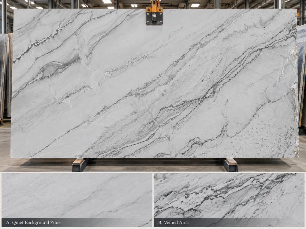
انظر إلى المناطق الأوسع والأكثر هدوءًا بين العروق. هل تبدو حادة، مخففة، رمادية، كريمية، أم متغيرة تحت ظروف المشاهدة؟ هذا هو المرجع الأكثر فائدة لعلاقة خلفية الحجر مع الخزائن البيضاء.
تؤثر العروق الرمادية أو الداكنة على الانطباع البصري العام، خاصةً عندما تشغل جزءًا كبيرًا من سطح العمل النهائي. وقد تبدو بلاطة ذات حركة أقوى أكثر رمادية من بعيد، حتى لو بدت مناطقها الهادئة بيضاء نسبيًا.
ابتعد عن صورة البلاطة أو العينة. هل يُقرأ الحجر كسطح فاتح بشكل أساسي، أم أن ميزاته الداكنة تجعله أكثر نشاطًا بصريًا؟ هذا لا يعادل النغمة الأساسية.
قد يغفل المشتري الذي يصف الحجر فقط بأنه “أبيض مع عروق رمادية” عن الفرق بين خلفية بيضاء هادئة والانطباع العام الذي يخلقه الجزيرة الكاملة أو الحائط الخلفي.
النغمة الأساسية + السطوع الأساسي + توزيع العروق
يجب مراجعة هذه العناصر بشكل منفصل قبل الحكم على لوحة المطبخ الكاملة.
من الأسباب الشائعة التي تجعل اختيارات اللون الأبيض على الأبيض مربكة هي أن كلمة “مطابقة” قد تشير إلى أمور متعددة.
قد تمتلك مادتان نغمة أساسية متشابهة لكنهما تختلفان بشكل واضح في السطوع. والعكس صحيح أيضًا: قد تبدوان مادتان بنفس السطوع بينما تميل إحداهما إلى الدفء والأخرى إلى البرودة.
| ما الذي تقارنه | السؤال الواجب طرحه | الملاحظة المحتملة |
| النبرة الأساسية | هل تميل الألوان البيضاء إلى الدفء، البرودة، أم أنها محايدة نسبيًا؟ | تبدو الخزانة كريمية أكثر بجانب الحجر. |
| السطوع | أي سطح يبدو أفتح؟ | يبدو الحجر أغمق قليلًا لكنه ليس بالضرورة أكثر دفئًا. |
| تباين العروق | إلى أي مدى تقطع الحركة الطبيعية مجال اللون الأبيض؟ | يبدو سطح العمل أكثر رماديًا عند مسافة الغرفة. |
| انعكاس السطح | كيف يتفاعل التشطيب مع الضوء والألوان القريبة؟ | السطح المصقول يعكس نافذة أو خزانة قريبة. |
هذا التمييز يمنع خطأ شائعًا: تغيير طلاء الخزانة لأن سطح العمل يبدو “رماديًا جدًا”، بينما المشكلة الحقيقية تكمن في العروق الطبيعية القوية وليس في نغمة أساسية باردة.
The most useful comparison begins with physical references rather than isolated online images.
For an Infinity White Quartzite kitchen, assemble the proposed stone sample or representative current material reference, a finished cabinet door or approved finish sample, the actual wall-paint drawdown, and the intended backsplash reference.
Where the stone is the backsplash, include that information explicitly. A countertop and full-height backsplash made from the same stone create a much larger continuous visual field than a countertop alone.
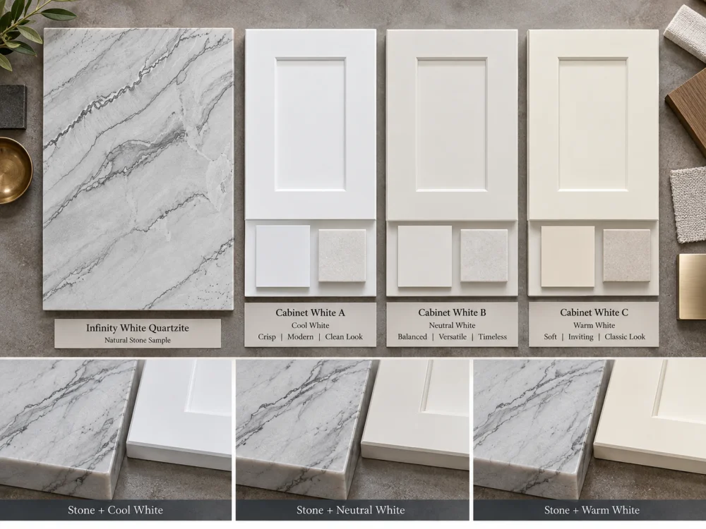
Place the stone sample immediately next to the cabinet finish. Review the edge-to-edge relationship, not merely two samples positioned far apart.
Ask whether the stone appears warmer, cooler, darker, or more patterned. Record these as separate observations.
Introduce the proposed wall paint. A wall white that appears neutral in isolation may look warmer or cooler once it becomes the background behind the cabinet and countertop.
Pay particular attention to areas where wall paint directly borders upper cabinets, tall units, open shelving, or the backsplash.
Flooring and metal finishes can influence the overall reading of the palette. Warm wood floors, pale stone floors, brushed nickel, brass, and black hardware create different surrounding color relationships.
These materials should not distract from the white comparison. Their role is to reveal whether the overall palette has a coherent direction.
If you are testing three cabinet whites, keep the Infinity White stone reference, wall paint, lighting, and other finishes unchanged. Change only the cabinet sample.
This is essential. If several variables change at once, it becomes difficult to identify why one combination appears more balanced.
Stone A + Cabinet White 2 + Same Wall + Same Light
Stone A + Cabinet White 3 + Same Wall + Same Light
Change one finish at a time.
Light can change how white surfaces are perceived. This matters because an Infinity White Quartzite kitchen may be photographed or sampled in a stone showroom, but experienced under a completely different combination of daylight and artificial light.
A north-facing room, a kitchen with large sunlit windows, and an interior kitchen with limited daylight can produce different impressions of the same materials. The apparent effect also depends on the room’s surrounding colors and the characteristics of the lighting fixtures.
Warmer artificial lighting may make cream or yellow tendencies more apparent. Cooler light may emphasize grey or blue tendencies. These are possible perceptual effects, not fixed predictions for every slab and lamp.
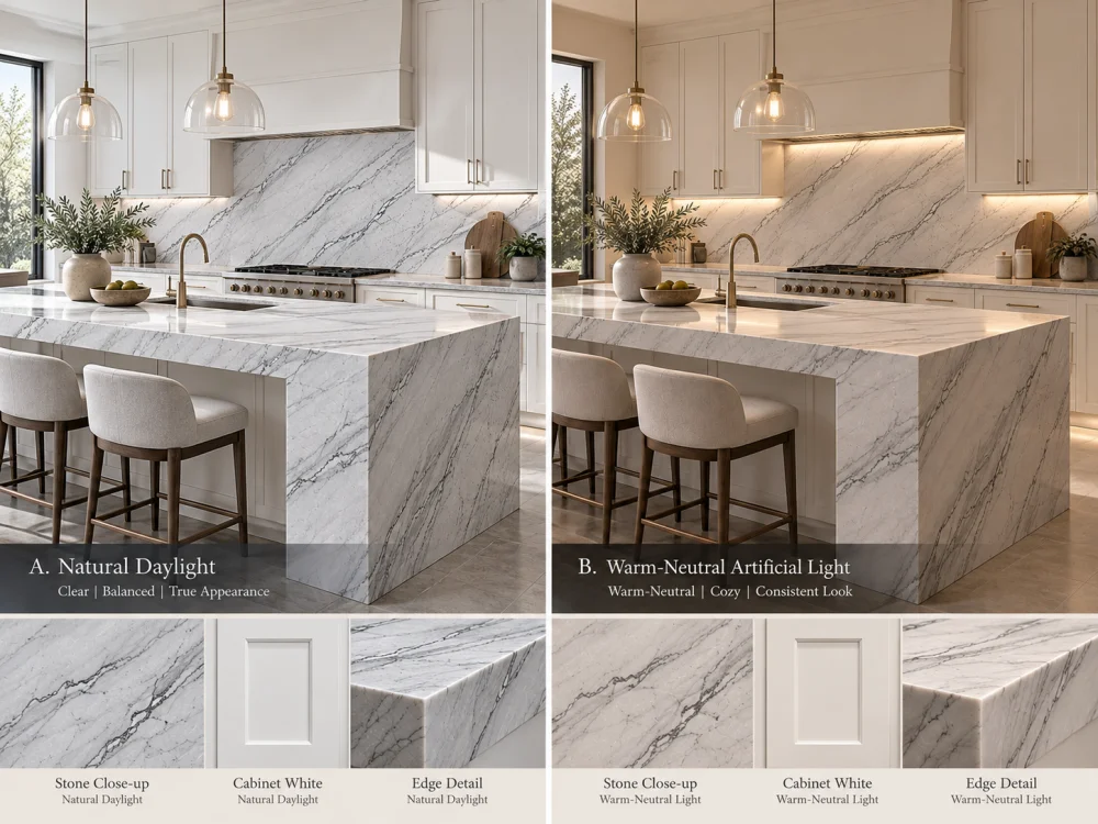
Compare the material set in the actual room where practical. Observe the palette when the kitchen receives its normal daylight and again when that light changes significantly.
Keep the samples close together and avoid judging one in direct sun while another remains in shadow.
Use the proposed or representative project lighting. Consider ceiling lights, under-cabinet strips, and pendants separately if they illuminate different parts of the stone.
Lighting color temperature alone does not fully describe color rendering. The actual lamp or a suitable representative should be part of a color-sensitive review.
Photographs are useful for documenting arrangements and discussing options remotely. However, automatic camera white balance, exposure, editing, and display settings can alter perceived whites.
Where precise color judgment matters, physical samples viewed under controlled conditions should take priority over a phone image.
Instead of searching for a universal “best white cabinet color,” test three intentional relationships against the proposed Infinity White slab.
The stone background and cabinet white appear relatively similar in temperature and brightness. Natural veining provides most of the visible variation.
This may suit a minimal kitchen where the designer wants the stone and cabinetry to read as a connected pale composition.
The risk is expecting a natural stone to behave like a uniform painted finish. Even when the quieter stone background coordinates closely, other areas may differ.
The cabinet and stone are intentionally different in brightness or warmth, but their relationship appears consistent with the walls, floor, and lighting.
For example, a slightly softer-looking stone beside a cleaner white cabinet may create depth without appearing accidental. Whether this works depends on the actual samples, not a generic color formula.
The design accepts a clearly visible difference between the cabinet white and the stone. A contrasting backsplash, architectural shadow line, timber detail, or other planned transition may help establish that separation.
This approach can be useful when the chosen Infinity White slab has a distinctive appearance that should remain visible rather than being forced into a near-identical white match.
The correct outcome is not always the closest color match. It is the most coherent relationship for the intended room.
Not every part of the kitchen exposes the same color relationship.
The strongest visual comparisons often occur where two large surfaces meet or where one white surface frames another.
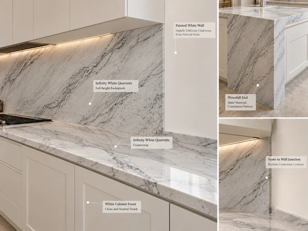
This is a direct comparison between horizontal natural stone and vertical cabinetry. The materials also receive and reflect light differently because of their orientation.
Review a representative cabinet door beneath the stone sample, not only beside it on a flat table.
A backsplash can make the stone’s background and veining much more prominent because the material occupies a vertical plane in the main field of view.
Place the proposed wall or cabinet white beside a vertical stone sample. Do not assume that approval of the horizontal countertop automatically covers the backsplash appearance.
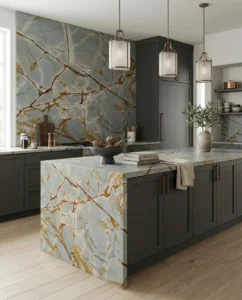
A waterfall end places the stone vertically next to cabinetry, flooring, or a contrasting island base. This can make an undertone difference more noticeable than it is on the top alone.
If the project includes a waterfall, review the actual stone allocation and the surrounding finishes from the main room viewpoint.
Large painted surfaces can act as a visual reference for nearby stone. A warm white hood beside a cooler-looking stone backsplash may make the difference more obvious.
Where the kitchen includes several painted whites, identify which finish should act as the principal reference rather than treating every surface independently.
First determine whether the observation concerns the stone’s quiet background, its natural veining, or a lighting effect.
If the stone looks grey because of its vein density, changing cabinet white may not significantly alter the overall geological character. If the quiet background looks creamy only beside a particularly cool cabinet, the relative color relationship may be contributing to the effect.
Use a short diagnostic sequence:
A change in appearance does not necessarily mean that either material is defective or incorrectly supplied. It may be a result of adjacent colors, viewing conditions, finish, or natural variation.
If the relationship remains unsuitable, possible design responses include reconsidering the cabinet finish, adjusting another major white reference, reviewing the stone selection, or introducing a deliberate transition. The appropriate response depends on which elements of the design are still open for change.
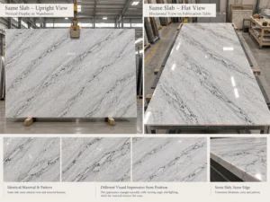
A polished stone reference and a honed stone reference may not look identical under the same light. Polished surfaces produce stronger reflections, while honed surfaces generally have a more diffuse appearance. Leathered surfaces introduce additional texture that can affect highlights and shadows.
These visual differences matter in a nearly all-white kitchen because the design may rely on subtle contrasts rather than strong color changes.
Do not approve the final color relationship using one finish and assume it will transfer unchanged to another.
Also distinguish a small sample from a complete slab. A sample may show a quiet white area while the actual proposed slab contains more grey movement or other natural variation. The final island and perimeter tops may come from different zones or multiple slabs.
For a large kitchen, review the selected stone areas at the scale of their intended applications. A full-height backsplash and a broad island may contribute differently to the perceived balance of white.
The final approval should identify which actual material references were compared and what visual relationship the project intends to achieve.
| المرجع | ما يجب تسجيله |
| Infinity White stone | Actual slab or sample reference, intended finish, and relevant selected zones |
| Cabinet white | Approved physical door or finish reference and revision |
| Wall and backsplash | Current paint and backsplash references, including direct-contact conditions |
| الإضاءة | Daylight and representative artificial-light conditions used for review |
| Visual decision | Close match, soft contrast, or deliberate separation, plus any unresolved differences |
When the material palette is accepted, coordinate it with the current kitchen drawings and stone layout. If the selected slab, cabinet finish, surface finish, or lighting specification changes, reassess the affected color relationship before treating the earlier approval as still applicable.
The same general issue arises with other pale natural stones, although each material has its own appearance. For a related example focused on another material, see Mont Blanc Quartzite with White Cabinets: Avoiding Undertone Mismatch.
لـ مطبخ حجر الكوارتزيت الأبيض إنفينيتي, the final goal is not a theoretical perfect white. It is a deliberate, repeatable material decision based on the actual stone, actual cabinetry, adjacent finishes, and expected room lighting.
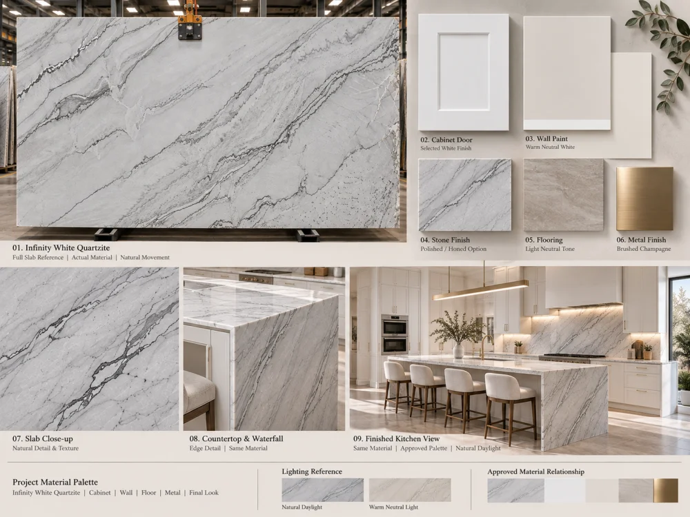
No fixed undertone should be assumed from the commercial name alone. The proposed slab’s background and natural movement should be compared with the actual cabinet and wall finishes under relevant lighting.
There is no single cabinet white that suits every slab and design. Test the actual stone against current cool, neutral, or warm cabinet finish samples, keeping the surrounding finishes and lighting consistent.
The impression may come from the stone’s natural grey veining, a difference in background brightness, a cooler relative undertone, or the lighting conditions. These should be evaluated separately before changing the design.
Not necessarily. A close match, a soft tonal difference, or a deliberate contrast can all be design choices. What matters is whether the relationship looks intentional when the actual materials are viewed together.
Photographs help communicate a proposed palette but can change perceived whites because of exposure, white balance, editing, and screen differences. Physical references under controlled lighting are preferable for final color-sensitive decisions.
Yes. Different finishes can change reflection and the perceived appearance of the same stone. Review a representative finish before approving its relationship with the cabinetry.
Recompare the selected stone, cabinet finish, wall paint, backsplash, floor, and relevant lighting. An earlier approval based on a different cabinet white may no longer describe the final combination.
For a white-on-white kitchen project, HRST STONE can help coordinate available Infinity White Quartzite slab references, selected finish information, stone layouts, CAD/shop drawing requirements, fabrication communication, QC records, and export packing according to the confirmed scope. Send Josh the kitchen drawings, cabinet-white reference, wall and backsplash finishes, intended lighting information, stone dimensions, quantities, and delivery destination for a project-specific discussion.
حقوق الطبع والنشر © HRST STONE / XIAMEN HRST STONE CO., LTD. جميع الحقوق محفوظة.