
Resumo Rápido
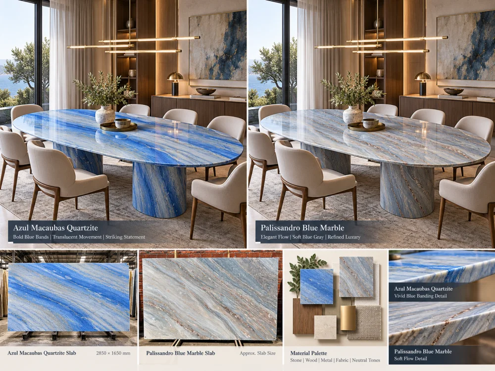
Azul Macaubas Quartzite and Palissandro Blue Marble can both support a blue-led interior, but the decision should not be reduced to which stone looks “more blue.” Compare the actual proposed slabs at full scale, then study how their blue, white, grey and darker movement behaves beside timber, metal, upholstery, wall finishes and project lighting. Azul Macaubas and Palissandro Blue also belong to different natural-stone categories, so any technical requirement should be verified separately from the visual design comparison.
A designer says:
“We want a blue natural stone.”
That sounds specific.
It is not.
One blue stone may feel cool, linear and architectural.
Another may feel layered, soft and atmospheric.
One may dominate the room from ten metres away.
Another may merge more quietly with blue-grey upholstery, brushed metal and pale timber.
That is the useful way to approach Azul Macaubas Quartzite vs Palissandro Blue Marble.
Do not compare two names.
Compare two possible interiors.
Before selecting either material, define the role blue is supposed to play in the room.
BLUE AS THE FOCAL POINT
The stone should become the first major visual element when entering the room.
BLUE AS THE BACKGROUND
The stone should establish atmosphere without overpowering furniture and artwork.
BLUE AS A CONNECTOR
The stone should connect several blue, grey, timber and metal finishes across the interior.
The answer changes what you should look for in the actual slab.
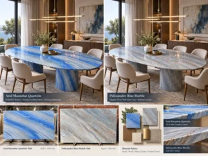
Place the proposed Azul Macaubas Quartzite and Palissandro Blue Marble references beside the same project materials.
A stone that looks compelling by itself is not automatically the material that creates the intended room composition.
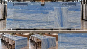
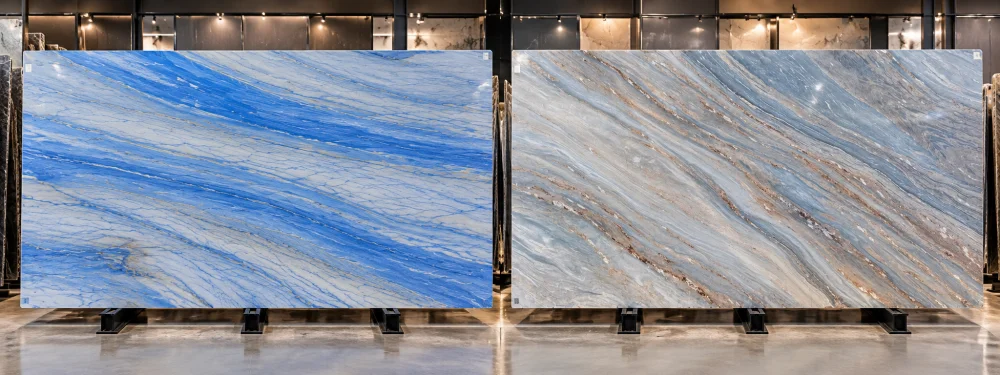
For Azul Macaubas Quartzite, the large-scale directional blue movement is an important part of the design discussion.
Do not judge it only from a small swatch.
On the actual proposed slab, study:
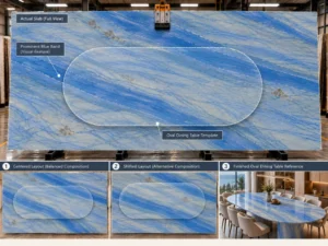
For large architectural surfaces, the question is not simply whether you like Azul Macaubas.
É which part of the actual Azul Macaubas slab the room will receive.
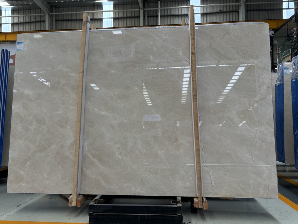
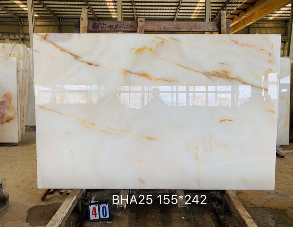
Palissandro Blue Marble should be reviewed the same way: at useful scale and from the actual proposed material.
Instead of assuming that the trade name guarantees one exact appearance, look at:
This makes the comparison specific to the slabs being considered rather than to two catalogue descriptions.
Place full-slab references side by side.
| Design Question | Quartzito Azul Macaubas | Mármore Azul Palissandro |
| Dominant Movement | Review the actual slab for the scale, direction and spacing of its blue bands. | Review the actual slab for its layered or flowing marble movement. |
| Room-Distance Reading | Check whether the main bands remain strongly legible across the room. | Check whether the layered movement reads as distinct bands or a broader tonal field. |
| Focal Area | Identify which strong blue movement should remain visible after cutting. | Identify which part of the marble movement should anchor the finished composition. |
| Variation | Treat the selected slab as the visual reference. | Treat the selected slab as the visual reference. |
Visual weight is different from color.
A stone can be pale blue yet visually dominant because its movement is large and directional.
Another stone can contain darker blue-grey areas yet feel calmer because those tones are distributed differently.
ROOM-DISTANCE TEST
Place both full-slab options into the same approximate architectural scale. Step back from the close mineral detail and ask which surface becomes dominant first, which becomes quieter, and whether that hierarchy matches the interior concept.
Timber can substantially change how a blue natural stone is perceived.
A pale oak sample introduces a warm, relatively light reference beside the blue stone.
Place the same oak sample against both proposed stones.
Then compare whether the intended interior feels:
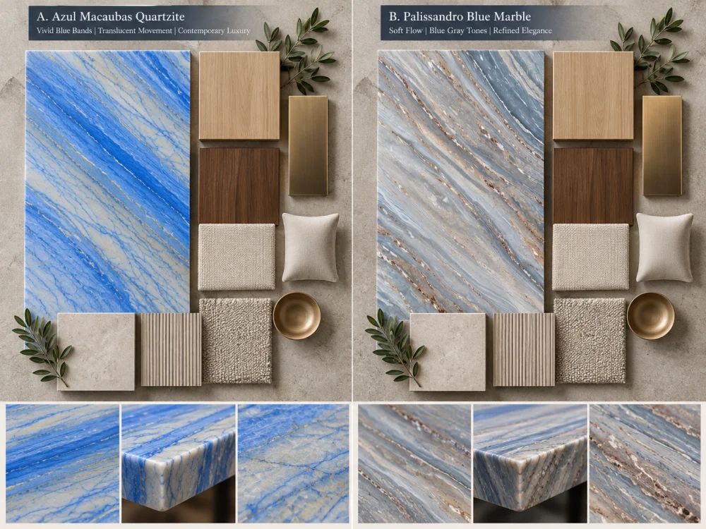
Walnut introduces a deeper warm field.
Instead of assuming that either blue stone automatically works with walnut, compare the actual samples under the intended lighting.
Look at the whole relationship between blue, brown, grey and pale mineral areas.
Blue stone does not exist only beside cabinetry.
Luxury interiors may combine it with:
Do not select the metal from a digital stone photograph.
Build a physical or controlled material board where possible.
This matters especially in living rooms, dining rooms, hospitality spaces and reception areas.
Imagine a blue stone feature wall behind a blue-grey sofa.
If both materials occupy a similar visual intensity, the room may lose hierarchy.
If one acts as the focal element and the other supports it, the composition becomes easier to read.
INTERIOR PALETTE QUESTION
Should the natural stone be the strongest blue object in the room, or should it sit inside a broader family of blue-grey finishes?
Do not compare one material photographed in cool showroom light with another photographed in warm residential light.
Where the project warrants a controlled comparison, review both proposed materials under similar viewing conditions.
Consider:
The purpose is not to assign one fixed digital color to either stone.
It is to understand how the actual proposed material participates in the intended room.
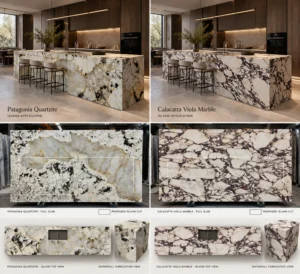
A feature wall is one of the clearest ways to understand the difference between two blue natural stones.
Use the same wall dimensions for both options.
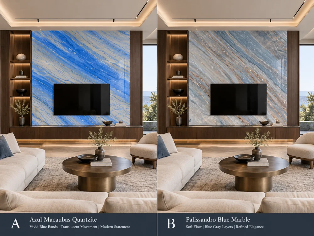
Do not change the furniture or wall size between the two visualisations.
The stone should be the principal variable.
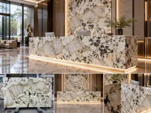
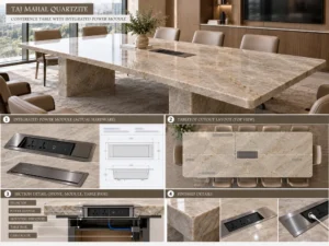
A material that feels very strong across a full wall may read differently on a dining table, console, reception counter or other custom stone furniture.
At furniture scale, look more closely at:
This is why a blue-interior comparison should include the intended application, not only full slabs.
This is particularly important when comparing natural stones online.
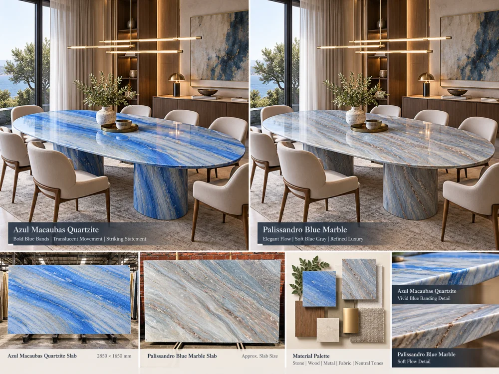
A dramatic close-up from one slab and a quiet wide photograph from another do not create a controlled comparison.
CONTROL THE COMPARISON
Full slab against full slab. Similar scale against similar scale. Same application outline. Same room. Same lighting concept. Then compare.
Finish can affect reflection, perceived depth and the way a natural stone interacts with light.
Rather than assuming a polished or honed appearance from online photography, request or prepare representative finish samples where the finish decision is important.
Compare both materials at the finish relevant to the project.
This keeps the decision focused on the surface that may actually be supplied rather than on unrelated reference photography.
Azul Macaubas Quartzite and Palissandro Blue Marble are not the same material category.
That matters.
But this article should not convert that distinction into unsupported universal performance claims.
TRACK A — DESIGN
Color relationship, pattern scale, movement, focal areas, finish, room distance, adjacent materials and layout.
TRACK B — PROJECT REQUIREMENTS
Required application, relevant material documentation, fabrication, support, installation interfaces, maintenance expectations and other project-specific technical requirements.
Keep the two tracks connected, but do not substitute one for the other.
If a technical property affects the project decision, request information that is relevant to the material and scope being considered.
Examples may include project-required material documentation, available test information, finish information, treatment information or fabrication details.
A commercial name alone should not be used to establish:
For an important blue interior, one of the clearest comparison methods is to build two controlled material boards.
| Material Board A | Material Board B |
| Actual Azul Macaubas Quartzite reference | Actual Palissandro Blue Marble reference |
| Same timber sample | Same timber sample |
| Same metal finish | Same metal finish |
| Same upholstery | Same upholstery |
| Same wall / floor reference | Same wall / floor reference |
| Project-relevant finish | Project-relevant finish |
Change the stone. Keep the rest of the palette constant.
Now you are comparing materials rather than comparing two unrelated mood boards.
The next step is the same experiment at architectural scale.
Use the same:
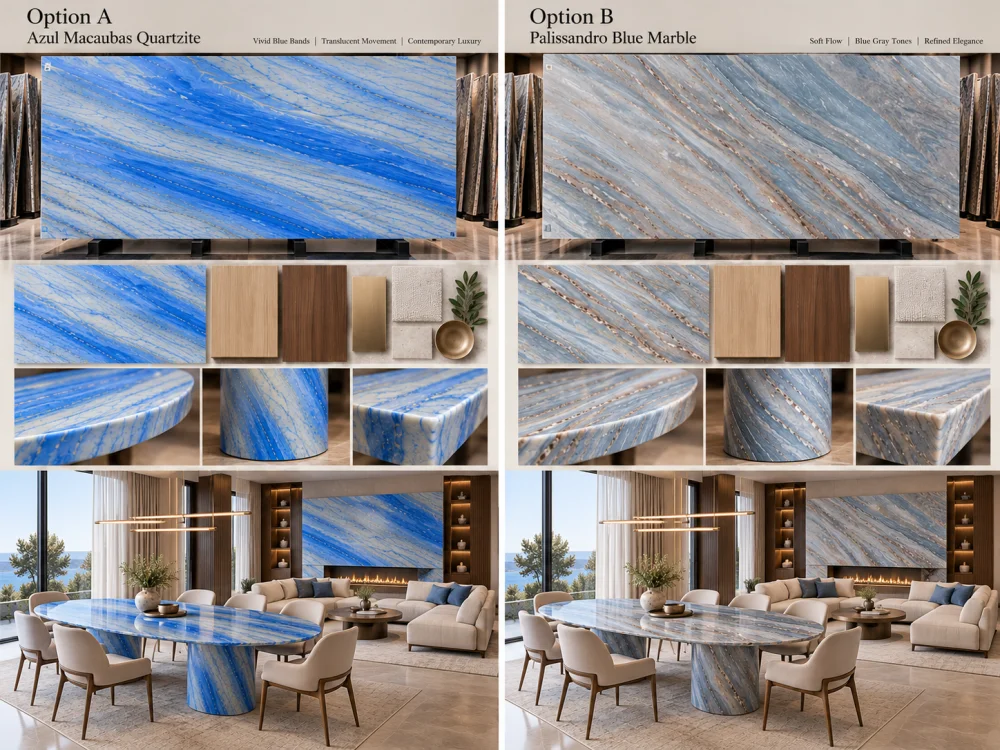
This makes differences in pattern scale, visual weight and room atmosphere easier to judge.
Do not reduce the answer to “Quartzite is better” or “marble is more elegant.”
Instead, finish the comparison with project questions:
01. Should the stone dominate the room or support the room?
02. Which actual slab has the pattern scale appropriate for the application?
03. Which slab works with the selected timber rather than an imagined timber?
04. Which option creates the intended relationship with metal and upholstery?
05. How does each material read under the intended lighting?
06. What happens when the actual finished-piece outline is placed on each slab?
07. Which project-specific technical requirements still need verification?
08. Which exact slab or slab set is being approved?
A comparação mais útil baseia-se nas placas efetivamente propostas. O Azul Macaubas deve ser avaliado quanto à escala e à direção de seu padrão de bandas azuis, enquanto o Palissandro Blue deve ser analisado quanto ao caráter e ao espaçamento de sua estratificação marmorizada. As placas individuais de pedra natural podem apresentar variações; portanto, a comparação entre placas inteiras é mais adequada do que confiar apenas nos nomes comerciais.
Não existe uma resposta universal. Defina se a pedra deve tornar-se um ponto focal, um fundo mais discreto ou um elemento de ligação entre outros acabamentos azul-acinzentados. Em seguida, compare as placas reais dentro da mesma paleta de cores e aplicação do ambiente.
As amostras podem auxiliar na avaliação da cor local e do acabamento, mas o movimento natural em grande escala pode não ser representado por um pequeno pedaço. Quando a escala do padrão é relevante, compare referências de lajes inteiras e posicione o contorno da peça finalizada pretendida sobre cada opção.
Sim. A madeira, o metal, o piso, a cor das paredes e o estofamento alteram as relações de cor e contraste do ambiente. Compare as duas pedras propostas utilizando as mesmas referências de acabamento adjacentes, em vez de recorrer a painéis de inspiração separados.
Lighting can change perceived color relationships, contrast, reflection and surface depth. Where the distinction matters, review both materials under comparable project-relevant viewing conditions and at the intended finish.
No. Azul Macaubas is commercially supplied as Natural Quartzite, while Palissandro Blue is supplied as natural marble. Project-specific technical requirements should therefore be reviewed using the relevant material information rather than treating both simply as “blue stone.”
Yes when layout is important. Using the same island, wall, vanity, tabletop or furniture outline helps show which part of each actual slab will remain visible after cutting and makes the comparison more relevant to the finished project.
Send Josh the intended application, dimensions, quantities, drawings, preferred finish, current slab or sample references, adjacent timber and metal finishes, wall and floor references, important room views, delivery destination and the design or technical questions that still need review.
Compare the Interior, Not Only the Stone
HRST STONE can coordinate current slab photographs, material samples, CAD/shop drawings, actual slab layouts, finish references, visible pattern placement, fabrication QC and export packing around the confirmed project scope. Send Josh the intended application, dimensions, drawings, Azul Macaubas Quartzite and Palissandro Blue Marble references, adjacent finish palette and the room views that matter to the design.
© HRST STONE / XIAMEN HRST STONE CO., LTD. Todos os direitos reservados.