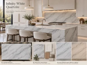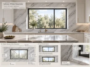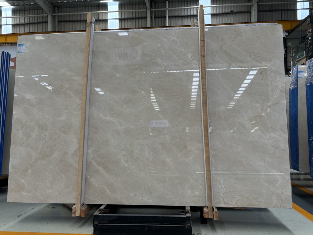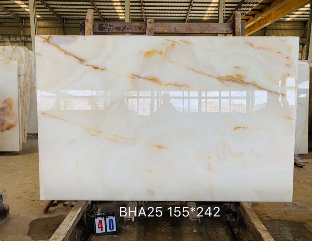

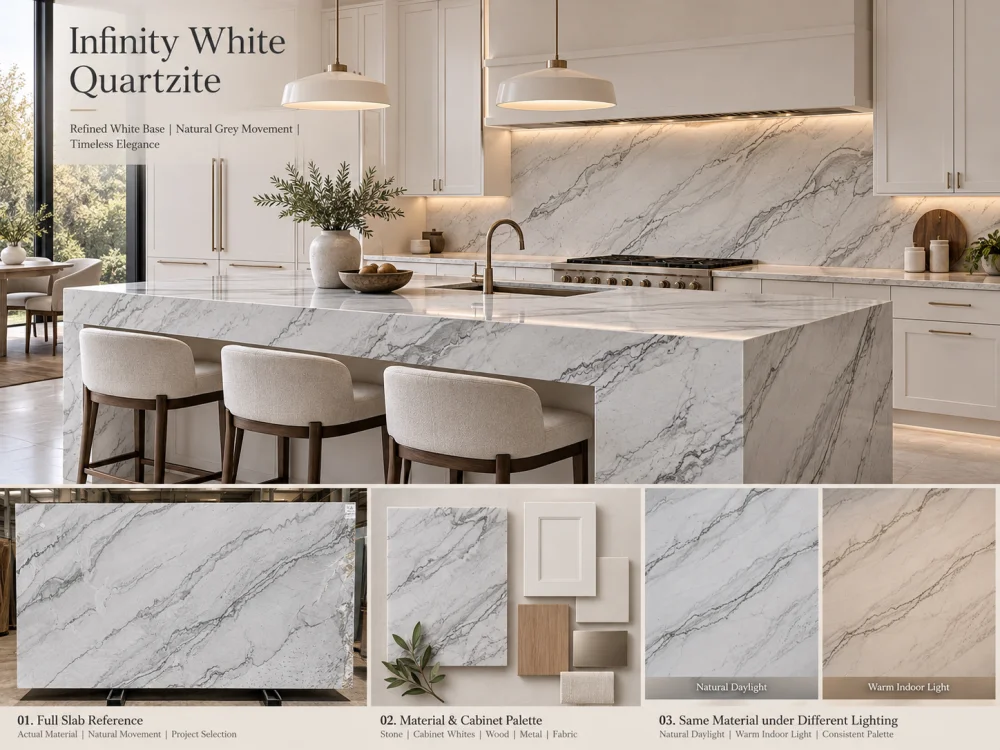
इन्फिनिटी व्हाइट क्वार्टज़ाइट को सफेद-सफेद किचन के लिए विचार किया जा सकता है, लेकिन “व्हाइट” शब्द से कैबिनेट, दीवार के पेंट या बैकस्प्लैश के फिनिश के साथ सटीक मिलान की पुष्टि नहीं होती। वास्तविक प्रस्तावित पत्थर की तुलना भौतिक कैबिनेट और पेंट संदर्भों से करें, अंडरटोन को चमक और वेनिंग से अलग करें, और पूर्ण हुए कमरे में उम्मीद की जाने वाली रोशनी के तहत संयोजन का अध्ययन करें। सामग्रियों के बीच के संबंध को ही मंजूरी दें—न कि व्हाइट के किसी मानक छाया को।.
एक सफेद किचन में कई अलग-अलग व्हाइट हो सकते हैं, बिना किसी असंगति के। चुनौती यह है कि ये अंतर जानबूझकर हैं या नहीं।.
कल्पना करें कि एक किचन में सफेद कैबिनेट दरवाजे, सफेद दीवारें, पतला पत्थर का काउंटरटॉप और पूरी ऊंचाई तक फैला पत्थर का बैकस्प्लैश है। अकेले देखने पर हर सामग्री सफेद लग सकती है। लेकिन जब उन्हें एक साथ रखा जाता है, तो कैबिनेट क्रीमी लग सकता है, दीवार थोड़ी नीली और पत्थर हल्का ग्रे दिखाई दे सकता है।.
यह एक मुख्य डिज़ाइन प्रश्न है जब आप इन्फिनिटी व्हाइट क्वार्टज़ाइट किचन के बारे में सोचते हैं: जब ये सभी सामग्रियाँ एक ही कमरे में होंगी, तो वास्तविक पत्थर अन्य सफेद फिनिश के साथ कैसे संबंधित होगा?
इसका जवाब बस “प्योर व्हाइट” नामक कैबिनेट पेंट का चुनाव या एक आकर्षक पत्थर की तस्वीर देखने से ज्यादा है। इसके लिए आवश्यक है वास्तविक सामग्रियों की नियंत्रित तुलना, सही संबंध में और संबंधित रोशनी के तहत।.
सफेद सतहें अपनी स्पष्ट चमक से अधिक अंतर रखती हैं। एक सफेद रंग में गर्म पीले, क्रीमी या बेज रंग की प्रवृत्ति हो सकती है; ठंडे नीले या ग्रे रंग की प्रवृत्ति भी हो सकती है; या तो तुलनात्मक रूप से संतुलित दिखाई दे सकती है।.
इन अंतरों को अक्सर कहा जाता है अंडरटोन. ये अंतर इतने सूक्ष्म होते हैं कि नमूनों को अलग-अलग देखने पर ध्यान नहीं जाता, लेकिन जब दो सतहें एक साथ आती हैं, तो ये स्पष्ट हो जाते हैं।.
सफेद-सफेद किचन में, सामग्रियों के बीच सीधे संपर्क की मात्रा इन अंतरों के महत्व को बढ़ा देती है। एक सफेद कैबिनेट दरवाजा पतले काउंटरटॉप के ठीक नीचे हो सकता है। पत्थर का बैकस्प्लैश सफेद ऊपरी कैबिनेट से छू सकता है। दीवार का पेंट सफेद हुड सराउंड या ऊँचे पैन्ट्री बॉक्स से मिल सकता है।.
इन सीमाओं पर, आँख सामग्रियों की सीधी तुलना करती है।.
महत्वपूर्ण बात यह है कि लक्ष्य हमेशा हर सफेद को एक जैसा बनाना नहीं होता। एक सावधानीपूर्वक योजनाबद्ध अंतर गहराई पैदा कर सकता है और एक सफेद इंटीरियर को फ्लैट दिखने से रोक सकता है। चिंता एक अनियोजित संबंध की है, जो किचन के लगने के बाद असंगत दिखाई देता है।.
इन्फिनिटी व्हाइट क्वार्टज़ाइट एक प्राकृतिक पत्थर है, और इसकी उपस्थिति का मूल्यांकन वास्तव में परियोजना के लिए प्रस्तावित सामग्री से ही किया जाना चाहिए।.
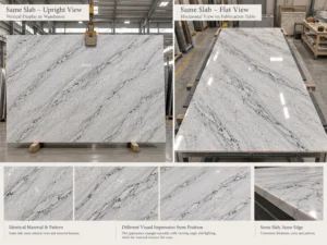
The इन्फिनिटी व्हाइट क्वार्टज़ाइट उत्पाद संदर्भ ग्रे या गहरे प्राकृतिक वेनिंग के साथ एक सफेद पृष्ठभूमि का वर्णन करता है। यह कई संभावित सतह फिनिश की भी पहचान करता है। ये शुरुआती विशेषताएं हैं, न कि यह वादा कि हर स्लैब बिल्कुल एक जैसे पृष्ठभूमि टोन या गति के वितरण का उपयोग करेगा।.
कैबिनेट का सफेद चुनने से पहले, प्रस्तावित स्लैब के तीन पहलुओं को अलग करें:
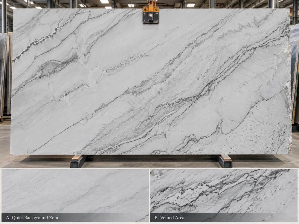
वेनिंग के बीच के बड़े, अपेक्षाकृत शांत क्षेत्रों को देखें। क्या वे देखने की स्थिति के अनुसार क्रिस्प, नरम, ग्रे, क्रीमी या बदलते दिखाई देते हैं? यही वह सबसे उपयोगी संदर्भ है जो पत्थर की सफेद कैबिनेट के साथ पृष्ठभूमि संबंध को समझने में मदद करता है।.
ग्रे या गहरे वेनिंग वाले पत्थर का समग्र दृश्य प्रभाव बढ़ाते हैं, खासकर जब वे तैयार काउंटरटॉप के बड़े हिस्से को कवर करते हैं। अधिक गति वाला स्लैब दूर से अधिक ग्रे दिखाई दे सकता है, भले ही उसके शांत पृष्ठभूमि वाले क्षेत्र अपेक्षाकृत सफेद दिखाई दें।.
स्लैब की तस्वीर या नमूने से दूर हट जाएं। क्या पत्थर अधिकतर पतली सतह के रूप में पढ़ा जाता है, या उसकी गहरी विशेषताएं इसे दृश्य रूप से अधिक सक्रिय बनाती हैं? यह पृष्ठभूमि अंडरटोन से अलग है।.
एक खरीदार जो पत्थर को केवल “ग्रे वेनिंग वाला सफेद” कहता है, वह पृष्ठभूमि के शांत सफेद रंग और पूरी आइलैंड या बैकस्प्लैश के समग्र प्रभाव के बीच के अंतर को नजरअंदाज कर सकता है।.
पृष्ठभूमि अंडरटोन + पृष्ठभूमि चमक + वेनिंग वितरण
इन सभी का पूर्ण किचन पैलेट का निर्णय लेने से पहले अलग-अलग समीक्षा की जानी चाहिए।.
सफेद-सफेद चयनों के भ्रम का एक सामान्य कारण यह है कि “मिलान” शब्द कई अलग-अलग चीजों का बोध करा सकता है।.
दो सामग्रियां एक जैसे अंडरटोन की हो सकती हैं, लेकिन चमक में नोटेबल अंतर हो सकता है। इसके विपरीत, दो सामग्रियां समान चमक वाली लग सकती हैं, जबकि एक गर्म और दूसरा ठंडा झुकाव रखता है।.
| आप किसकी तुलना कर रहे हैं | पूछने का प्रश्न | संभावित अवलोकन |
| अंडरटोन | क्या सफेद रंग गर्म, ठंडा या अपेक्षाकृत न्यूट्रल है? | कैबिनेट पत्थर के बगल में क्रीमी लगता है।. |
| चमक | कौन सी सतह हल्की दिखाई देती है? | पत्थर थोड़ा गहरा लगता है, लेकिन जरूरी नहीं कि गर्म हो।. |
| वेनिंग विपरीतता | प्राकृतिक गति सफेद क्षेत्र को कितनी तेजी से बाधित करती है? | काउंटरटॉप कमरे की दूरी से ग्रे दिखाई देता है।. |
| सतह का प्रतिबिंब | फिनिश आसपास की रोशनी और रंगों के साथ कैसे बातचीत करता है? | चमकदार सतह आसपास की खिड़की या कैबिनेट का प्रतिबिंब दिखाती है।. |
यह अंतर एक आम गलती को रोकता है: काउंटरटॉप को “बहुत ग्रे” लगने पर कैबिनेट का पेंट बदल देना, जबकि असली समस्या ठंडे पृष्ठभूमि अंडरटोन के बजाय प्राकृतिक वेनिंग की तेज गति है।.
सबसे उपयोगी तुलना अकेले ऑनलाइन छवियों के बजाय भौतिक संदर्भों से शुरू होती है।.
इन्फिनिटी व्हाइट क्वार्ट्जाइट किचन के लिए, प्रस्तावित पत्थर के नमूने या प्रतिनिधि वर्तमान सामग्री के संदर्भ, एक तैयार कैबिनेट दरवाजे या मंजूरी प्राप्त फिनिश नमूने, वास्तविक दीवार-पेंट ड्रॉडाउन और अभिप्रेत बैकस्प्लैश संदर्भ को एक साथ जोड़ें।.
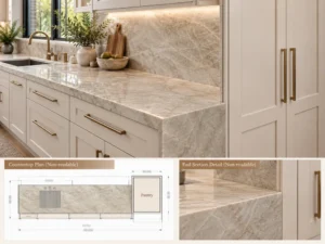
जहाँ पत्थर बैकस्प्लैश है, उस जानकारी को स्पष्ट रूप से शामिल करें। एक ही पत्थर से बनी काउंटरटॉप और पूरी ऊंचाई वाली बैकस्प्लैश एकल काउंटरटॉप की तुलना में कहीं अधिक बड़े निरंतर दृश्य क्षेत्र का निर्माण करती है।.
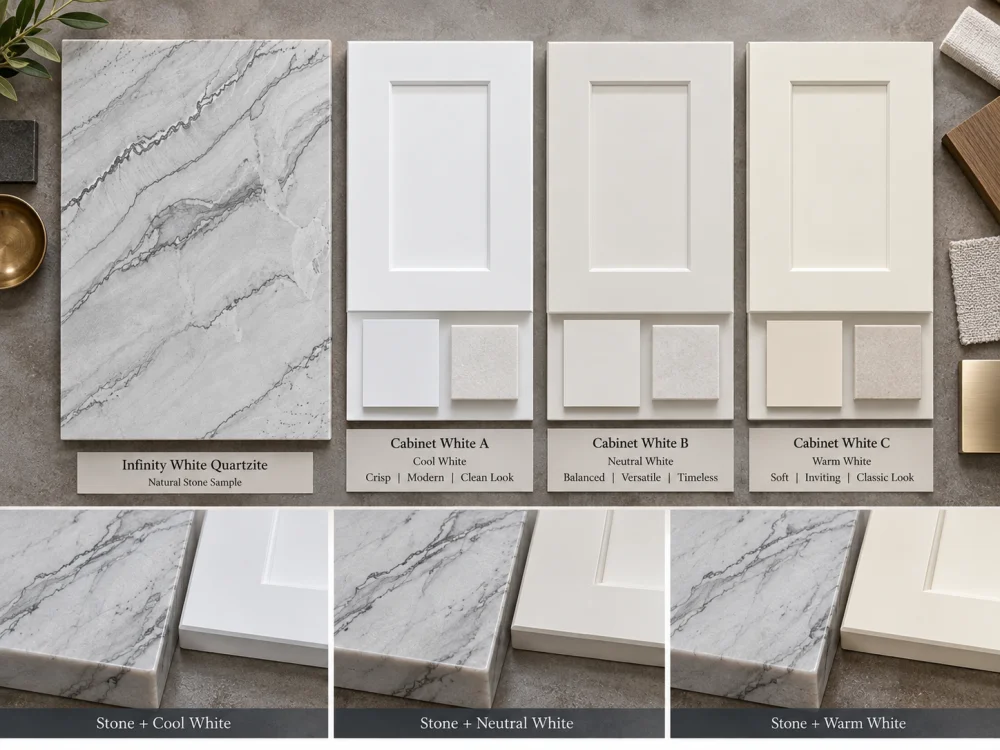
पत्थर के नमूने को कैबिनेट फिनिश के ठीक बगल में रखें। केवल दो नमूनों को एक दूसरे से दूर रखने के बजाय, किनारे से किनारे के संबंध की समीक्षा करें।.
पूछें कि पत्थर गर्म, ठंडा, गहरा या अधिक पैटर्न वाला लगता है या नहीं। इन्हें अलग-अलग निरीक्षण के रूप में दर्ज करें।.
प्रस्तावित दीवार पेंट को पेश करें। अकेले देखने पर निष्पक्ष दिखने वाला दीवार का सफेद रंग कैबिनेट और काउंटरटॉप के पीछे पृष्ठभूमि बनने पर गर्म या ठंडा दिखाई दे सकता है।.
उन क्षेत्रों पर विशेष ध्यान दें जहाँ दीवार पेंट सीधे ऊपरी कैबिनेट, ऊँची इकाइयों, खुले शेल्विंग या बैकस्प्लैश से लगता है।.
फर्श और धातु फिनिश पैलेट की समग्र झलक को प्रभावित कर सकते हैं। गर्म लकड़ी के फर्श, पीले पत्थर के फर्श, ब्रश्ड निकल, पीतल और काले हार्डवेयर से अलग-अलग आसपास के रंग संबंध बनते हैं।.
इन सामग्रियों को सफेद तुलना से विचलित नहीं होना चाहिए। इनका कार्य यह पता लगाना है कि क्या समग्र पैलेट में एक सुगठित दिशा है।.
यदि आप तीन कैबिनेट सफेद रंगों का परीक्षण कर रहे हैं, तो इन्फिनिटी व्हाइट पत्थर के संदर्भ, दीवार पेंट, प्रकाश व्यवस्था और अन्य फिनिश को अपरिवर्तित रखें। केवल कैबिनेट नमूने को ही बदलें।.
यह अत्यंत आवश्यक है। यदि एक साथ कई चर बदलते हैं, तो यह पहचानना कठिन हो जाता है कि किस संयोजन को अधिक संतुलित क्यों लगता है।.
पत्थर A + कैबिनेट सफेद 2 + वही दीवार + वही प्रकाश
पत्थर A + कैबिनेट सफेद 3 + वही दीवार + वही प्रकाश
एक समय में केवल एक फिनिश को बदलें।.
प्रकाश सफेद सतहों की धारणा को बदल सकता है। यह इसलिए महत्वपूर्ण है कि इन्फिनिटी व्हाइट क्वार्ट्जाइट किचन को पत्थर के शोरूम में फोटोग्राफ किया जा सकता है या नमूना लिया जा सकता है, लेकिन वास्तविक दिन के प्रकाश और कृत्रिम प्रकाश के पूरी तरह से अलग संयोजन के तहत अनुभव किया जा सकता है।.
उत्तर की ओर लगी कमरा, बड़ी खिड़कियों वाली रोशनी वाली रसोई और सीमित दिन के प्रकाश वाली आंतरिक रसोई एक ही सामग्रियों की अलग-अलग छवियाँ पैदा कर सकती हैं। दिखाई देने वाला प्रभाव कमरे के आसपास के रंगों और प्रकाश उपकरणों की विशेषताओं पर भी निर्भर करता है।.
गर्म कृत्रिम प्रकाश क्रीम या पीले रंग की प्रवृत्ति को अधिक स्पष्ट बना सकता है। ठंडा प्रकाश ग्रे या नीले रंग की प्रवृत्ति को जोर दे सकता है। ये संभावित धारणात्मक प्रभाव हैं, हर ब्लॉक और लैंप के लिए निश्चित भविष्यवाणियाँ नहीं।.
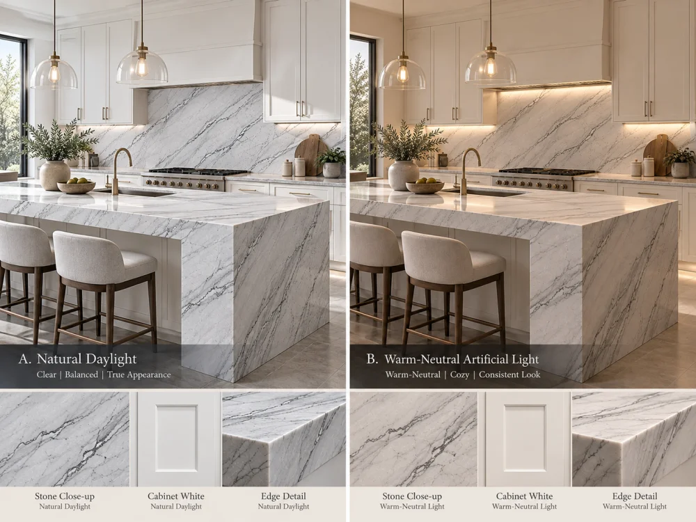
व्यावहारिक रूप से जिस कमरे में वास्तविक सामग्री लगी है, उसी कमरे में सामग्री की तुलना करें। जब किचन को उसका सामान्य दिन का प्रकाश मिलता है और फिर जब वह प्रकाश काफी बदल जाता है, तब पैलेट का निरीक्षण करें।.
नमूनों को एक साथ रखें और एक को सीधे धूप में रखकर दूसरे को छाया में छोड़ने जैसी जजमेंट से बचें।.
प्रस्तावित या प्रतिनिधि परियोजना प्रकाश व्यवस्था का उपयोग करें। यदि वे पत्थर के अलग-अलग हिस्सों को रोशन करते हैं, तो छत की लाइट्स, कैबिनेट के नीचे लगी स्ट्रिप्स और पेंडेंट्स को अलग-अलग विचार करें।.
प्रकाश का रंग तापमान अकेले रंग प्रस्तुति का पूरा वर्णन नहीं करता है। वास्तविक लैंप या उसके उपयुक्त प्रतिनिधि को रंग संवेदनशील समीक्षा का हिस्सा बनाना चाहिए।.
फोटोग्राफ व्यवस्थाओं को दर्ज करने और विकल्पों पर दूर से चर्चा करने में उपयोगी हैं। हालाँकि, स्वचालित कैमरा व्हाइट बैलेंस, एक्सपोजर, एडिटिंग और डिस्प्ले सेटिंग्स धारणा के अनुसार सफेद रंगों को बदल सकते हैं।.
जहाँ सटीक रंग निर्णय महत्वपूर्ण है, नियंत्रित परिस्थितियों में देखे गए भौतिक नमूनों को फोन की छवि पर तरजीह दी जानी चाहिए।.
सार्वभौमिक “सर्वश्रेष्ठ सफेद कैबिनेट रंग” की तलाश करने के बजाय, प्रस्तावित इन्फिनिटी व्हाइट ब्लॉक के खिलाफ तीन जानबूझकर बनाए गए संबंधों का परीक्षण करें।.
पत्थर की पृष्ठभूमि और कैबिनेट का सफेद रंग तापमान और चमक में अपेक्षाकृत समान दिखाई देते हैं। प्राकृतिक वेनिंग अधिकांश दृश्य भिन्नता प्रदान करती है।.
यह एक न्यूनतम किचन के लिए उपयुक्त हो सकता है जहाँ डिजाइनर पत्थर और कैबिनेट को एक जुड़े हुए पीले रंग के रूप में देखना चाहता है।.
जोखिम यह है कि एक प्राकृतिक पत्थर से एक समान चित्रित फिनिश की उम्मीद की जाती है। यहाँ तक कि जब शांत पत्थर की पृष्ठभूमि करीब से समन्वयित होती है, अन्य क्षेत्र अलग हो सकते हैं।.
कैबिनेट और पत्थर चमक या गर्मी में जानबूझकर अलग हैं, लेकिन उनका संबंध दीवारों, फर्श और प्रकाश व्यवस्था के साथ सुसंगत दिखाई देता है।.
उदाहरण के लिए, थोड़ा नरम दिखने वाला पत्थर एक साफ सफेद कैबिनेट के बगल में गहराई पैदा कर सकता है बिना किसी आकस्मिकता के। यह काम करता है या नहीं, वास्तविक नमूनों पर निर्भर करता है, न कि किसी सामान्य रंग सूत्र पर।.
डिजाइन एक स्पष्ट रूप से दिखने वाले अंतर को स्वीकार करता है जो कैबिनेट के सफेद रंग और पत्थर के बीच है। एक विपरीत बैकस्प्लैश, वास्तुकला की छाया रेखा, लकड़ी का डिटेल या अन्य योजनाबद्ध संक्रमण उस अलगता को स्थापित करने में मदद कर सकते हैं।.
यह दृष्टिकोण तब उपयोगी हो सकता है जब चुने गए इन्फिनिटी व्हाइट ब्लॉक का एक विशिष्ट रूप होता है जिसे दिखाई देना चाहिए न कि लगभग समान सफेद रंग के साथ मिलान करने के लिए मजबूर किया जाना।.
सही परिणाम हमेशा सबसे करीबी रंग मिलान नहीं होता है। यह अभिप्रेत कमरे के लिए सबसे सुसंगत संबंध है।.
किचन का हर हिस्सा एक ही रंग संबंध को उजागर नहीं करता है।.
The strongest visual comparisons often occur where two large surfaces meet or where one white surface frames another.
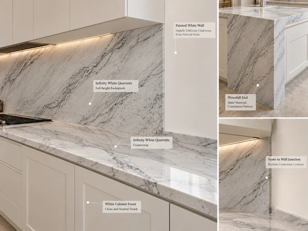
This is a direct comparison between horizontal natural stone and vertical cabinetry. The materials also receive and reflect light differently because of their orientation.
Review a representative cabinet door beneath the stone sample, not only beside it on a flat table.
A backsplash can make the stone’s background and veining much more prominent because the material occupies a vertical plane in the main field of view.
Place the proposed wall or cabinet white beside a vertical stone sample. Do not assume that approval of the horizontal countertop automatically covers the backsplash appearance.
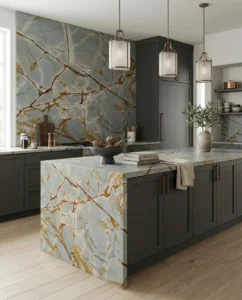
A waterfall end places the stone vertically next to cabinetry, flooring, or a contrasting island base. This can make an undertone difference more noticeable than it is on the top alone.
If the project includes a waterfall, review the actual stone allocation and the surrounding finishes from the main room viewpoint.
Large painted surfaces can act as a visual reference for nearby stone. A warm white hood beside a cooler-looking stone backsplash may make the difference more obvious.
Where the kitchen includes several painted whites, identify which finish should act as the principal reference rather than treating every surface independently.
First determine whether the observation concerns the stone’s quiet background, its natural veining, or a lighting effect.
If the stone looks grey because of its vein density, changing cabinet white may not significantly alter the overall geological character. If the quiet background looks creamy only beside a particularly cool cabinet, the relative color relationship may be contributing to the effect.
Use a short diagnostic sequence:
A change in appearance does not necessarily mean that either material is defective or incorrectly supplied. It may be a result of adjacent colors, viewing conditions, finish, or natural variation.
If the relationship remains unsuitable, possible design responses include reconsidering the cabinet finish, adjusting another major white reference, reviewing the stone selection, or introducing a deliberate transition. The appropriate response depends on which elements of the design are still open for change.
A polished stone reference and a honed stone reference may not look identical under the same light. Polished surfaces produce stronger reflections, while honed surfaces generally have a more diffuse appearance. Leathered surfaces introduce additional texture that can affect highlights and shadows.
These visual differences matter in a nearly all-white kitchen because the design may rely on subtle contrasts rather than strong color changes.
Do not approve the final color relationship using one finish and assume it will transfer unchanged to another.
Also distinguish a small sample from a complete slab. A sample may show a quiet white area while the actual proposed slab contains more grey movement or other natural variation. The final island and perimeter tops may come from different zones or multiple slabs.
For a large kitchen, review the selected stone areas at the scale of their intended applications. A full-height backsplash and a broad island may contribute differently to the perceived balance of white.
The final approval should identify which actual material references were compared and what visual relationship the project intends to achieve.
| संदर्भ | क्या दर्ज करना है |
| Infinity White stone | Actual slab or sample reference, intended finish, and relevant selected zones |
| Cabinet white | Approved physical door or finish reference and revision |
| Wall and backsplash | Current paint and backsplash references, including direct-contact conditions |
| प्रकाश व्यवस्था | Daylight and representative artificial-light conditions used for review |
| Visual decision | Close match, soft contrast, or deliberate separation, plus any unresolved differences |
When the material palette is accepted, coordinate it with the current kitchen drawings and stone layout. If the selected slab, cabinet finish, surface finish, or lighting specification changes, reassess the affected color relationship before treating the earlier approval as still applicable.
The same general issue arises with other pale natural stones, although each material has its own appearance. For a related example focused on another material, see Mont Blanc Quartzite with White Cabinets: Avoiding Undertone Mismatch.
एक इन्फिनिटी व्हाइट क्वार्टज़ाइट किचन के बारे में सोचते हैं, the final goal is not a theoretical perfect white. It is a deliberate, repeatable material decision based on the actual stone, actual cabinetry, adjacent finishes, and expected room lighting.
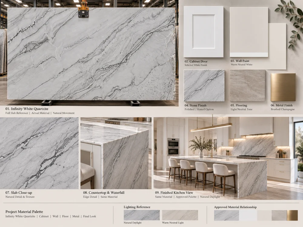
No fixed undertone should be assumed from the commercial name alone. The proposed slab’s background and natural movement should be compared with the actual cabinet and wall finishes under relevant lighting.
There is no single cabinet white that suits every slab and design. Test the actual stone against current cool, neutral, or warm cabinet finish samples, keeping the surrounding finishes and lighting consistent.
The impression may come from the stone’s natural grey veining, a difference in background brightness, a cooler relative undertone, or the lighting conditions. These should be evaluated separately before changing the design.
Not necessarily. A close match, a soft tonal difference, or a deliberate contrast can all be design choices. What matters is whether the relationship looks intentional when the actual materials are viewed together.
Photographs help communicate a proposed palette but can change perceived whites because of exposure, white balance, editing, and screen differences. Physical references under controlled lighting are preferable for final color-sensitive decisions.
Yes. Different finishes can change reflection and the perceived appearance of the same stone. Review a representative finish before approving its relationship with the cabinetry.
Recompare the selected stone, cabinet finish, wall paint, backsplash, floor, and relevant lighting. An earlier approval based on a different cabinet white may no longer describe the final combination.
For a white-on-white kitchen project, HRST STONE can help coordinate available Infinity White Quartzite slab references, selected finish information, stone layouts, CAD/shop drawing requirements, fabrication communication, QC records, and export packing according to the confirmed scope. Send Josh the kitchen drawings, cabinet-white reference, wall and backsplash finishes, intended lighting information, stone dimensions, quantities, and delivery destination for a project-specific discussion.
कॉपीराइट © HRST STONE / XIAMEN HRST STONE CO., LTD. सभी अधिकार सुरक्षित हैं।.