
संक्षिप्त सारांश
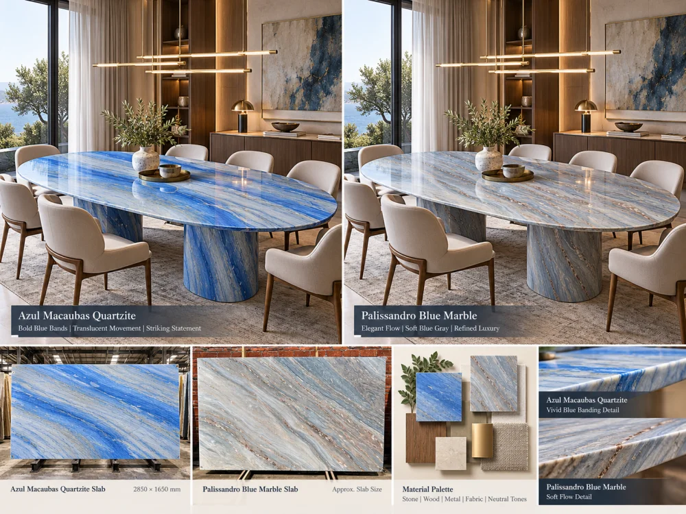
Azul Macaubas Quartzite और Palissandro Blue Marble दोनों ही नीले रंग पर आधारित इंटीरियर का समर्थन कर सकते हैं, लेकिन फैसला केवल यह तय करने पर नहीं होना चाहिए कि कौन सा पत्थर “अधिक नीला” दिखता है। असली प्रस्तावित स्लैब्स की पूरी पैमाने पर तुलना करें, फिर उनके नीले, सफेद, ग्रे और गहरे रंगों की गति को लकड़ी, धातु, असबाब, दीवार के फिनिश और प्रोजेक्ट लाइटिंग के साथ मिलाकर देखें। Azul Macaubas और Palissandro Blue भी अलग-अलग प्राकृतिक पत्थर श्रेणियों के हैं, इसलिए किसी भी तकनीकी आवश्यकता की जाँच दृश्य डिजाइन की तुलना से अलग तरीके से की जानी चाहिए।.
एक डिजाइनर कहते हैं:
“हमें एक नीला प्राकृतिक पत्थर चाहिए।”
यह बहुत विशिष्ट लगता है।.
ऐसा नहीं है।.
एक नीला पत्थर ठंडा, सीधा और वास्तुकलात्मक लग सकता है।.
दूसरा पत्थर स्तरीकृत, मुलायम और वातावरणीय लग सकता है।.
एक पत्थर दस मीटर दूर से भी कमरे को छा जाने वाला लग सकता है।.
दूसरा पत्थर नीले-ग्रे असबाब, ब्रश्ड धातु और हल्की लकड़ी के साथ अधिक शांति से मिला लग सकता है।.
यही तरीका है जिससे आप इस तरह के मामलों का समाधान कर सकते हैं। Azul Macaubas Quartzite बनाम Palissandro Blue Marble.
दो नामों की तुलना न करें।.
दो संभावित इंटीरियर की तुलना करें।.
दोनों सामग्रियों में से किसी एक का चयन करने से पहले, नीले रंग की कमरे में क्या भूमिका होनी चाहिए, उसे परिभाषित करें।.
नीला रंग फोकल पॉइंट के रूप में
कमरे में प्रवेश करते समय पत्थर को पहला प्रमुख दृश्य तत्व बनाया जाना चाहिए।.
नीला रंग पृष्ठभूमि के रूप में
पत्थर को ऐसा वातावरण बनाना चाहिए जो फर्नीचर और कलाकृतियों को दबाए बिना उसका संगठन बनाए।.
नीला रंग एक कनेक्टर के रूप में
पत्थर को इंटीरियर में नीले, ग्रे, लकड़ी और धातु के कई फिनिश को जोड़ना चाहिए।.
इसका जवाब आपको असली स्लैब में क्या देखना चाहिए, उसे बदल देता है।.
प्रस्तावित Azul Macaubas Quartzite और Palissandro Blue Marble के रेफरेंस को एक ही प्रोजेक्ट की सामग्रियों के बगल में रखें।.
अकेले दिखने वाला आकर्षक पत्थर जरूरी नहीं है कि वही सामग्री हो जो इरादे के अनुसार कमरे की रचना बनाए।.
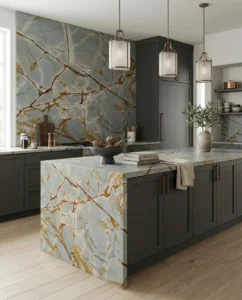
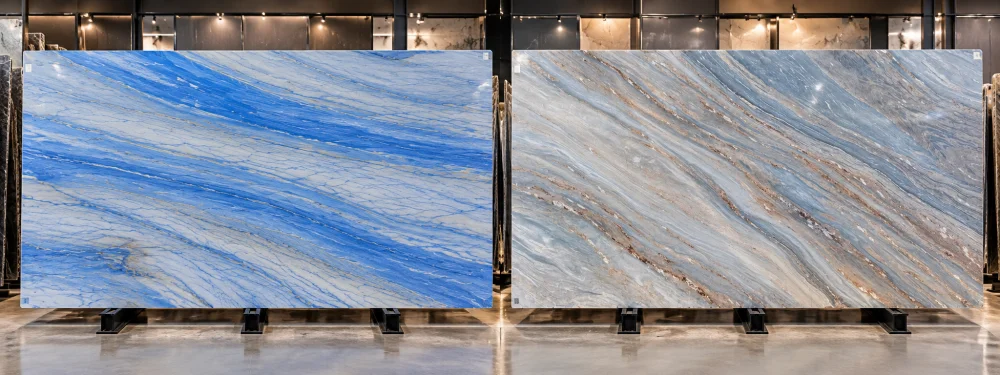
Azul Macaubas Quartzite के लिए, बड़े पैमाने पर दिशात्मक नीले रंग की गति डिजाइन चर्चा का एक महत्वपूर्ण हिस्सा है।.
केवल एक छोटे से सैंपल से इसका आकलन न करें।.
असली प्रस्तावित स्लैब पर अध्ययन करें:
बड़ी वास्तुकलात्मक सतहों के लिए, सवाल यह नहीं है कि क्या आपको Azul Macaubas पसंद है।.
यह है कमरे को असली Azul Macaubas स्लैब का कौन सा हिस्सा मिलेगा।.
Palissandro Blue Marble की भी इसी तरह समीक्षा की जानी चाहिए: उपयोगी पैमाने पर और असली प्रस्तावित सामग्री से।.
व्यापारिक नाम एक निश्चित दिखावे की गारंटी नहीं देता, इसलिए इसके बजाय देखें:
इससे तुलना विचाराधीन स्लैबों तक ही सीमित हो जाती है, न कि दो कैटलॉग विवरणों तक।.
पूर्ण स्लैब संदर्भों को एक साथ बगल में रखें।.
| डिज़ाइन प्रश्न | अज़ुल मकाउबास क्वार्टजाइट | पैलिसेंड्रो ब्लू मार्बल |
| प्रमुख गति | अपने स्लैब के नीले पट्टियों के पैमाने, दिशा और अंतराल की वास्तविक स्थिति की समीक्षा करें।. | अपने स्लैब की स्तरीय या बहती हुई संगमरमर गति की समीक्षा करें।. |
| कमरे की दूरी से पढ़ना | जाँच करें कि क्या मुख्य पट्टियाँ कमरे के पूरे भाग में भी अच्छी तरह पढ़ी जा सकती हैं।. | जाँच करें कि क्या स्तरीय गति अलग-अलग पट्टियों के रूप में या एक व्यापक टोनल क्षेत्र के रूप में पढ़ी जाती है।. |
| केंद्रीय क्षेत्र | यह पहचानें कि कटने के बाद कौन सी मजबूत नीली गति दिखाई देनी चाहिए।. | यह पहचानें कि संगमरमर गति का कौन सा हिस्सा तैयार रचना को आधार देना चाहिए।. |
| भिन्नता | चुने गए स्लैब को दृश्य संदर्भ के रूप में लें।. | चुने गए स्लैब को दृश्य संदर्भ के रूप में लें।. |
दृश्य भार रंग से अलग है।.
एक पत्थर पीला नीला हो सकता है, फिर भी दृश्य रूप से प्रमुख हो सकता है, क्योंकि उसकी गति बड़ी और दिशात्मक होती है।.
एक अन्य पत्थर में गहरे नीले-ग्रे क्षेत्र हो सकते हैं, फिर भी वह शांत महसूस होता है, क्योंकि उन टोन्स का वितरण अलग होता है।.
कमरे की दूरी परीक्षण
दोनों पूर्ण स्लैब विकल्पों को एक ही लगभग स्थापत्य पैमाने पर रखें। करीबी खनिज विवरण से दूर हटकर पूछें कि कौन सी सतह पहले प्रमुख होती है, कौन सी शांत होती है, और क्या यह श्रेणीबद्धता आंतरिक अवधारणा से मेल खाती है।.
लकड़ी एक नीले प्राकृतिक पत्थर की धारणा को काफी बदल सकती है।.
एक पीले ओक का नमूना नीले पत्थर के बगल में एक गर्म, अपेक्षाकृत हल्के संदर्भ को लाता है।.
उसी ओक के नमूने को दोनों प्रस्तावित पत्थरों के सामने रखें।.
फिर तुलना करें कि क्या इच्छित आंतरिक वातावरण:
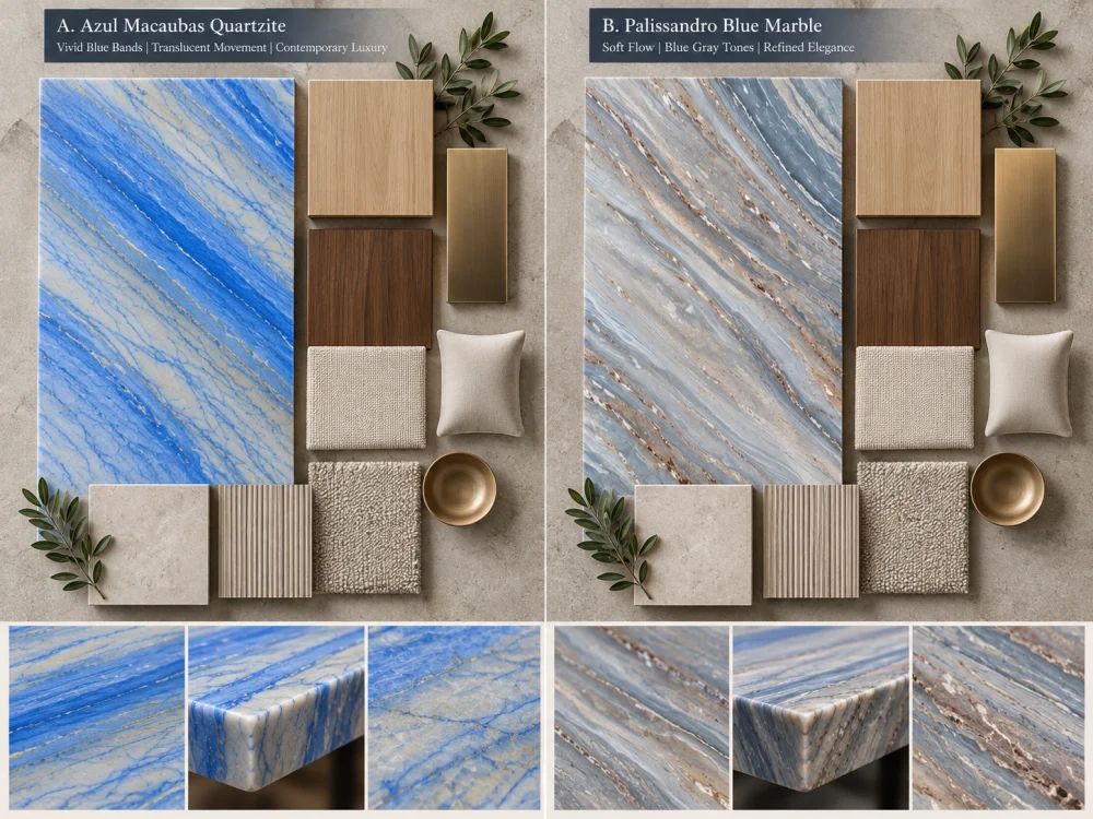
अखरोट एक गहरे गर्म क्षेत्र को लाता है।.
यह मान लेने के बजाय कि नीला पत्थर स्वतः ही अखरोट के साथ अच्छा लगता है, इच्छित प्रकाश के तहत वास्तविक नमूनों की तुलना करें।.
नीले, भूरे, ग्रे और पीले खनिज क्षेत्रों के बीच के संबंध को पूरी तरह से देखें।.
नीला पत्थर केवल कैबिनेट के बगल में ही नहीं होता है।.
विलासिता आंतरिक वातावरण इसे इन चीज़ों के साथ जोड़ सकते हैं:
धातु का चयन डिजिटल पत्थर की तस्वीर से न करें।.
जहाँ संभव हो, एक भौतिक या नियंत्रित सामग्री बोर्ड तैयार करें।.
This matters especially in living rooms, dining rooms, hospitality spaces and reception areas.
Imagine a blue stone feature wall behind a blue-grey sofa.
If both materials occupy a similar visual intensity, the room may lose hierarchy.
If one acts as the focal element and the other supports it, the composition becomes easier to read.
INTERIOR PALETTE QUESTION
Should the natural stone be the strongest blue object in the room, or should it sit inside a broader family of blue-grey finishes?
Do not compare one material photographed in cool showroom light with another photographed in warm residential light.
Where the project warrants a controlled comparison, review both proposed materials under similar viewing conditions.
Consider:
The purpose is not to assign one fixed digital color to either stone.
It is to understand how the actual proposed material participates in the intended room.
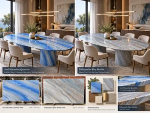
A feature wall is one of the clearest ways to understand the difference between two blue natural stones.
Use the same wall dimensions for both options.
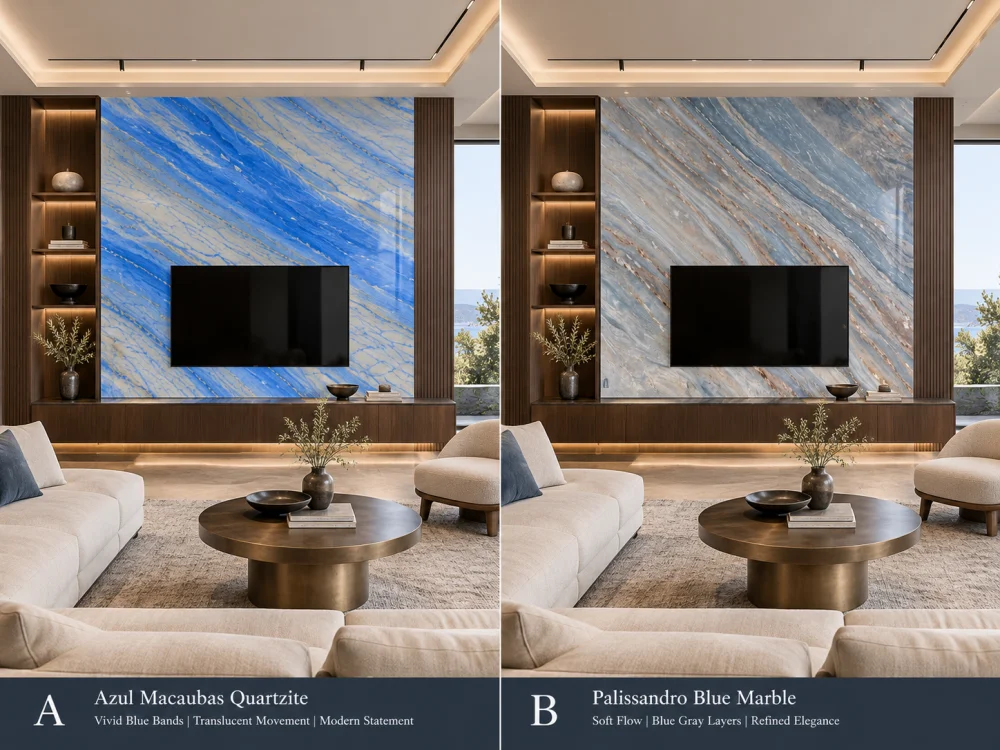
Do not change the furniture or wall size between the two visualisations.
The stone should be the principal variable.
A material that feels very strong across a full wall may read differently on a dining table, console, reception counter or other custom stone furniture.
At furniture scale, look more closely at:
This is why a blue-interior comparison should include the intended application, not only full slabs.
This is particularly important when comparing natural stones online.
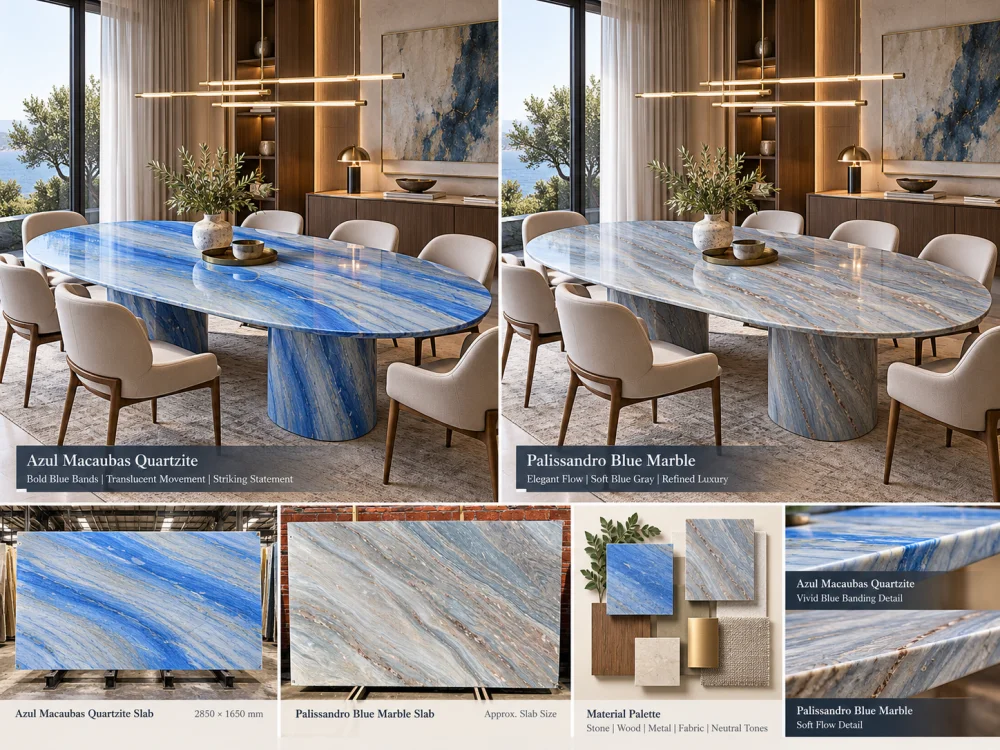
A dramatic close-up from one slab and a quiet wide photograph from another do not create a controlled comparison.
CONTROL THE COMPARISON
Full slab against full slab. Similar scale against similar scale. Same application outline. Same room. Same lighting concept. Then compare.
Finish can affect reflection, perceived depth and the way a natural stone interacts with light.
Rather than assuming a polished or honed appearance from online photography, request or prepare representative finish samples where the finish decision is important.
Compare both materials at the finish relevant to the project.
This keeps the decision focused on the surface that may actually be supplied rather than on unrelated reference photography.
Azul Macaubas Quartzite and Palissandro Blue Marble are not the same material category.
That matters.
But this article should not convert that distinction into unsupported universal performance claims.
TRACK A — DESIGN
Color relationship, pattern scale, movement, focal areas, finish, room distance, adjacent materials and layout.
TRACK B — PROJECT REQUIREMENTS
Required application, relevant material documentation, fabrication, support, installation interfaces, maintenance expectations and other project-specific technical requirements.
Keep the two tracks connected, but do not substitute one for the other.
If a technical property affects the project decision, request information that is relevant to the material and scope being considered.
Examples may include project-required material documentation, available test information, finish information, treatment information or fabrication details.
A commercial name alone should not be used to establish:
For an important blue interior, one of the clearest comparison methods is to build two controlled material boards.
| Material Board A | Material Board B |
| Actual Azul Macaubas Quartzite reference | Actual Palissandro Blue Marble reference |
| Same timber sample | Same timber sample |
| Same metal finish | Same metal finish |
| Same upholstery | Same upholstery |
| Same wall / floor reference | Same wall / floor reference |
| Project-relevant finish | Project-relevant finish |
Change the stone. Keep the rest of the palette constant.
Now you are comparing materials rather than comparing two unrelated mood boards.
The next step is the same experiment at architectural scale.
Use the same:
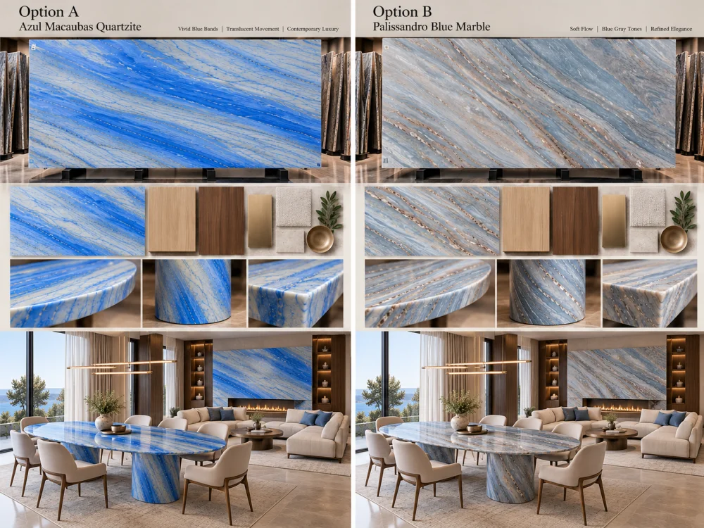
This makes differences in pattern scale, visual weight and room atmosphere easier to judge.
Do not reduce the answer to “Quartzite is better” or “marble is more elegant.”
Instead, finish the comparison with project questions:
01. Should the stone dominate the room or support the room?
02. Which actual slab has the pattern scale appropriate for the application?
03. Which slab works with the selected timber rather than an imagined timber?
04. Which option creates the intended relationship with metal and upholstery?
05. How does each material read under the intended lighting?
06. What happens when the actual finished-piece outline is placed on each slab?
07. Which project-specific technical requirements still need verification?
08. Which exact slab or slab set is being approved?
उपयोगी तुलना वास्तविक प्रस्तावित स्लैबों पर आधारित है। अज़ुल मकाउबास के नीले पट्टियों की गति के पैमाने और दिशा का जांच किया जाना चाहिए, जबकि पैलिसेंड्रो ब्लू के संगमरमर की परतों के चरित्र और अंतराल का जांच किया जाना चाहिए। व्यक्तिगत प्राकृतिक पत्थर के स्लैब भिन्न हो सकते हैं, इसलिए केवल वाणिज्यिक नामों पर निर्भर रहने की बजाय पूर्ण स्लैब तुलना अधिक उपयोगी है।.
सार्वभौमिक उत्तर कोई नहीं है। यह निर्धारित करें कि पत्थर को केंद्रबिंदु, शांत पृष्ठभूमि या अन्य नीले-ग्रे फिनिश के बीच संयोजक के रूप में इस्तेमाल किया जाना चाहिए या नहीं। फिर एक ही कमरे के पैलेट और एप्लिकेशन के भीतर वास्तविक स्लैबों की तुलना करें।.
नमूने स्थानीय रंग और फिनिश की समीक्षा में मदद कर सकते हैं, लेकिन बड़े पैमाने पर प्राकृतिक गति एक छोटे से टुकड़े द्वारा प्रतिनिधित्व नहीं की जा सकती है। जहाँ पैटर्न का पैमाना महत्वपूर्ण होता है, वहाँ पूर्ण-स्लैब संदर्भों की तुलना करें और प्रत्येक विकल्प पर इच्छित फिनिश्ड पीस की आउटलाइन चिह्नित करें।.
हाँ। लकड़ी, धातु, फर्श, दीवार का रंग और असबाब आसपास के रंग तथा कंट्रास्ट संबंधों को बदल देते हैं। अलग-अलग मूड बोर्ड्स का उपयोग करने के बजाय, एक ही आसन्न फिनिश संदर्भों के साथ दोनों प्रस्तावित पत्थरों की तुलना करें।.
Lighting can change perceived color relationships, contrast, reflection and surface depth. Where the distinction matters, review both materials under comparable project-relevant viewing conditions and at the intended finish.
No. Azul Macaubas is commercially supplied as Natural Quartzite, while Palissandro Blue is supplied as natural marble. Project-specific technical requirements should therefore be reviewed using the relevant material information rather than treating both simply as “blue stone.”
हाँ, जब लेआउट महत्वपूर्ण होता है। एक ही आइलैंड, दीवार, वैनिटी, टेबल-टॉप या फर्नीचर की रूपरेखा का उपयोग करने से यह स्पष्ट हो जाता है कि काटने के बाद प्रत्येक वास्तविक स्लैब का कौन सा हिस्सा दिखाई देगा और इससे तुलना पूर्ण परियोजना के अनुरूप अधिक प्रासंगिक हो जाती है।.
जोश को अभिप्रेत आवेदन, आयाम, मात्राएँ, ड्राइंग्स, प्राथमिकता वाली फिनिश, वर्तमान स्लैब या सैम्पल संदर्भ, आसपास की लकड़ी और धातु की फिनिश, दीवार और फर्श के संदर्भ, महत्वपूर्ण कमरे के दृश्य, डिलीवरी का गंतव्य तथा उन डिज़ाइन या तकनीकी प्रश्नों का विवरण भेजें, जिनकी अभी समीक्षा की जरूरत है।.
Compare the Interior, Not Only the Stone
HRST STONE can coordinate current slab photographs, material samples, CAD/shop drawings, actual slab layouts, finish references, visible pattern placement, fabrication QC and export packing around the confirmed project scope. Send Josh the intended application, dimensions, drawings, Azul Macaubas Quartzite and Palissandro Blue Marble references, adjacent finish palette and the room views that matter to the design.
© HRST STONE / XIAMEN HRST STONE CO., LTD. सभी अधिकार सुरक्षित हैं।.