Краткое резюме
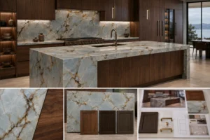
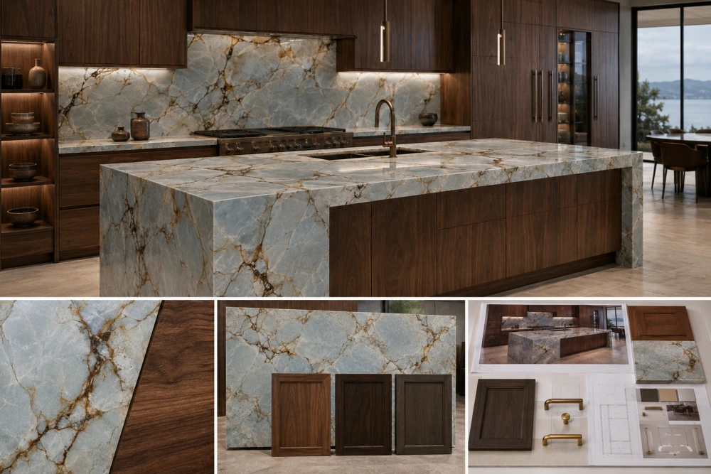
Кварцит Блю Рома может естественно сочетаться с шкафами из орехового дерева, поскольку тёплый коричневый оттенок древесины перекликается с кофейно-коричневыми минеральными прожилками камня, одновременно контрастируя с его более прохладным сине‑серым фоном. Средний нейтрально‑тёплый оттенок ореха обычно служит хорошей отправной точкой, так как он придаёт интерьеру уют, не перегружая камень. Очень тёмные, сильно красноватые или оранжевые оттенки ореха также могут подойти, однако их использование требует более тщательного согласования с фактическими плитами Блю Рома, освещением, стенами, полом и фурнитурой.
Кварцит Блю Рома с шкафами из ореха создаёт характерное сочетание холодных и тёплых материалов. Камень привносит в помещение сине‑серые, дымчатые и минеральные оттенки, тогда как орех добавляет естественную коричневую теплоту и заметную текстуру древесины.
Такое сочетание наиболее эффективно, когда эти цвета воспринимаются не как два совершенно независимых покрытия.
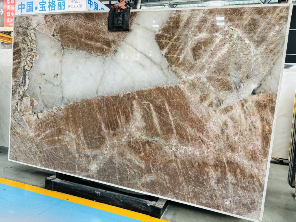
Сам Блю Рома может стать визуальным связующим звеном между ними: его прохладное сине‑серое поле может быть пересечено кофейно‑коричневыми до тёмно‑коричневых природными минеральными структурами. Орех же повторяет эту коричневую гамму, сохраняя при этом чётко различимую текстуру.
Основная цветовая взаимосвязь выглядит следующим образом:
Сине‑серое каменное поле → Прохладный якорь
Кофейно‑коричневое движение минералов → Тон моста
Шкафы из ореха → Тёплый якорь
Это даёт дизайнерам удобную отправную точку, однако окончательный баланс зависит от конкретных плит Блю Рома, отделки орехом, освещения помещения, окружающих цветов и степени видимости каждого материала.
Кварцит Блю Рома + Шкафы из ореха: цветовой баланс в кратком обзоре
| Дизайн‑элемент | Типичная визуальная роль | Влияние на композицию |
| Сине‑серое поле Блю Рома | Прохладный якорь | Сохраняет палитру изысканной, минеральной и визуально свежей |
| Кофейно‑коричневое движение минералов | Тон моста | Создаёт естественную визуальную связь между прохладным камнем и тёплым деревом |
| Средний оттенок ореха | Тёплый якорь | Добавляет тёплого уюта и глубины, не перегружая при этом камень |
| Стены цвета слоновой кости / тёплого белого | Нейтральный буфер | Обеспечивает визуальное пространство как для сине‑серого камня, так и для коричневых шкафов |
| Освещение | Цветовой модификатор | Может сделать камень более прохладным или мягким, а орех — богаче или более нейтральным |
| Металлическая фурнитура | Акцент | Может подчеркнуть тёплую сторону, тёмную минеральную структуру или более нейтральное современное направление |
Почему кварцит Блю Рома хорошо сочетается с шкафами из ореха?
Сочетание работает благодаря использованию одновременно контраста и повторения.
Сине‑серые участки Блю Рома контрастируют с более тёплым коричневым характером ореха. В то же время кофейно‑коричневые минеральные структуры внутри многих плит Блю Рома визуально повторяют часть цветовой гаммы ореха.
Это означает, что материалы не являются ни полностью совпадающими, ни абсолютно противоположными.
Вместо этого композиция может работать через:
Контраст «холодное‑тёплое» + повторение коричневых оттенков
Часто это оказывается визуально гораздо интереснее, чем попытки подобрать шкафы, точно соответствующие одному отдельному цвету в камне.
Текстура также помогает разграничить материалы. Кварцит Блю Рома обладает жёсткой кристаллической минеральной поверхностью, тогда как орех имеет более мягкую линейную текстуру древесины. Даже когда их коричневые оттенки перекликаются, поверхности остаются чётко различимыми.
Какие именно цвета присутствуют в кварците Блю Рома?
Блю Рома не следует воспринимать как однотонный синий камень.
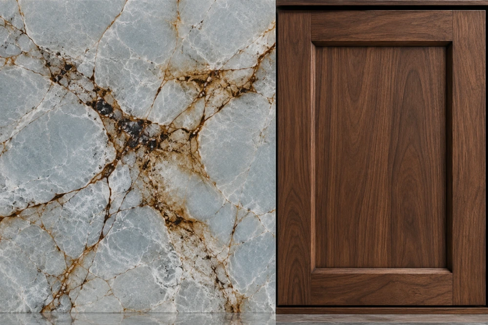
Фактические плиты могут различаться, но материал может демонстрировать сочетание:
- Бледно‑сине‑серые и ледяно‑голубые фоновые участки
- Дымчато‑серые и облачные минеральные поля
- Бледно‑серое или белое природное движение минералов
- Кофейно‑коричневые трещины и структурные линии
- Более тёмные коричневые и коричнево‑чёрные минеральные особенности
- Localized crystalline or visually translucent-looking areas
- Natural changes in color concentration across the slab
For a walnut kitchen, the brown mineral movement deserves particular attention.
If the selected slab contains visible coffee-brown fissures, those areas can become a natural color bridge to the cabinetry. If the slab is dominated by cooler blue-grey fields with relatively little brown, the contrast with walnut will be stronger.
Therefore, two Blue Roma slabs sold under the same material name can produce noticeably different cabinet combinations.
Approve the slab, not only the trade name.
Which Walnut Tone Works Best with Blue Roma Quartzite?
A medium neutral-to-warm walnut is usually a strong starting point for Blue Roma Quartzite.
This type of walnut can provide enough warmth to balance the stone’s cooler field while remaining close enough to its coffee-brown mineral movement to create visual continuity.
However, walnut is not one fixed brown.
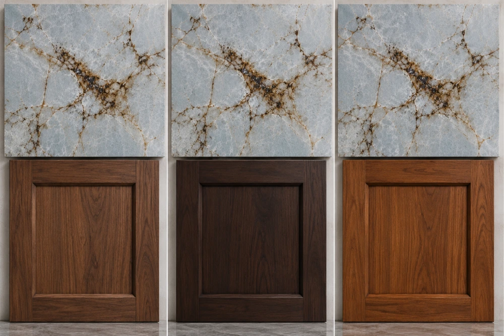
Veneer selection, solid wood variation, stain, clear finish, sheen and lighting can shift walnut toward:
- Neutral medium brown
- Warm chocolate brown
- Golden brown
- Red-brown
- Smoked or cooler brown
- Very dark brown
The best choice depends on which side of Blue Roma the design should emphasize.
Medium Walnut vs Dark Walnut vs Red or Orange Walnut
| Walnut Direction | Relationship with Blue Roma | Design Consideration |
| Medium Neutral-Warm Walnut | Balanced cool-warm contrast | Often a useful starting point because it can relate to brown mineral movement without making the room too dark |
| Dark Chocolate Walnut | Stronger and more dramatic | Can work well in a bright room but may make the composition heavy when combined with darker Blue Roma slabs |
| Red-Brown Walnut | Higher warm-cool contrast | May emphasize the cool blue character of the stone; actual samples should be reviewed together |
| Golden / Orange Walnut | Strong chromatic contrast | Can feel energetic but may compete with the stone if the orange component becomes dominant |
| Smoked Walnut | More restrained and contemporary | Can reduce warm contrast and create a quieter blue-grey/brown palette |
This is a design-direction guide rather than a fixed color formula. Always compare the intended cabinet finish with the actual stone slab.
How Does Lighting Change Blue Roma and Walnut?
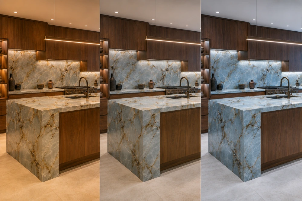
Lighting can change the perceived relationship between blue-grey stone and brown wood substantially.
Warm White Lighting
Under warmer artificial lighting, walnut can appear richer and more golden or brown. The coffee-brown mineral movement in Blue Roma may also become more noticeable, while the blue-grey background can appear softer and less icy.
This can visually pull the two materials closer together.
Neutral Lighting
Neutral lighting is useful when the design team wants to evaluate the balance between the cool stone and warm cabinetry without strongly pushing either material in one direction.
It can be particularly useful during material comparison because the blue-grey field, brown mineral structures and walnut tone remain easier to evaluate together.
Cooler White Lighting
Cooler lighting can emphasize Blue Roma’s blue and grey character. At the same time, walnut may appear less golden than it does under warmer light.
The result can be a stronger visual separation between the stone and cabinetry.
These are general visual tendencies, not guaranteed color results. Room daylight, lamp spectrum, surrounding finishes and the actual materials all affect perception.
For an appearance-sensitive kitchen, compare:
Daylight → Intended Artificial Lighting → Evening Condition
Should Blue Roma or Walnut Lead the Kitchen Composition?
One of the easiest ways to control a complex material palette is to decide which material should be visually dominant.
If Blue Roma Is the Focal Material
For a dramatic island or full-height backsplash, allow the stone to lead.
Use walnut with a relatively controlled grain and medium tone so the cabinetry frames the Quartzite rather than competing with it.
This works especially well when the Blue Roma slab contains strong coffee-brown fissures or large blue-grey movement.
If Walnut Is the Dominant Material
For a kitchen with extensive walnut cabinetry, wall panels or tall units, a somewhat quieter Blue Roma slab may create better balance.
The stone can then introduce cool mineral contrast without adding another equally dominant pattern.
A useful design principle is:
Active Stone → Quieter Wood
Active Wood Grain → More Controlled Stone Selection
How Should Walnut Grain Work with Blue Roma Movement?
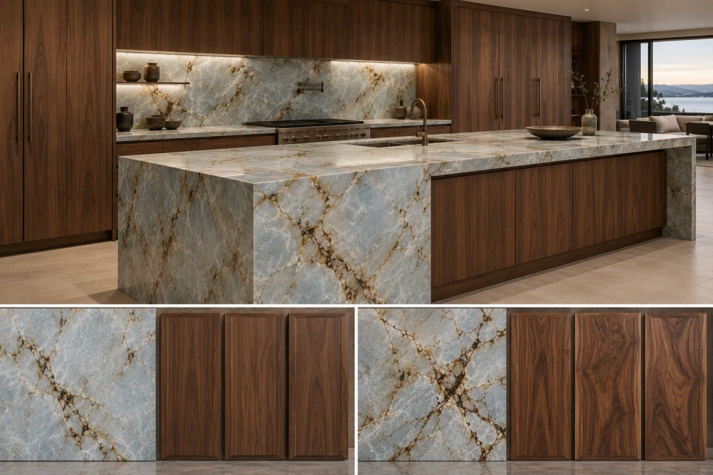
Walnut grain and Quartzite movement should be reviewed together because both materials contain directional visual lines.
Vertical walnut grain can create a strong architectural rhythm on tall cabinets. Blue Roma may introduce horizontal, diagonal or irregular mineral movement across the countertop and island.
These directions do not need to match.
In many designs, controlled contrast is more effective than forced alignment.
Например:
Vertical Walnut Grain + Broad Diagonal Blue Roma Movement
can create a clear distinction between joinery structure and natural stone movement.
The risk occurs when both materials become equally busy. Highly active walnut grain beside a slab with concentrated brown fissures and complex movement can make the composition visually crowded.
Review the main kitchen elevation or rendering using the actual slab and cabinet finish before fabrication.
What Wall Colors Work with Blue Roma Quartzite and Walnut?
A third neutral color can make the cool-blue and warm-brown relationship easier to control.
Useful starting directions include:
- Soft off-white
- Warm white
- Light greige
- Restrained pale grey
A soft off-white or warm white can keep the kitchen bright while connecting more naturally to walnut than a very stark white.
A light greige can provide a bridge between grey stone and brown cabinetry.
A pale grey can support the cooler side of Blue Roma, but it should be checked carefully if the room already contains substantial cool light.
The correct wall color should be reviewed beside the actual slab and cabinet sample rather than selected from the stone name alone.
What Backsplash Works with Blue Roma and Walnut Cabinets?
If Blue Roma is already being used as the countertop, the backsplash can either continue the stone or become a quieter supporting surface.
Full-Height Blue Roma Backsplash
This creates the strongest material statement and can connect the countertop to the upper part of the room. Slab layout becomes especially important because strong brown fissures or blue-grey movement will be highly visible.
Quiet Off-White Backsplash
A restrained warm-white or off-white backsplash can provide visual relief when both the Blue Roma countertop and walnut cabinetry already contain strong natural movement.
The main principle is to avoid introducing a third highly active pattern unless the design intentionally calls for it.
What Hardware Finishes Work with Blue Roma and Walnut?
Hardware can reinforce either the warm or cool side of the palette.
| Hardware Direction | Visual Relationship |
| Brushed Brass / Restrained Warm Metal | Supports walnut warmth and can relate to warmer brown mineral details, but overly yellow finishes may add too much warmth |
| Matte Black | Can echo darker mineral structures in Blue Roma and create a stronger architectural contrast |
| Brushed Nickel / Stainless | Provides a more neutral modern accent and supports the cooler mineral side of the palette |
Hardware should remain an accent rather than introducing a completely separate dominant color family.
Can Blue Roma and Walnut Make a Kitchen Too Dark?
Yes, but the combination is not inherently dark.
The risk increases when several dark elements are used together:
- A Blue Roma slab with a deeper blue-grey field
- Large concentrations of dark brown or brown-black mineral movement
- Very dark walnut cabinetry
- Dark flooring
- Black backsplash or wall finishes
- Limited daylight
- Extensive dark metal accents
If the room begins to feel visually heavy, the design can be rebalanced with:
- Lighter or medium walnut
- Warm-white or off-white walls
- A quieter light backsplash
- Better ambient lighting
- Reduced use of dark hardware
- A Blue Roma slab with a lighter blue-grey field
The objective is not to eliminate dark tones. It is to control their proportion.
How Should Blue Roma Be Laid Out on a Walnut Kitchen Island?
A large island is usually where the relationship between Blue Roma and walnut becomes most visible.
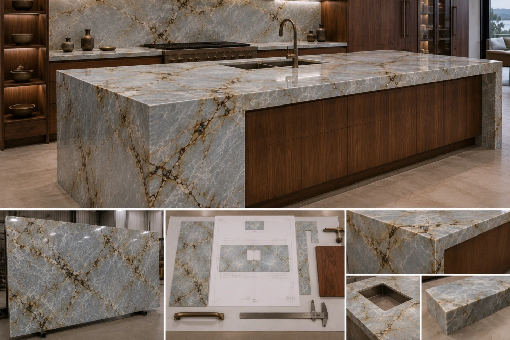
Before cutting, review the full slab against:
- Island length and depth
- Отверстия для мойки или варочной панели
- Свес сиденья
- Visible front edge
- Waterfall ends
- Cabinet door rhythm
- Primary room viewpoint
- Possible seam positions
For Blue Roma, decide where the major blue-grey fields and coffee-brown fissures should appear.
A strong mineral feature may deserve the center of the island rather than being removed by a sink cutout.
Likewise, an important brown fissure may be intentionally positioned where it visually connects the stone to the walnut cabinetry below.
How Should Blue Roma Veins Continue Across a Waterfall Edge?
For a waterfall island, the top and vertical face should be considered as one composition.
A useful planning sequence is:
Slab Photograph → Island Top → Mitered Edge → Waterfall Face → Main Viewing Direction
Where the slab geometry permits, continuing major blue-grey movement or a brown mineral feature across the mitered corner can make the waterfall feel more intentional.
Perfect continuity should not be assumed. Natural slab geometry, usable area, cutouts, slab size and fabrication allowances determine what can actually be achieved.
The final layout should be approved from the actual slab before cutting.
Worked Example: Blue Roma Waterfall Island with Walnut Cabinets
Consider a large kitchen with a Blue Roma waterfall island, walnut base cabinetry, light walls and a restrained neutral backsplash.
Option A — Medium Neutral-Warm Walnut
The walnut relates naturally to the coffee-brown mineral movement while contrasting with the pale blue-grey stone field.
The Blue Roma remains the focal material, but the wood prevents the kitchen from becoming visually cold.
Result: Balanced Cool-Warm Composition
Option B — Dark Walnut
The darker wood creates a stronger and more dramatic base beneath the Blue Roma.
This can work particularly well in a large, bright room. However, if the selected slab also contains extensive dark brown mineral structures, the lower half of the kitchen may become visually heavy.
Result: Dramatic, but More Dependent on Room Brightness
Option C — Strong Red or Orange-Brown Walnut
The wood creates a much stronger chromatic contrast against the blue-grey stone.
This may be intentional in a highly expressive interior, but it is less forgiving. Lighting, flooring, wall color and hardware become more important because another strong warm hue has entered the palette.
Result: Higher Contrast and Greater Need for Sample Review
For many projects, a medium neutral-to-warm walnut is therefore a practical starting point—not a universal rule.
Blue Roma + Walnut Decision Guide
| If You Want… | Review This Direction First |
| Balanced cool and warm palette | Blue Roma + medium neutral-to-warm walnut + off-white surroundings |
| Blue Roma as the main focal material | More restrained walnut grain and limited competing patterns |
| Dramatic luxury contrast | Blue Roma + darker walnut, balanced with sufficient light and lighter surrounding finishes |
| Softer warmer kitchen | Medium walnut + warmer neutral walls + controlled warm lighting |
| Cooler contemporary kitchen | Smoked walnut + neutral metal accents + restrained grey/off-white surroundings |
Blue Roma and Walnut Approval Checklist
Before final material approval, review:
- Actual Blue Roma Slab: Is the selected slab predominantly pale blue-grey, darker blue-grey, or strongly brown-moved?
- Walnut Undertone: Is the cabinet finish neutral brown, warm brown, red-brown, golden, smoked, or very dark?
- Brown Connection: Does the wood relate naturally to the stone’s coffee-brown mineral movement?
- Lighting: Have both materials been viewed under daylight and the intended artificial lighting?
- Wall Color: Does the surrounding neutral balance the cool and warm materials?
- Backsplash: Does it support the composition rather than introduce another competing pattern?
- Hardware: Does the metal finish reinforce the intended warm, dark, or neutral direction?
- Grain Direction: Does the walnut grain support rather than compete with the stone movement?
- Slab Layout: Are major blue-grey fields and brown fissures positioned intentionally?
- Cutouts: Are sink or cooktop openings avoiding important visual areas where practical?
- Waterfall: Has the top-to-side mineral movement been reviewed before cutting?
- Overall Darkness: Are the stone, wood, floor and metal finishes collectively becoming too heavy?
Часто задаваемые вопросы для покупателей
1. Does Blue Roma Quartzite go with walnut cabinets?
Yes, the combination can work very well. Walnut provides warm brown contrast against Blue Roma’s cooler blue-grey field, while the stone’s coffee-brown mineral movement can create a visual connection to the wood. Review the actual slab and cabinet finish together because both materials vary.
2. What walnut tone works best with Blue Roma Quartzite?
Средний ореховый оттенок, близкий к нейтральному или тёплому, обычно служит хорошей отправной точкой, поскольку придаёт интерьеру теплоту, не перебивая при этом синий цвет «Рома». Тёмный, красновато-коричневый, золотистый или дымчатый ореховые оттенки также могут подойти, однако они создают разные уровни контраста и их следует сравнивать непосредственно с конкретным образцом плиты.
3. Does Blue Roma look more blue under cool lighting?
Более холодное освещение может подчеркнуть сине‑серый оттенок Blue Roma, тогда как более тёплое — смягчить синеву и сделать коричневые минеральные участки более заметными. Точный эффект зависит от плиты, спектра ламп, естественного света и окружающих отделочных материалов.
4. Can dark walnut make a Blue Roma kitchen look too dark?
Это возможно, если плитка Blue Roma также тёмная, в комнате ограниченное естественное освещение или пол и другие отделочные материалы содержат преимущественно тёмные оттенки. Тёмный орех всё равно способен создать изысканный интерьер, если его сочетать со светлыми стенами, поверхностями фартука и достаточным уровнем освещения.
5. What wall color works with Blue Roma Quartzite and walnut?
Мягкий слоновая кость, тёплый белый, светлый грэйдж и сдержанный бледно‑серый — это полезные исходные направления. Оптимальный выбор зависит от того, следует ли в комнате подчеркнуть более тёплую ореховую сторону или более прохладную синевато‑серую каменную.
6. What hardware finish works with Blue Roma and walnut?
Сдержанные тёплые металлы могут подчеркнуть ореховый оттенок, матовый чёрный — гармонировать с более тёмными минеральными элементами, а матовый никель или нержавеющая сталь помогут создать более нейтральный современный стиль. Рассматривайте фурнитуру как часть общей цветовой палитры, а не в изоляции.
7. Should the Blue Roma slab be selected before the final cabinet stain is approved?
Для проекта, требующего особого внимания к внешнему виду, полезно совместно рассмотреть фактический слэб Blue Roma и предложенную отделку шкафов ещё до их окончательного утверждения. Небольшой образец камня не способен передать всю структуру сине‑серых полей и кофейно‑коричневых вкраплений, распределённых по поверхности слэба.
8. How should Blue Roma movement be placed on a waterfall island?
Перед раскроем сопоставьте фактическую плиту с верхней частью острова и поверхностью водопада. Там, где это позволяет геометрия плиты, важные синевато‑серые включения или коричневые минеральные образования можно согласовать по стыковому срезу, сохраняя при этом пригодный материал для вырезов, швов и допусков на обработку.
Заключительное примечание
Blue Roma Quartzite and walnut work best when their colors are treated as a connected palette rather than as separate material choices. The stone’s blue-grey field provides the cool anchor, its coffee-brown mineral movement can bridge the palette, and walnut provides the warm anchor. A medium neutral-to-warm walnut is often a strong starting point, while darker, redder or more orange finishes create progressively stronger contrast. The final decision should always be made with the actual Blue Roma slab, cabinet finish, lighting and surrounding materials together.
Discuss Your Blue Roma Quartzite Project with HRST STONE
For a project-specific Blue Roma Quartzite enquiry, contact Josh at HRST STONE with current slab or material references, cabinet finish samples or photographs, countertop and island dimensions, quantities, drawings, required surface finish, visible-edge or waterfall requirements, lighting context and delivery destination. These inputs make it possible to review the stone selection and slab layout against the actual kitchen design rather than relying on a generic color name.
Авторское право (c) HRST STONE / XIAMEN HRST STONE CO., LTD. Все права защищены.