빠른 요약
주방 조리대에 가장 적합한 석영암 색상과 패턴 는 단순한 스타일 문제만이 아닙니다. 이는 주방의 밝기, 시각적 균형, 판재 배치, 그리고 장기적인 만족도에 영향을 미치는 구매 결정입니다. 최선의 선택은 부드럽고 따뜻한 뉴트럴 톤을 원하는지, 밝고 빛을 반사하는 톤을 선호하는지, 혹은 더 강렬한 자연스러운 무늬를 원하는지, 그리고 주방이 차분한 배경을 원하는지 아니면 강렬한 포인트 표면을 원하는지에 따라 달라집니다.
주방 조리대에 석영암을 선택하는 일은 단지 돌 이름 하나를 고르는 것만이 아닙니다. 대부분의 구매자에게 진정한 도전은 올바른 색상 계열 과 올바른 패턴 스타일. 을 선택하는 것입니다. 전시실 사진에서는 아름답게 보이는 판재라도, 좁은 주방에서는 지나치게 복잡해 보일 수 있고, 넓은 오픈 플랜 공간에서는 너무 평평하게 느껴질 수 있으며, 따뜻한 목재 캐비닛에는 너무 차가워 보일 수도 있습니다. 그렇기 때문에 주방 조리대에 가장 적합한 석영암 색상과 패턴은 항상 개별 샘플이 아니라 전체 주방 디자인과 연관하여 평가되어야 합니다.
석영암은 천연석의 가치와 풍부한 시각적 표현을 결합하고 있기 때문에 여전히 매우 매력적입니다. 일부 판재는 부드럽고 차분하며, 따뜻한 아이보리나 베이지 배경과 은은한 구름 같은 무늬를 가지고 있습니다. 다른 판재들은 더 밝고 건축적인 느낌을 주며, 흰색, 회색, 크림 톤에 길고 선형적인 무늬를 보여줍니다. 또 다른 판재들은 더욱 드라마틱한 무늬로, 섬 조리대를 방의 시각적 중심으로 만들어 줍니다. 최선의 선택은 조리대가 주방에서 어떤 역할을 해야 하는지에 따라 달라집니다.
구매자들에게 있어 가장 중요한 질문은 단순히 어느 석영암이 유명한가가 아닙니다. 더 나은 질문은 어떤 석영암이 색상과 패턴 주방의 크기, 캐비닛 색조, 조명 조건, 에지 프로파일, 백스플래시 전략, 그리고 전체 디자인 목표에 가장 잘 맞는지를 고려하는 것입니다. 이러한 방식으로 생각하는 구매자들은 대개 더 성공적인 판재 선택을 하게 되며, 나중에 발생할 수 있는 비용이 큰 후회를 피할 수 있습니다.
주방 디자인에서 석영암 색상과 패턴이 중요한 이유
주방 디자인에서 색상은 감정적 분위기를 정하고, 패턴은 시각적 리듬을 조절합니다. 부드러운 베이지 색상의 석영암은 주방을 너무 격식 있게 만들지 않으면서도 따뜻하고 친근하며 고급스러운 느낌을 줄 수 있습니다. 흰색이나 옅은 회색 석영암은 공간을 밝게 하고 더 깔끔하고 건축적인 느낌을 살릴 수 있습니다. 드라마틱한 무늬의 판재는 움직임과 고급스러움을 더해줄 수 있지만, 나머지 디자인이 이미 시각적으로 복잡하다면 오히려 공간을 압도할 수도 있습니다.
이는 특히 조리대에 더욱 중요합니다. 조리대는 주방에서 가장 눈에 잘 띄는 수평 면 중 하나이기 때문입니다. 섬 조리대에서는 돌이 마치 가구처럼 인식되는 경우가 많습니다. 주변 조리대에서는 캐비닛, 하드웨어, 벽 페인트, 백스플래시 표면, 조명 등과 긴밀하게 상호작용합니다. 좋은 석영암 색상은 혼자서 효과를 발휘하지 않습니다. 이 색상이 모든 요소들이 조화롭게 어우러지도록 돕기 때문에 효과가 나타납니다.
패턴 역시 똑같이 중요합니다. 일부 구매자는 표현력이 강한 무늬에 끌리는데, 이는 고급스럽고 유니크한 느낌을 주기 때문입니다. 또 다른 사람들은 시간이 지나도 더 쉽게 사용할 수 있는 차분한 무늬를 선호합니다. 두 가지 선호 모두 잘못된 것은 아닙니다. 올바른 답은 조리대가 배경 표면으로 자리해야 하는지, 아니면 디자인의 포인트로 작용해야 하는지에 따라 달라집니다.
주방 조리대에 가장 인기 있는 석영암 색상 계열
따뜻한 베이지와 크림 색상의 석영암
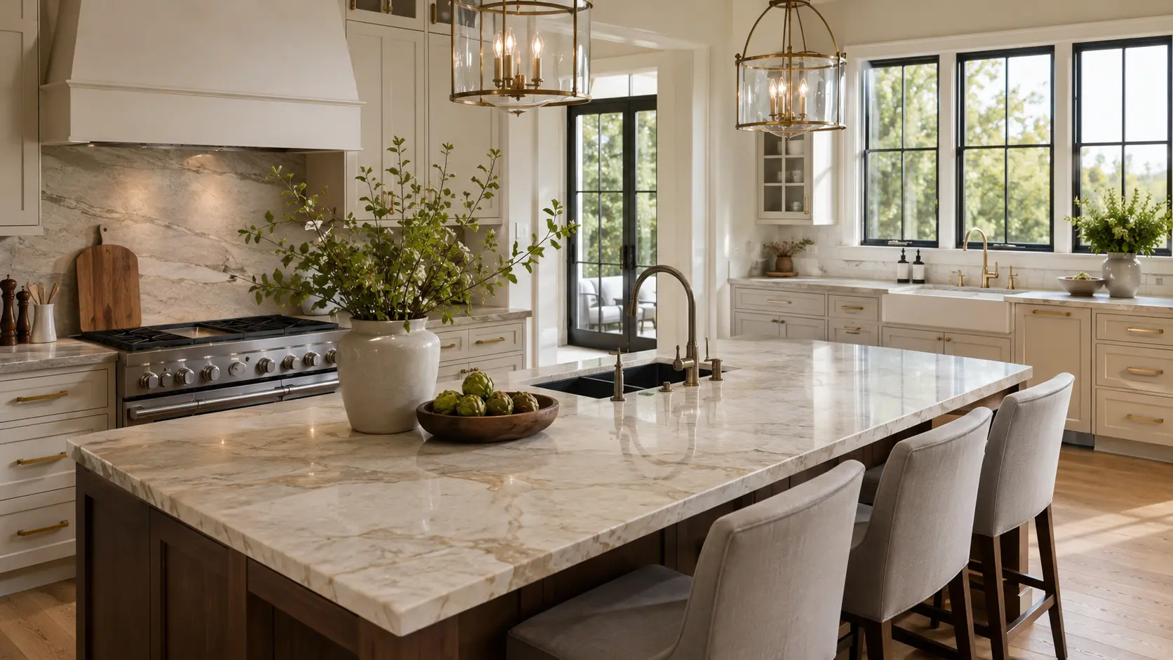
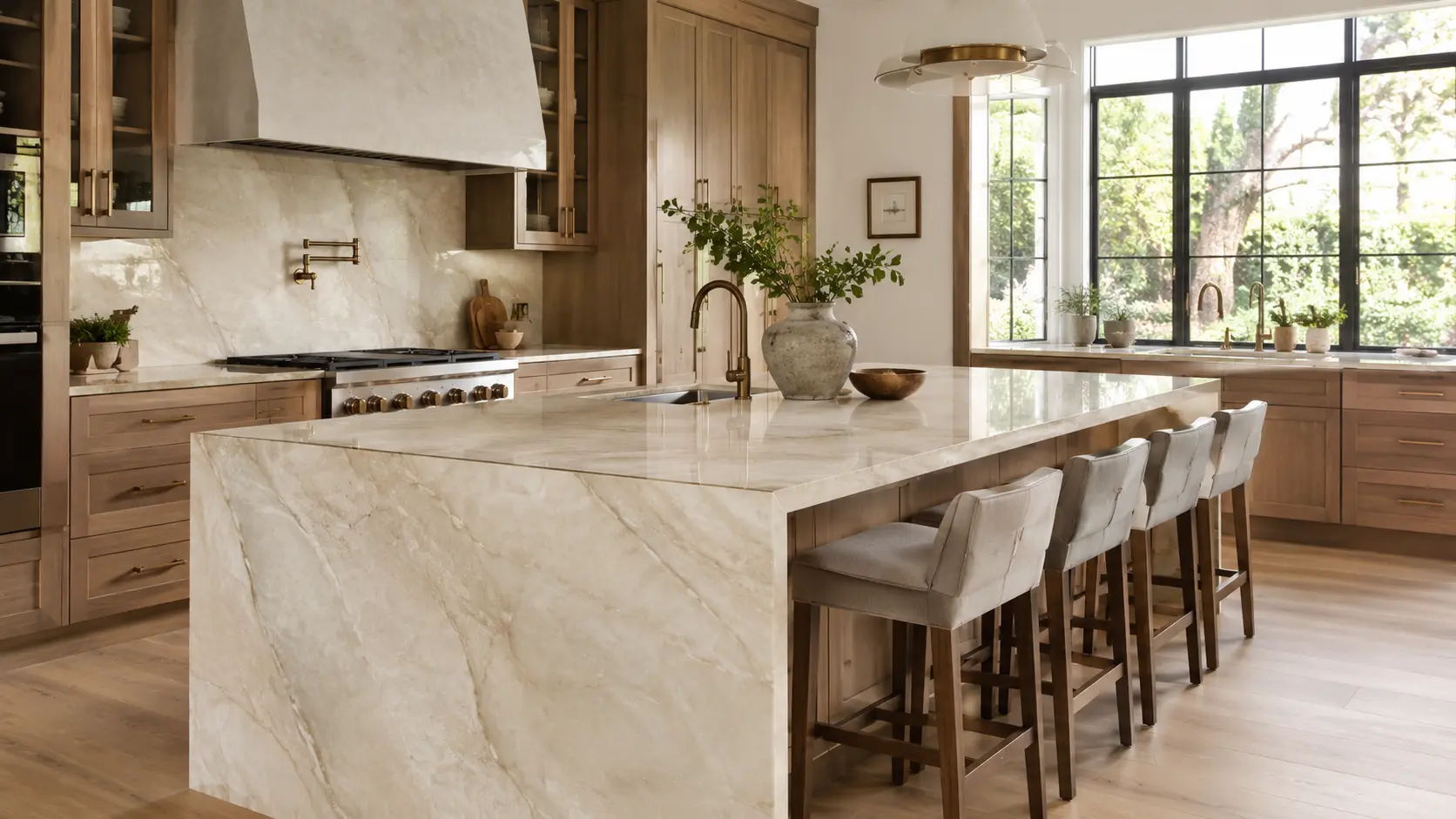
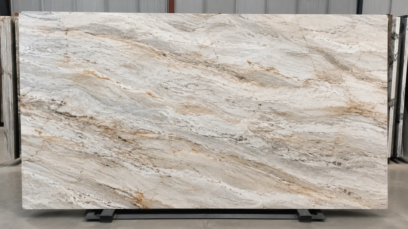
따뜻한 베이지와 크림 색상의 석영암은 밝음과 따뜻함을 균형 있게 조화시키기 때문에 주방 조리대에서 가장 상업적으로 성공적인 선택 중 하나입니다. 특히 일부 순수한 흰색 표면이 주는 차가운 느낌 없이도 프리미엄 느낌을 원하는 주방에 특히 잘 어울립니다. 이 색상 계열은 참나무, 호두나무, 테이프, 그레이지, 그리고 따뜻한 페인트 처리된 캐비닛과도 매우 잘 어울립니다.
많은 구매자가 이 카테고리에 끌리는 이유는 이 색상이 시대를 초월하는 느낌을 주기 때문입니다. 현대적인 주방, 과도기적인 주방, 그리고 고급 주거 공간에서도 모두 잘 어울립니다. 타지마할 스타일의 석영암은 이 카테고리에서 자주 언급되는데, 이는 방을 압도하지 않으면서도 차분하고 우아하며 고급스러운 시각적 효과를 만들어내기 때문입니다.
흰색과 옅은 흰색 석영암
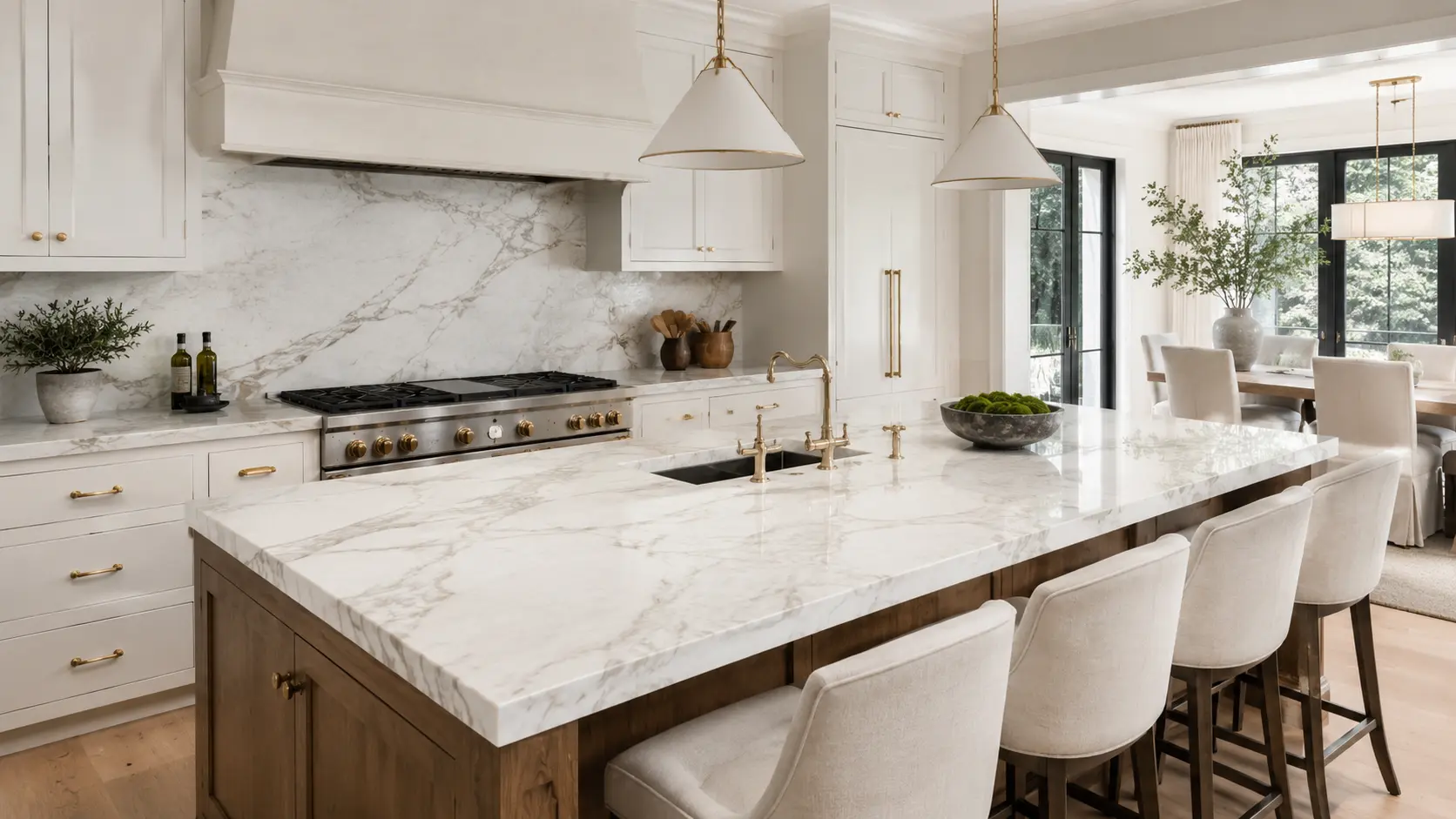
흰색과 옅은 흰색 석영암은 더 밝은 주방과 깔끔한 시각적 인상을 원하는 구매자들에게 특히 매력적입니다. 이들 판재는 밝은 캐비닛, 검은 액센트, 브러시드 니켈, 크롬, 또는 미니멀한 디테일이 들어간 주방에도 잘 어울립니다. 특히 자연광이 강한 경우에는 공간을 더 넓고 신선하게 느끼게 해줍니다.
그러나 구매자들은 모든 흰색 석영암이 동일하게 느껴진다고 가정해서는 안 됩니다. 어떤 제품은 따뜻하고 크리미한 느낌을 주는 반면, 다른 제품은 차갑고 회색빛을 띠기도 합니다. 일부는 부드럽고 거의 눈에 띄지 않는 무늬를 가지고 있는 반면, 다른 제품은 더 강한 방향성 있는 무늬를 지니고 있습니다. 이러한 차이는 큰 섬 조리대나 긴 연속 조리대에 설치된 이후에 크게 중요해집니다.
회색과 그레이지 색상의 석영암
회색과 그레이지 색상의 석영암은 너무 어두운 돌로 넘어가지 않으면서도 좀 더 안정적이고 약간 무드가 있는 주방 팔레트를 원하는 구매자들에게 유용합니다. 이 색상들은 더 짙은 캐비닛 색상, 다양한 금속 마감, 또는 좀 더 세련된 컨템포러리 스타일의 주방에서도 잘 어울립니다. 특히 그레이지 색상의 석영암은 따뜻한 요소와 차가운 요소를 동시에 연결해주는 유연성을 지니고 있어 더욱 활용도가 높습니다.
회색 계열의 돌을 사용할 때 주의해야 할 점은 조명이 더욱 중요해진다는 것입니다. 조명이 약한 주방에서는 지나치게 차가운 판재가 공간을 예상보다 더 평평하거나 무겁게 느껴지게 할 수 있습니다. 반면 조명이 충분한 주방에서는 같은 판재가 세련되고 건축적인 느낌을 줄 수 있습니다. 구매자들은 반드시 실제 조명 조건에서 판재 사진이나 영상을 확인한 후에 결정을 내려야 합니다.
골드, 테이프, 지구 톤의 석영암
골드, 테이프, 모래, 또는 지구에서 영감을 받은 톤의 석영암은 구매자가 더 강한 자연스러운 특성을 원할 때 자주 선택됩니다. 이들 판재는 고급스럽고 유기적이며 다층적인 느낌을 줄 수 있습니다. 특히 대형 주방에서, 조리대가 방대한 캐비닛, 바닥재, 조명 요소들과도 충분히 대결할 수 있을 만큼 시각적으로 풍부한 존재감을 유지해야 할 때 특히 효과적입니다.
This family is often successful in high-end residential projects because it adds depth without relying on strong black-white contrast. It is also a good direction for buyers who want the room to feel expensive and natural rather than stark and ultra-minimal.
Dark Quartzite for Statement Kitchens
Dark quartzites are less universal than beige, white, or greige options, but they can be extremely effective in the right design. They work best in kitchens where contrast is part of the concept or where the buyer wants a moodier, more dramatic statement. These slabs often pair well with warm woods, brass, textured cabinetry, and controlled lighting.
The risk is that dark stone can make a smaller kitchen feel visually heavier if the rest of the space also carries strong contrast. For this reason, dark quartzite is usually a more deliberate design choice rather than the default recommendation for broad buyer appeal.
Best Quartzite Pattern Types for Different Kitchen Styles
Soft Movement
Soft movement is one of the safest and most versatile quartzite pattern types for kitchen countertops. It creates interest without becoming visually aggressive. Buyers who want a calm, elegant kitchen often do well with slabs that show gentle mineral movement, light layering, or subtle diffuse veining. This pattern type tends to age well visually because it is easy to coordinate with changing accessories and finishes over time.
Linear Veining
Linear veining works well when the kitchen design calls for direction, structure, and a more architectural feeling. These slabs can be particularly strong for long islands, waterfall edges, and backsplashes because the movement can reinforce the geometry of the room. They are a good option when the buyer wants the countertop to feel intentional and design-driven rather than simply decorative.
Bold Dramatic Veining
Bold dramatic veining is best for buyers who want the stone to become a visual event. In the right kitchen, it can be stunning. A large island with strong quartzite movement can become the signature feature of the room. But this choice requires discipline. If cabinetry, lighting, flooring, and hardware are all visually active, a very dramatic slab can push the kitchen into visual overload.
For this reason, bold veining usually works best when the surrounding design is more restrained. The stone then becomes the hero rather than competing with everything else.
Cloudy or Layered Texture
Some quartzites do not present as clearly veined at all. Instead, they show softer clouding, layered mineral depth, or diffuse transitions. These slabs can be ideal for buyers who want a natural stone appearance without strong directional lines. They often feel softer and more atmospheric than sharply veined slabs, which can make them attractive in relaxed luxury kitchens.
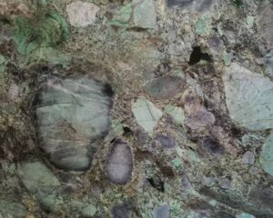
Brecciated and Highly Expressive Patterns
Brecciated or highly expressive quartzites create the strongest visual identity, but they are also the least forgiving if used without a clear design plan. These patterns are best suited to statement islands, feature surfaces, or larger kitchens where the stone can be appreciated from a comfortable viewing distance. They are usually not the first recommendation for buyers seeking the most universally appealing countertop look.
How to Choose Quartzite Colors by Kitchen Style
Modern Warm-Neutral Kitchens
For modern warm-neutral kitchens, beige, cream, taupe, and soft greige quartzites are usually the strongest choices. These colors support the calm, premium feeling that many buyers want today. They pair naturally with warm woods, textured painted cabinetry, and understated metal finishes.
Bright Luxury Kitchens
If the goal is a bright and refined luxury kitchen, white, off-white, or very pale cream quartzites usually perform best. Buyers often choose these slabs because they lift the whole room and create a more open visual effect. The key is to decide whether the brightness should feel cool and crisp or warm and gentle.
Classic Transitional Kitchens
Transitional kitchens often benefit from slabs that feel elegant but not overly trendy. Soft white, cream, beige, and lightly veined quartzites are especially useful here because they can bridge traditional detailing and contemporary simplicity. A calm pattern generally works better than a highly dramatic one in this category.
Bold Designer Kitchens
For buyers who want a more expressive or editorial look, stronger veining and richer contrast can be appropriate. This is where a quartzite island can act almost as a sculptural piece. The rest of the kitchen, however, should usually stay relatively controlled so that the stone remains the focal point.
How Kitchen Size and Layout Affect Quartzite Choice
Kitchen size changes the way stone is perceived. In a compact kitchen, a slab with very strong movement can make the space feel crowded. In a large open-plan kitchen, a slab that is too quiet may disappear and fail to deliver enough design presence. Buyers therefore need to judge slab personality in relation to scale.
Layout matters too. On a long island, directional veining may become a major design feature. On smaller perimeter counters, a more diffuse pattern may feel easier and more balanced. If the design includes waterfall ends, the buyer must also think about how the movement continues from top to side. A quartzite that looks good in a small sample may not behave the same way when cut across a larger composition.
Best Quartzite Colors and Patterns for Different Buyer Goals
| Buyer Goal | Best Color Direction | Best Pattern Direction | Why It Works |
|---|---|---|---|
| Warm luxury kitchen | Beige, cream, taupe | Soft movement or light linear veining | Creates a calm and expensive look without feeling cold |
| Bright open kitchen | White, off-white, pale cream | Soft or moderate veining | Helps the room feel larger and lighter |
| Balanced transitional style | Cream, greige, warm white | Subtle layered movement | Feels timeless and easy to coordinate |
| Statement island design | Depends on room palette | Bold dramatic veining | Turns the island into the centerpiece |
| Calm everyday kitchen | Soft neutral tones | Low-contrast movement | Easier to live with visually over time |
Quartzite Pattern Selection Guide
| Pattern Type | 시각적 효과 | Best Use Case | Buyer Caution |
|---|---|---|---|
| Soft movement | Quiet, elegant, versatile | Most kitchen styles | May feel too subtle in a very large room |
| Linear veining | Directional, structured, architectural | Islands, waterfalls, long counters | Needs careful layout planning |
| Bold dramatic veining | Luxurious, expressive, focal-point driven | Statement kitchens and large islands | Can overwhelm visually busy kitchens |
| Cloudy layered texture | Soft, atmospheric, natural | Relaxed luxury and warm interiors | Can look flatter in weak lighting |
| Brecciated expressive pattern | Rich, artistic, high-impact | Feature islands and statement applications | Less forgiving for broad buyer appeal |
Common Mistakes When Choosing Quartzite Slabs
One of the biggest mistakes is choosing from a small sample instead of reviewing the full slab. Quartzite is a natural material, and the same color family can vary greatly in movement, contrast, and overall personality. A sample can suggest tone, but it rarely tells the full design story.
Another common mistake is selecting the most dramatic slab simply because it looks impressive in a photo. Strong patterns are not always the best fit for everyday kitchens. Buyers should think about how often they want the stone to command attention and whether the rest of the room is quiet enough to support it.
Some buyers also choose a color without considering cabinet undertones. A quartzite that feels creamy and beautiful on its own may clash with cool-gray cabinetry. A bright white slab may make warm wood cabinets look more yellow than expected. Good selection is always relational.
The final mistake is ignoring layout. Waterfall edges, seam positions, backsplash transitions, and sink cutouts all affect how the pattern is ultimately read. The best slab can lose much of its value if it is not planned properly in fabrication.
Buyer Checklist Before Choosing a Quartzite Color and Pattern
Before confirming a slab, buyers should review the full slab image, confirm whether the kitchen needs warmth or brightness, compare the stone with cabinet and flooring tones, decide whether the countertop should be calm or statement-making, and evaluate how the pattern will behave across islands, seams, and waterfall returns. They should also confirm whether the selected slab still looks balanced under the lighting conditions expected in the actual kitchen.
For buyers who are still narrowing down options, it often helps to compare two or three slab directions rather than trying to find the perfect name immediately. In practice, successful selection depends less on brand-like stone labels and more on choosing the right slab personality for the project.
If the next step is active material evaluation, buyers should move from inspiration into a 조리대 재료 문의를 제출하는 것입니다. and request actual slab photos, finish options, and project-based recommendations. Buyers who want broader planning guidance can also review more ideas around 쿼츠라이트 주방 조리대 before finalizing a selection direction.
Final Recommendation
The best quartzite colors and patterns for kitchen countertops are not the same for every project. The best choice is the one that supports the kitchen’s scale, light, cabinet palette, and intended visual mood. For most buyers, soft warm neutrals and moderate movement offer the safest balance of beauty and versatility. For more design-driven kitchens, stronger veining or richer tones can create a memorable statement when the rest of the room is controlled.
The smartest buying approach is to think in terms of kitchen atmosphere, slab personality, 그리고 fabrication layout together. Buyers who evaluate those three factors as one decision usually achieve better results than those who focus on stone name alone.
최종 참고 사항 / 실용적인 팁
For buyers, quartzite color and pattern selection is not only a design preference. It is a practical decision about how the kitchen will feel every day, how the stone will interact with cabinetry and light, and whether the countertop should serve as a quiet foundation or a visual focal point.
In most kitchens, the strongest results come from choosing a slab that looks balanced at full scale, not just attractive in a cropped image. Warm beige, cream, off-white, and soft greige quartzites remain the most versatile directions because they are easier to coordinate and easier to live with over time.
The most expensive or dramatic slab is not automatically the best slab. The better choice is the one that fits the kitchen’s atmosphere, supports the layout, and can be fabricated in a way that preserves the visual value of the natural pattern.
자주하는 질문
1. 주방 조리대에 가장 적합한 석영암 색상은 무엇인가요?
주방 조리대에 가장 적합한 석영암 색상은 보통 따뜻한 베이지, 크림색, 오프화이트, 부드러운 회색, 그리고 그레이지입니다. 이들 톤은 다재다능하여 다양한 주방 스타일에 잘 어울리기 때문입니다. 올바른 선택은 주방에 더 따뜻한 분위기가 필요한지, 더 밝은 느낌을 원하는지, 아니면 더욱 강렬한 인상을 주고 싶은지에 따라 달라집니다.
2. 밝은 색의 석영암 조리대가 어두운 색의 조리대보다 더 나은가요?
밝은 색의 석영암 조리대는 공간을 더욱 밝고 개방감 있게 만들어 주기 때문에 다양한 주방에서 사용하기가 더 수월한 경우가 많습니다. 어두운 색의 석영암도 매우 효과적이지만, 실내가 지나치게 무겁거나 대비가 지나치게 강하게 느껴지지 않도록 보다 신중한 디자인 계획이 필요합니다.
3. 주방 아일랜드에는 어떤 석영암 패턴이 가장 적합한가요?
많은 주방 아일랜드의 경우, 중간 정도에서 강렬한 무늬가 잘 어울립니다. 이는 아일랜드가 종종 공간의 시각적 중심이 되기 때문입니다. 만일 주방의 나머지 부분이 이미 시각적으로 복잡하다면, 보다 부드러운 패턴을 선택하는 것이 더 균형 잡힌 결과를 만들어낼 수 있습니다.
4. 석영암에서 부드러운 움직임과 극적인 결을 어떻게 선택해야 하나요?
차분하고 시간을 초월한, 동시에 조화롭게 매치하기 쉬운 주방을 원하신다면 부드러운 무늬를 선택하세요. 카운터탑이나 아일랜드가 더욱 강렬한 디자인 포인트로 자리매김하고, 주변의 주방 요소들이 그 포인트를 잘 받쳐줄 만큼 절제된 스타일이라면 드라마틱한 결을 선택하세요.
5. 전체 슬래브 선택이 석재 이름보다 더 중요합니까?
네. 석재 이름은 선택의 방향을 좁히는 데 도움이 될 수 있지만, 일반적으로 전체 판재 선택이 더 중요합니다. 이는 규암이 천연 소재로, 개별 판재마다 색상 균형, 무늬의 분포 및 전반적인 특성이 크게 다를 수 있기 때문입니다. 최종 결정은 항상 실제 판재를 기준으로 내려야 합니다.