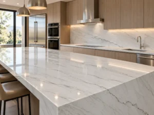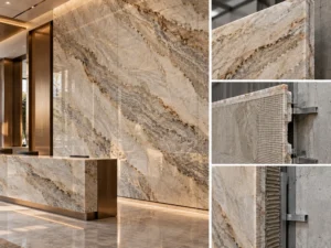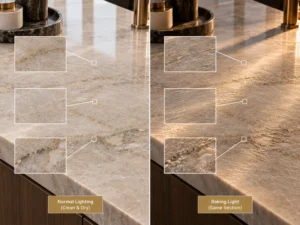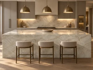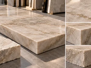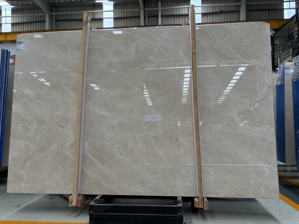
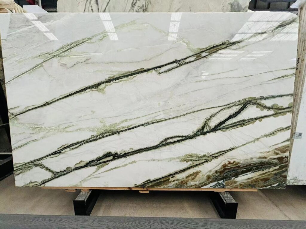

A pale Natural Quartzite countertop looks warm and balanced in the slab warehouse.
The kitchen is installed.
Then a large stainless-steel refrigerator is placed beside the perimeter run.
From the room entrance, the stone suddenly appears cooler.
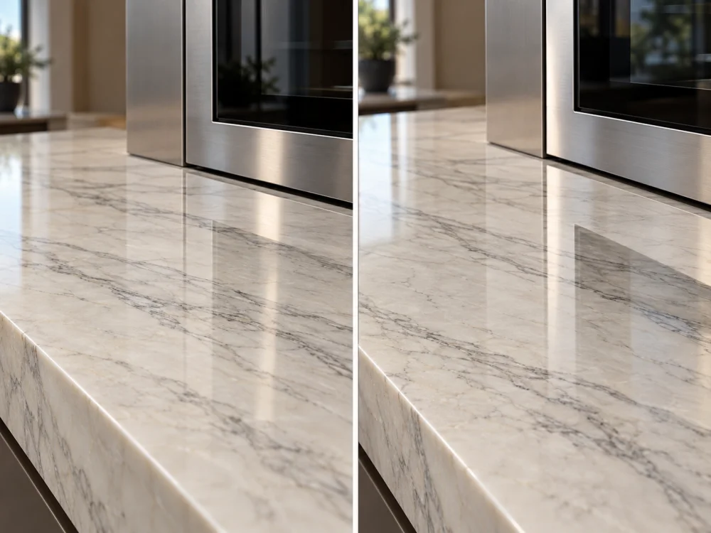
From another angle, the polished countertop reflects a dark oven door and one part of the worktop looks noticeably greyer.
At night, warm pendant lights turn the stainless-steel fronts slightly warmer while their bright highlights appear across the Quartzite island.
Has the stone colour changed?
必ずしもそうではありません。.
Has the stainless steel changed?
必ずしもそうではありません。.
The reflection environment has changed.
This is the central issue behind Quartzite with Stainless-Steel Appliances: Reviewing Reflections.
When two reflective materials occupy the same kitchen, their appearance cannot be understood from isolated samples alone. The project needs to consider what each surface reflects, from which direction it is viewed, and under which lighting condition.
The first step is to distinguish what belongs to the physical material from what belongs to the surrounding room.
The Natural Quartzite itself has an actual slab-specific combination of:
These characteristics should be reviewed from the actual slab or current physical stone reference.
A polished surface can also show light and colour coming from somewhere else.
Depending on the angle, the viewer may see reflections of:
These reflected elements can change the apparent colour of one part of the countertop without changing the stone itself.
If a grey or dark area appears on the polished Quartzite, move the viewing position.
If the apparent area moves, changes shape, or disappears while the geological pattern stays fixed, reflection is likely contributing to what is being seen.
If the colour feature remains in exactly the same stone location from several viewing positions and lighting states, it is more likely to belong to the material itself.
Actual Stone Colour + Surface Finish + Lighting + Reflected Surroundings + Viewing Angle = What the Eye Sees. Do not treat the complete visual impression as intrinsic Quartzite colour.
Stainless-steel appliance fronts can look visually similar in a specification schedule while behaving quite differently in the finished room.
Some stainless-steel surfaces are brighter and more reflective.
Others are brushed, satin-like, textured, coated, or otherwise finished to create a softer visual response.
Two appliances described simply as “stainless steel” may therefore show surrounding reflections differently.

A brushed surface contains a directional finishing pattern.
Light interacting with that texture may produce elongated highlights or a softer directional sheen rather than a mirror-like image.
From another angle, the same appliance can look darker or flatter.
This does not necessarily mean that the stainless-steel colour is inconsistent.
A refrigerator, oven, dishwasher, or range may combine:
Those components can create several colours and reflection levels within one appliance elevation.
Do not reduce the entire appliance to a single grey sample swatch.
For colour-sensitive kitchens, record:
A generic stainless-steel sample can help during early palette development, but it does not automatically reproduce the exact appliance front.
The selected stone finish is one of the strongest variables in the reflection relationship.

Polished Natural Quartzite can produce stronger, more defined reflections.
A tall refrigerator or dark oven front positioned close to the worktop may become visible as a reflected shape in the stone from certain angles.
Bright stainless surfaces can also create lighter reflected bands.
The effect can move as the viewer walks through the kitchen.
A honed surface generally produces a softer, more diffuse reflection.
The appliance can still affect the perceived brightness or colour of the countertop, but the reflected image may be less distinct.
This does not automatically make honed Quartzite the better finish beside stainless steel.
The finish should be selected for the complete design, maintenance expectation, tactile character, and desired visual depth.
A reflection can temporarily strengthen or weaken the visibility of natural mineral movement.
A dark reflected oven door may make a pale vein appear less visible.
A bright refrigerator reflection may wash across a quiet area and make the stone look lighter.
These effects should not be confused with permanent slab variation.
The related キッチンカウンタートップ用の研磨仕上げとヘイズド仕上げのクォーツァイト guide explains how finish changes reflectivity, colour depth, and the way natural pattern is read.
| Review Factor | 研磨仕上げのクォーツァイト | ホーニング仕上げのクォーツァイト |
| Reflected appliance shape | Can appear more distinct from some viewing angles | Typically softer and less mirror-like |
| Highlight intensity | Generally stronger | Generally more diffuse |
| Natural pattern | Often reads with greater visual depth and contrast | Often reads more softly |
| Approval question | Are stronger reflections acceptable in the actual kitchen? | Does the softer finish still provide the desired stone character? |
Not every appliance affects every countertop area equally.
Map the important adjacencies.
A stainless-steel range may sit directly between two Quartzite runs.

The stone is horizontal while the appliance front is vertical.
From standing height, the countertop may reflect parts of:
The result can be visually more complex than placing a stainless sample directly beside a flat stone sample.
A tall stainless-steel refrigerator can occupy a large vertical area beside a smaller horizontal stone surface.
It may influence the stone through both direct visual contrast and reflection.
If the refrigerator sits very close to a polished countertop end, review the relationship from the main room approach as well as from the working side.
A dishwasher typically sits below the worktop plane.
Its stainless front may therefore appear more strongly in a polished countertop when viewed from a lower or more distant angle than when standing directly above it.
This can matter in open-plan kitchens where the island or perimeter run is viewed from an adjacent living area.
Large stainless-steel vertical surfaces above the countertop can create another reflection path.
A polished Quartzite worktop may reflect the metal above while the metal simultaneously reflects the countertop and surrounding cabinetry.
The project should evaluate the combined composition rather than trying to assign every visible colour shift to one material.
Do not review “Quartzite + Stainless Steel” only as two samples on a table. Review the real orientation: horizontal stone, vertical appliance, dark glass, metal trim, surrounding cabinets, floor, and the principal viewing direction.
Reflective materials borrow visual information from the room around them.
A brushed stainless appliance beside warm oak cabinetry may pick up warmer reflected tones.
From another angle, the same appliance may reflect a pale wall or cool daylight and appear more neutral.
The physical stainless-steel surface does not need to change for this difference to occur.
A black or charcoal cabinet elevation located opposite a polished island can appear as a dark reflected zone across the stone.
If the natural Quartzite already contains grey or dark mineral movement, the reflection can visually overlap the geology.
Move the viewing position before concluding that the dark area belongs to the slab.
Stainless fronts can reflect flooring strongly, particularly from oblique viewing positions.
A warm timber floor may therefore make the lower part of a refrigerator or dishwasher look warmer than the upper part.
In a close adjacency, the stainless appliance may reflect the pale Quartzite while the polished Quartzite reflects the stainless appliance.
This can make the overall junction appear more coordinated than the two isolated samples—or more visually active.
The design decision should be made on the complete relationship.
の ホワイトオンホワイトのキッチンに映えるインフィニティ・ホワイト・クォーツァイト:アンダートーンの比較 guide explains a related principle: adjacent physical finishes and lighting can shift how neutral colours are perceived even though the materials themselves have not changed.
A kitchen rarely has one fixed visual condition.
During the day, windows may dominate the reflections.
At night, the appliance fronts and Quartzite may respond more strongly to pendant, ceiling, and under-cabinet lighting.
A bright window can appear as a strong reflected area in polished stone.
That reflection may be visually stronger than the nearby stainless appliance.
At the same time, the appliance can reflect the window and become much brighter than it appears under artificial lighting.
Morning or afternoon sun can create strong directional highlights.
A brushed stainless surface may show its directional texture more clearly.
Polished Quartzite may develop strong reflected bands from windows or bright exterior scenery.
Do not interpret these temporary highlights as permanent changes in material colour.
When daylight disappears, warm artificial lighting may become the dominant source.
Both the stone and stainless surfaces can then take on warmer reflected tones.
Dark oven glass may become more visually dominant because there is less daylight balancing the contrast.
Task lighting near perimeter countertops may illuminate the stone more directly than the appliance face.
This can make the Quartzite appear brighter while the stainless front below remains comparatively dark.
Again, the material relationship has not necessarily changed; the lighting hierarchy has.
サイトの クォーツァイトスラブの直立と平置きの比較:なぜ見え方が変わるのか guide explains why polished Natural Quartzite can look different when surface orientation, reflection and viewer position change.
| Viewing Condition | What May Dominate | 想定しないでください |
| Bright daylight | Window reflections and broad room brightness | That this predicts evening appearance |
| Low-angle sun | Directional highlights and strong reflected bands | That temporary glare is intrinsic stone colour |
| Evening ambient light | Warm/cool artificial-light relationship and dark appliance glass | That daytime approval covers this condition automatically |
| Under-cabinet lighting | Bright countertop with comparatively darker vertical appliance fronts | That brightness difference means a material mismatch |
A photograph records reflected light as well as physical material.
This makes remote approval particularly sensitive when the kitchen includes polished Quartzite and stainless-steel appliances.
If the camera exposes for a bright Quartzite countertop, the stainless appliance may appear darker.
If it exposes for a darker appliance front, the pale stone may appear brighter or more washed out.
Automatic HDR processing can change the relationship again.
A photograph taken under warm artificial light may be automatically corrected toward a cooler neutral.
Another phone may preserve more warmth.
The receiving screen adds another variable.
Do not use small photographic colour differences as the sole basis for rejecting the material combination.
Architectural renderings can be very useful for composition and design direction.
But a rendering may show perfectly controlled metal highlights, simplified stone reflections, or an environment that does not reproduce the final lighting and surroundings exactly.
Use it to understand the design intent, then return to physical materials for final colour-sensitive approval.
For remote review, use a sequence such as:
This provides more useful context than an isolated close-up of one reflected dark band.

The strongest approval compares identified real materials in the relationship the finished kitchen will create.
Record the material name, slab or board reference where available, intended stone finish, and the relevant finished countertop areas.
Record the exact appliance models and finish references rather than writing only “stainless steel.”
Pay particular attention to large surfaces close to the Quartzite.
Prioritize:
At minimum, compare the conditions that materially change the room.
This might include:
Daylight Condition
Normal Evening Lighting
Task Lighting Where Relevant
Reflections are angle-dependent.
Review the materials from:
A useful approval may state:
“Selected Quartzite slab and polished finish accepted with specified stainless-steel appliance package under reviewed daylight and evening conditions. Reflections from surrounding finishes are understood as part of the installed visual environment.”
これは、次のような記述よりもはるかに正確です:
“Quartzite matches stainless steel.”
Actual Quartzite → Intended Finish → Exact Appliance Finish → Real Orientation → Surrounding Materials → Daylight → Evening Lighting → Main Viewing Positions → Defined Approval.
The stone may be reflecting the stainless appliance, dark appliance glass, surrounding cabinetry, flooring, windows or lighting. The physical Quartzite does not need to change colour for its apparent tone to shift from another viewing angle. Compare the same stone from several positions and lighting conditions.
No. Stainless-steel appliance surfaces can differ in brightness, brushing, texture, coating and overall construction. Some appliances also combine stainless steel with dark glass, handles and other materials. Review the exact selected appliance package when the reflection relationship is visually important.
Neither finish is universally better. Polished Quartzite generally creates stronger and more distinct reflections, while honed Quartzite usually produces a softer, lower-sheen response. The better choice depends on the desired visual depth, overall kitchen design and actual lighting.
They can contribute to that visual impression through reflection and contrast, particularly beside a polished surface. However, windows, cabinet colours, flooring, artificial-light temperature and dark appliance components can also influence the result. Review the complete physical palette before attributing the change to stainless steel alone.
Yes when they occupy large visible areas close to the stone or strongly affect the kitchen palette. Bring the exact appliance finish information into the review, but do not allow a small generic stainless sample to replace actual slab selection and full-kitchen coordination.
Photographs are useful for documentation, but exposure, white balance, HDR processing, viewing angle and the receiving screen can alter the relationship. Use complete-room and junction photographs together, and rely on physical review when colour and reflection are critical.
Send Josh the proposed Natural Quartzite material, current slab references where available, kitchen drawings, countertop dimensions, quantities, stone finish, appliance manufacturer and model references, appliance finish information, important appliance-to-countertop junctions, cabinet and flooring references, lighting information where known, photographs or renderings of the kitchen, and delivery destination. Identify whether the main concern is colour, glare, dark reflections, finish choice, or the overall appliance-and-stone relationship.
For project-based Natural Quartzite kitchens, HRST STONE can coordinate available full-slab photographs, board references, surface-finish review, countertop and island drawings, cutting layouts, visible edges, appliance-opening coordination, fabrication QC, packing and export documentation according to the confirmed stone scope. Send Josh the kitchen plan, appliance schedule, proposed Quartzite, finish, dimensions, quantities, visual priorities and destination for review.