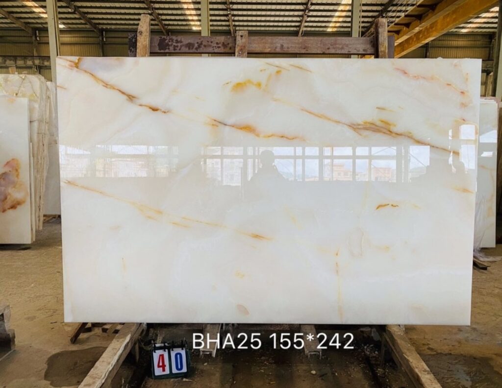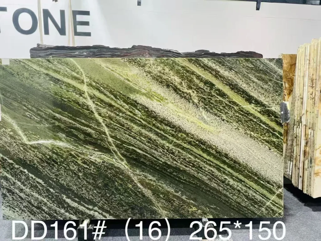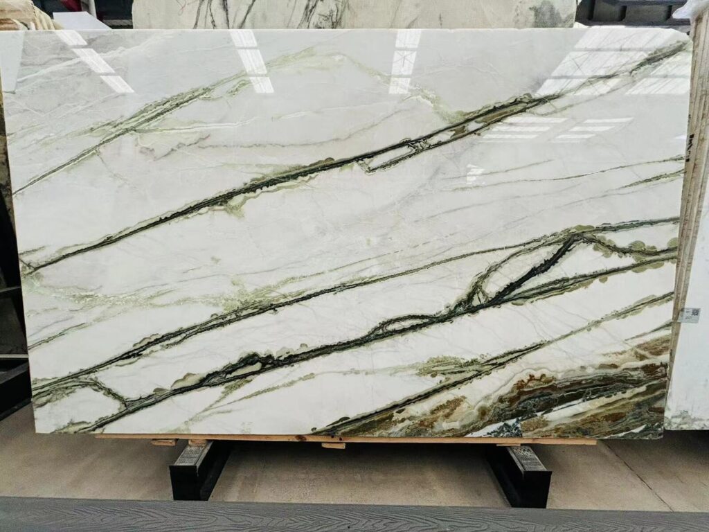

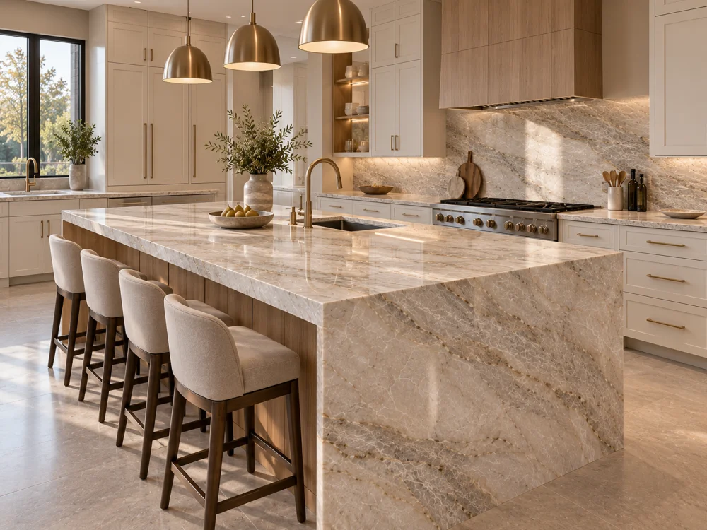
Résumé rapideQuartzite with Two-Tone Cabinets does not require the stone to “match” one cabinet colour and ignore the other. First identify where each cabinet finish appears, which one occupies the larger visual field, which one directly touches the stone, and whether the Natural Quartzite is used on the island, perimeter, backsplash, or all three. Then separate the Quartzite background undertone, brightness, and natural mineral movement. The stone may bridge both cabinet finishes, align more closely with the visually dominant cabinet, or intentionally contrast with both. Approve that relationship using the actual Quartzite slab or current slab reference, two physical cabinet samples, the intended stone finish, flooring, wall or backsplash materials, and relevant daylight and artificial lighting.
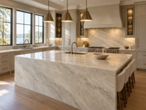
A kitchen uses soft warm-white perimeter cabinets and a darker island.
The designer selects a pale Natural Quartzite with warm cream background areas and restrained taupe-grey movement.
One person asks:
“Should the Quartzite match the white cabinets?”
Another says:
“No—the stone sits directly on the island, so it should follow the island colour.”
Both questions are understandable.
Neither creates a universal design rule.
This is the central issue behind Quartzite with Two-Tone Cabinets: Which Colour Should the Stone Follow?
A two-tone kitchen is not simply Cabinet Colour A + Cabinet Colour B + Stone.
The room contains different material areas, different viewing planes, different amounts of each finish, and different physical junctions.
La question plus pertinente est :
What visual role should the Quartzite play between the two cabinet finishes?
Depending on the project, the stone may connect the two colours, align mainly with one of them, or become an independent focal material.
Before comparing undertones, map the kitchen.

The percentage and location of each cabinet finish can change which material visually controls the room.
The perimeter cabinetry may occupy a large continuous wall area.
It can include:
Even if the second cabinet colour appears on a large island, the perimeter colour may still dominate the room because it extends across several elevations.
The island may use the second colour.
Because it sits near the centre of the room, it can still become the strongest focal cabinet finish even if it occupies fewer square metres.
Its importance increases when:
A dark or timber finish used only on a tall pantry wall can still have strong visual weight because it occupies a large vertical plane.
Do not classify it as a “secondary colour” simply because it appears on fewer cabinet boxes.
Now identify the actual junctions.
Par exemple :
Perimeter Quartzite → Warm-White Base Cabinets
Island Quartzite → Natural Oak Island Cabinets
Full-Height Quartzite Backsplash → Warm-White Upper Cabinets
These are three different colour relationships even when the same Natural Quartzite is used throughout the kitchen.
Cabinet Distribution Rule
Do not ask which cabinet colour the Quartzite should follow until you know where each colour appears, how much of it is visible, which stone surfaces touch it, and which viewpoint controls the room.
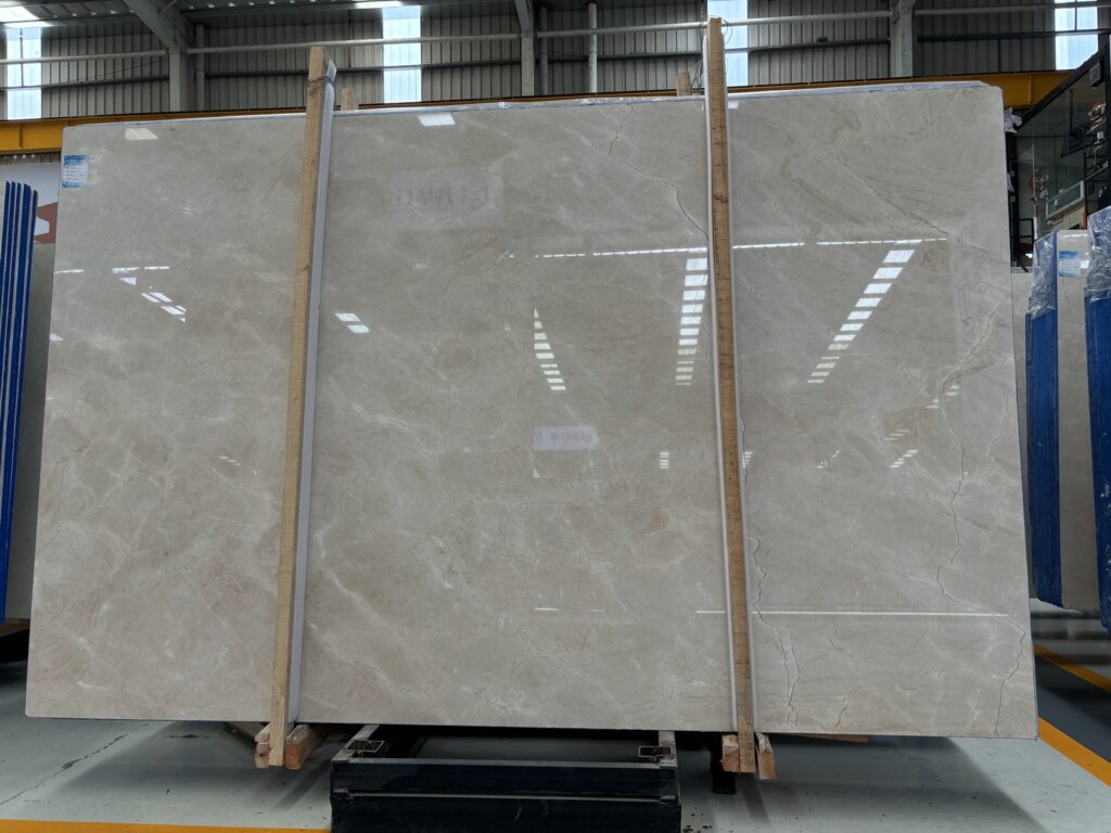
Natural Quartzite should not be represented by one sampled RGB colour.
A slab can contain several visual layers at the same time.

Begin with the larger relatively quiet areas.
Do they read as:
This background often creates the strongest direct colour relationship with painted cabinet doors.
Undertone and brightness are not the same thing.
A Quartzite background may have a warm undertone while still appearing brighter than a warm-white cabinet.
Another slab may have a similar undertone but be visually darker because of its overall mineral density.
Now look at the stronger movement.
The stone may contain:
These secondary colours may relate more strongly to the second cabinet finish than the stone background does.
This is one reason Quartzite can sometimes act as a bridge between two cabinet colours.
Finally, step back.
A cream-background Quartzite with extensive grey movement may read relatively grey at room distance.
A pale slab with only a few taupe bands may still read primarily warm cream.
Le Quartzite blanc Infinity dans une cuisine blanc sur blanc : comparaison des sous-tons guide uses the same three-part approach: background undertone, brightness, and vein distribution should be reviewed separately before judging the complete palette.
Three-Part Stone Check
Background Undertone + Background Brightness + Natural Vein / Mineral Distribution. Do not decide which cabinet colour the stone “follows” from one local stone colour alone.
Once the actual cabinet distribution and actual Quartzite are understood, the project can choose an intentional relationship.
This is often effective when different parts of the stone relate naturally to the two cabinet colours.
Imagine:

Cabinet A — soft warm white.
Cabinet B — natural white oak or warm taupe.
Quartzite — pale cream / greige background with soft taupe mineral movement.
The quieter background may coordinate with Cabinet A while the warmer mineral movement connects visually with Cabinet B.
The Quartzite becomes the transition material.
This does not require an exact colour match with either cabinet finish.
In another kitchen, one cabinet colour clearly controls the architecture.
For example, warm-white perimeter cabinets may occupy most elevations while a dark island acts as a deliberate accent.
The Quartzite may coordinate more closely with the warm-white perimeter and intentionally contrast with the dark island.
This can create a clear hierarchy:
Main Cabinet Field → Related Stone → Contrasting Island Base.
The opposite approach can also work.
If the island is the dominant focal object and the stone appears mainly or exclusively on the island, the island cabinet finish may become the stronger colour reference.
The perimeter cabinetry can then act as the calmer room background.
A dramatic Natural Quartzite does not always need to repeat either cabinet colour.
The design may intentionally create three distinct layers:
Light Perimeter Cabinetry → Dark Island Cabinetry → Expressive Natural Stone.
This can work when flooring, walls, metals, and lighting create a coherent overall palette.
The important point is that the separation is deliberate.
| Stone Strategy | Useful When | Question principale d’examen |
| Bridge Both | Stone background and movement connect naturally to different cabinet tones | Does the complete slab connect the two finishes without looking forced? |
| Follow Perimeter | Perimeter cabinetry dominates the room | Does the island remain an intentional contrast? |
| Follow Island | Island is the main focal object and primary stone location | Does the perimeter remain visually supportive? |
| Contrast with Both | Stone is intended as an independent focal material | Do the remaining finishes make the three-way contrast look intentional? |
Using one Natural Quartzite throughout the kitchen does not mean it will read identically everywhere.
A large island normally exposes much more stone.
It may contain:
The stone’s complete pattern can therefore become one of the strongest visual elements in the room.

The island cabinet colour below it may occupy a similarly prominent position.
Perimeter counters are often narrower.
They may be visually interrupted by:
The same Quartzite can therefore appear quieter on the perimeter than on the island.
A Natural Quartzite slab can contain both quiet and more expressive areas.
If the cutting plan allows, slab allocation may help coordinate the room.
For example, the project may prefer:
This should remain a slab-layout decision rather than a promise that Natural Quartzite can be recolored to suit each cabinet zone.
Le Échelle de motif de quartzite : lecture d’une dalle à distance normale guide explains why the correct question is not only whether the complete slab looks good, but what the particular island or perimeter crop will look like once installed.
A two-tone cabinet kitchen changes again when the Natural Quartzite continues vertically.
When the Quartzite stops at the countertop, the strongest immediate relationship is often with the base cabinet directly below it.
When the same Quartzite rises to the underside of upper cabinets, the relationship changes.
The stone now sits directly beside:
The upper cabinet colour may therefore become as important as the base cabinet colour.
A waterfall panel turns the Quartzite vertically beside:
A colour relationship that looks subtle across a horizontal countertop can become more obvious on a large vertical waterfall end.
Review the stone in its intended orientation rather than approving only flat samples lying on a table.
“Two-tone cabinets” does not necessarily mean two paint colours.
A kitchen may combine:
Painted finishes create relatively continuous colour fields.
The project should identify the actual colour reference and sheen where colour coordination matters.
Wood introduces its own variation.
Grain direction, heartwood and sapwood differences, stain, finish, veneer matching, and lighting can all change the overall visual relationship.
Do not reduce a natural oak door to one beige colour chip.
Warm taupe, beige, brown, or gold movement in Natural Quartzite may visually connect with timber cabinetry even when the stone background is considerably lighter.
That can make the stone an effective bridge between painted perimeter cabinets and a natural-wood island.
The goal is colour and material coherence, not reproducing the exact wood tone inside the natural stone.
The relationship should look intentional at room scale.
A cabinet-and-stone combination should not be isolated from the rest of the kitchen.
Flooring may occupy more visible area than either cabinet finish.
A warm timber floor can connect cool-looking painted cabinetry to warmer Quartzite movement.
A grey floor can shift the room in another direction.
Wall colour is particularly important where it surrounds tall cabinetry or sits above a shorter backsplash.
A wall that is noticeably warmer or cooler than both cabinet colours may change the way the entire palette reads.
Brass, brushed nickel, stainless steel, dark bronze, and black hardware can reinforce or soften the temperature of the room.
Large stainless-steel, black-glass, white, or panel-ready appliances introduce another visual field.
Polished Quartzite can also reflect nearby appliance and cabinet colours.
When diagnosing a cabinet-to-stone issue, begin with the two cabinet references and Quartzite.
Then add flooring, wall, metal, and appliance finishes one group at a time.
This makes it easier to identify which material is changing the relationship.
The perceived relationship can change during the day.
Natural daylight can reveal subtle warm or cool differences between the Quartzite background and painted cabinetry.
The direction and intensity of daylight can also change across the island and perimeter.
Task lighting may illuminate perimeter Quartzite directly while leaving the base cabinet comparatively darker.
The stone can appear brighter and more separate from the cabinetry than it does under broad room light.
Island pendants can emphasize the island stone and change its visual priority relative to the cabinet base below.
Warm artificial lighting can strengthen cream, beige, and timber tones.
Cooler lighting can emphasize grey and blue tendencies.
A stone that appears to coordinate closely with the white perimeter during daylight may appear more connected to the warmer island cabinetry at night.
This does not mean the stone literally changes allegiance between cabinet colours.
It means colour is being perceived within a changing lighting environment.
For a two-tone kitchen, the most useful basic sample set is not Stone + One Cabinet Door.
Elle est :
Actual Quartzite + Cabinet Finish A + Cabinet Finish B.

Use the same identified Quartzite reference while comparing the two cabinet finishes.
If the stone sits horizontally above a painted perimeter cabinet, place that cabinet sample vertically beneath or beside the stone.
If the second finish forms the island base, reproduce that vertical relationship.
Do not judge every sample lying flat on a table.
Demander :
Move from sample distance to room-scale context.
The final decision should consider which combination dominates from the kitchen entrance and connected living or dining spaces.
Introduce flooring, backsplash, wall paint, metals, and appliance references after the basic three-material relationship is understood.
If the two cabinet colours change significantly under evening light, include that state before final colour approval.
A useful approval might say:
“Selected Quartzite accepted as a bridging material between the warm-white perimeter cabinetry and natural-oak island. The stone’s pale background relates to the perimeter while its taupe movement connects with the island finish under the reviewed daylight and evening conditions.”
This records the design logic.
It is more useful than:
“Quartzite matches cabinets.”
The answer depends on the architecture.
| Kitchen Condition | Useful Stone Strategy |
| Stone used everywhere; cabinet colours have related undertones | Look for a Quartzite that can bridge both finishes |
| Perimeter cabinetry dominates; island is accent colour | Stone can coordinate more closely with the perimeter while intentionally contrasting with the island |
| Stone appears mainly on focal island | Island cabinetry may deserve greater visual priority |
| Expressive stone is intended as primary focal material | Cabinet colours can support or frame the stone rather than dictate it |
| Full-height stone backsplash touches upper cabinetry | Upper cabinet colour becomes an important direct reference in addition to the base cabinets |
There is therefore no universal answer that Quartzite should follow the lighter cabinet, darker cabinet, island, or perimeter.
The final hierarchy should be based on:
Cabinet Distribution → Stone Location → Direct Junctions → Visual Priority → Actual Slab Character → Adjacent Finishes → Lighting → Main Room View.
Le Salons d’exposition de dalles de quartzite : ce qu’il faut apporter à un rendez-vous de sélection guide recommends bringing physical cabinet and adjacent-material samples to slab selection for exactly this reason: Natural Quartzite is most useful when reviewed beside the materials it will actually live with.
There is no universal rule. Review where each cabinet colour appears, which one dominates the room, which one directly touches the stone, where the Quartzite is used, and whether the stone is intended to bridge both colours, align mainly with one, or act as an independent focal material.
Yes, depending on the actual materials. A pale stone background may coordinate with the painted cabinetry while warm taupe, beige, brown, or gold mineral movement relates to the wood. Confirm the relationship using the actual slab and physical cabinet references rather than colour names alone.
It may deserve greater priority because the two materials meet directly and the island is often a major focal point. However, perimeter cabinetry, flooring, walls, backsplash, and room sightlines can still control the overall palette. Review the complete room before making the island the only reference.
No. The stone does not need to reproduce both cabinet colours. A successful relationship may come from similar undertones, a secondary vein colour, deliberate contrast, or another transition material in the room.
First identify whether the issue concerns undertone, brightness, stone movement, lighting, or surrounding finishes. Then test whether another cabinet finish, another slab, a different stone crop, or a deliberate transition improves the relationship. Change one major variable at a time so the cause remains clear.
Photographs and renderings are useful for design direction, but cameras, screens, lighting, and image processing can alter colour. For a colour-sensitive two-tone kitchen, compare actual cabinet finish references with the physical Quartzite or current slab-specific reference before final approval.
Send Josh the proposed Natural Quartzite material, current slab references where available, kitchen plan and elevations, island and perimeter dimensions, quantities, intended stone finish, both cabinet finish references, information showing where each cabinet colour is used, backsplash and flooring references, important viewing directions, lighting context, waterfall or full-height stone requirements, and delivery destination.
Two-Tone Cabinet Approval SummaryA Natural Quartzite does not automatically need to follow the lighter cabinet, darker cabinet, island colour, or perimeter colour. First map where the two cabinet finishes appear and how they physically relate to the stone. Then separate the Quartzite background undertone, brightness, and natural movement. Decide whether the stone should bridge both finishes, coordinate mainly with the visually dominant cabinet, support the island as the focal object, or remain an independent natural-stone feature. Review that decision using the actual slab, both physical cabinet references, the intended stone finish, flooring, backsplash, other major finishes, and relevant daylight and artificial lighting.
For project-based Natural Quartzite kitchens with two-tone cabinetry, HRST STONE can coordinate available full-slab photographs, board references, finish review, island and perimeter slab allocation, cutting layouts, waterfall relationships, CAD/shop drawings, visible-face review, fabrication QC, packing, and export documentation according to the confirmed stone scope. Send Josh the kitchen drawings, both cabinet finish references, proposed Quartzite, finish, dimensions, quantities, visual priorities, and destination for review.